## Scatter Plot: Relationship Between MA and c
### Overview
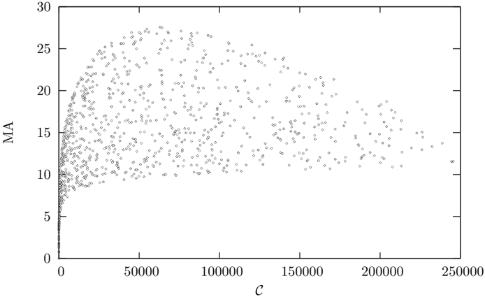
The image is a scatter plot depicting the relationship between two variables: "MA" (y-axis) and "c" (x-axis). Data points are distributed across the plot, with a general trend of increasing MA values as c increases. The plot is sparse in the lower-left region and becomes denser toward the upper-right, suggesting a non-linear or asymptotic relationship.
### Components/Axes
- **X-axis (c)**: Labeled "c", with values ranging from 0 to 250,000 in increments of 50,000. No explicit units are provided.
- **Y-axis (MA)**: Labeled "MA", with values ranging from 0 to 30 in increments of 5. No explicit units are provided.
- **Data Points**: Black dots (no legend or color coding). No additional annotations or text are visible in the image.
### Detailed Analysis
- **Data Distribution**:
- At low values of c (0–50,000), MA values are tightly clustered near 0–5, indicating minimal variability.
- As c increases (50,000–150,000), MA values spread out more broadly, with some points reaching up to ~15.
- Beyond c = 150,000, MA values continue to increase but with greater dispersion, reaching up to ~25 at c = 250,000.
- The highest MA value observed is approximately 25, occurring at the maximum c value (250,000).
- **Trends**:
- The relationship between MA and c appears to follow a logarithmic or saturating curve, as the rate of increase in MA slows at higher c values.
- No clear linear correlation is evident; the spread of points suggests potential outliers or variability in the data.
### Key Observations
- The data points are densest in the lower-left quadrant (c < 50,000, MA < 5), indicating a concentration of low MA values for small c.
- A noticeable "tail" of points extends toward higher MA values as c increases, suggesting a possible threshold or limit to MA growth.
- No distinct clusters or subgroups are visible, implying a single underlying relationship between MA and c.
### Interpretation
The plot suggests that MA increases with c, but the relationship is not strictly linear. The saturation effect at higher c values (e.g., MA plateauing near 25) could indicate a maximum capacity or limiting factor in the system being measured. The variability in MA at higher c values might reflect measurement noise, external influences, or non-uniform conditions. The absence of a legend or additional context limits the ability to interpret the exact meaning of "MA" and "c," but the trend implies a positive, diminishing-returns relationship. This could be relevant in fields such as economics, biology, or engineering, where growth rates often exhibit such patterns.