TECHNICAL ASSET FINGERPRINT
8b2704250c4d74ec31709ac6
Click to view fullscreen
Press ESC or click to close
FOUND IN PAPERS
EXPERT: healer-alpha-free VERSION 1
RUNTIME: free/openrouter/healer-alpha
INTEL_VERIFIED
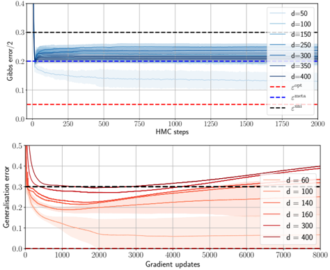
## [Chart/Diagram Type]: Dual-Panel Line Chart with Error Bands
### Overview
The image contains two vertically stacked line charts. The top chart plots "Gibbs error / 2" against "HMC steps" for various model dimensions (`d`). The bottom chart plots "Generalization error" against "Gradient updates" for a different set of model dimensions (`d`). Both charts include multiple data series with shaded error bands and reference dashed lines.
### Components/Axes
**Top Chart:**
* **Y-axis:** Label: `Gibbs error / 2`. Scale: 0.0 to 0.4, with major ticks at 0.1 intervals.
* **X-axis:** Label: `HMC steps`. Scale: 0 to 2000, with major ticks every 250 steps.
* **Legend (Top-Right):** Lists 7 data series by dimension `d` with corresponding line colors (shades of blue, from light to dark):
* `d=50` (lightest blue)
* `d=100`
* `d=150`
* `d=200`
* `d=300`
* `d=350`
* `d=400` (darkest blue)
* **Reference Lines (Dashed):**
* Red dashed line: Label `ε_opt` (positioned at y ≈ 0.05).
* Blue dashed line: Label `ε_infer` (positioned at y ≈ 0.20).
* Black dashed line: Label `ε_init` (positioned at y ≈ 0.30).
**Bottom Chart:**
* **Y-axis:** Label: `Generalization error`. Scale: 0.0 to 0.5, with major ticks at 0.1 intervals.
* **X-axis:** Label: `Gradient updates`. Scale: 0 to 8000, with major ticks every 1000 updates.
* **Legend (Bottom-Right):** Lists 6 data series by dimension `d` with corresponding line colors (shades of red/brown, from light to dark):
* `d=60` (lightest red)
* `d=100`
* `d=140`
* `d=160`
* `d=300`
* `d=400` (darkest red/brown)
* **Reference Lines (Dashed):**
* Red dashed line: Label `ε_opt` (positioned at y ≈ 0.0, near the x-axis).
* Black dashed line: Label `ε_init` (positioned at y ≈ 0.30).
### Detailed Analysis
**Top Chart (Gibbs Error vs. HMC Steps):**
* **Trend Verification:** All blue lines show a similar pattern: a very sharp initial drop from a high error within the first ~50 HMC steps, followed by a rapid stabilization to a near-constant value for the remainder of the 2000 steps. The final stabilized error value increases with dimension `d`.
* **Data Points (Approximate Final Values at 2000 steps):**
* `d=50`: Stabilizes at ~0.13.
* `d=100`: Stabilizes at ~0.18.
* `d=150`: Stabilizes at ~0.20 (aligns closely with the `ε_infer` line).
* `d=200`: Stabilizes at ~0.22.
* `d=300`: Stabilizes at ~0.25.
* `d=350`: Stabilizes at ~0.26.
* `d=400`: Stabilizes at ~0.27.
* **Error Bands:** Shaded regions around each line indicate variance or confidence intervals. The bands are narrowest for lower `d` and widen slightly for higher `d`.
**Bottom Chart (Generalization Error vs. Gradient Updates):**
* **Trend Verification:** All red/brown lines begin with a sharp decrease in error within the first ~500 gradient updates. After this initial drop, their trajectories diverge significantly based on dimension `d`.
* **Data Points & Diverging Trends:**
* **Low `d` (60, 100):** After the initial drop, the error continues to decrease slowly and steadily, remaining well below the `ε_init` line. `d=60` ends near ~0.05 at 8000 updates.
* **Medium `d` (140, 160):** After the initial drop, the error plateaus and then begins a gradual, steady increase. `d=160` ends near ~0.35, crossing above the `ε_init` line.
* **High `d` (300, 400):** After the initial drop, the error increases more sharply and consistently. `d=400` shows the most pronounced rise, ending near ~0.40 at 8000 updates, significantly above `ε_init`.
* **Error Bands:** The shaded variance bands are very wide for all series, especially for medium and high `d` after the initial drop, indicating high variability in the generalization error across different runs or measurements.
### Key Observations
1. **Dimension Dependence:** Both plots show a clear, monotonic relationship between model dimension `d` and the final error metric. Higher `d` leads to higher Gibbs error (top) and, after an initial improvement, higher generalization error (bottom).
2. **Phase Change in Generalization:** The bottom chart reveals a critical phenomenon: models with lower `d` continue to improve (generalization error decreases), while models with higher `d` begin to degrade (generalization error increases) after a certain number of gradient updates. This suggests a transition from learning to overfitting or instability as model capacity increases.
3. **Convergence Speed:** Gibbs error (top) converges extremely quickly (within ~100 steps) and remains stable. Generalization error (bottom) has a longer initial learning phase (~500 updates) before its long-term trend (improvement vs. degradation) becomes apparent.
4. **Reference Lines:** The `ε_init` line (black dashed) serves as a common starting point or baseline in both charts. The `ε_opt` (red dashed) represents a theoretical or optimal lower bound, which is approached only by the lowest-dimensional models in the bottom chart.
### Interpretation
This data visualizes the **double descent** or **capacity-controlled learning** phenomenon in machine learning models.
* **Top Chart (Gibbs Error):** This measures the model's fit to the training data (or a specific posterior). The quick convergence shows that Hamiltonian Monte Carlo (HMC) sampling efficiently finds a stable solution. The monotonic increase with `d` is expected: higher-capacity models can fit the training data more closely, resulting in lower *training* error (note: Gibbs error here is likely a training-related metric, hence it decreases with `d` if it's a loss, but here it increases, suggesting it might be a measure of complexity or a specific error term that grows with dimension).
* **Bottom Chart (Generalization Error):** This is the critical metric, measuring performance on unseen data. The initial drop for all `d` shows learning. The subsequent divergence is key:
* **Low `d` (Underfitting to Well-fit regime):** Models have sufficient but not excessive capacity. They continue to generalize better with more training.
* **High `d` (Overfitting/Interpolation regime):** Models have very high capacity. After memorizing the training data (initial drop), further training causes them to fit noise or specific quirks of the training set, harming generalization. The rising error and wide variance bands are hallmarks of this unstable, overfitting regime.
* **Relationship Between Plots:** The charts together suggest that while HMC can always find a stable *training* solution (top), the *generalization* properties of that solution (bottom) depend critically on model dimension and training duration. The optimal model size and stopping point are not where training error is minimized, but where generalization error is minimized, which for higher `d` occurs earlier in training. This underscores the importance of early stopping and careful model selection based on validation performance, not just training convergence.
DECODING INTELLIGENCE...