## Heatmap Comparison: Gaussian vs. Laplace Distribution Parameters
### Overview
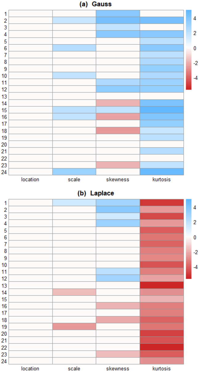
The image displays two vertically stacked heatmaps, labeled **(a) Gauss** and **(b) Laplace**. Each heatmap visualizes the values of four statistical parameters across 24 numbered samples or cases. The color intensity represents the numerical value of each parameter, according to a shared color scale.
### Components/Axes
* **Titles:** Centered above each heatmap: "(a) Gauss" and "(b) Laplace".
* **Row Labels:** A vertical column on the far left of each heatmap, numbering rows from **1** to **24**.
* **Column Labels:** Located at the bottom of each heatmap, identifying the four parameters: **location**, **scale**, **skewness**, **kurtosis**.
* **Color Scale/Legend:** Positioned to the right of each heatmap. It is a vertical bar showing a gradient from **dark red (-4)** through **white (0)** to **dark blue (+4)**. Numerical markers are placed at **-4, -2, 0, 2, 4**.
* **Data Grid:** The main body of each heatmap is a 24-row by 4-column grid of colored cells. Each cell's color corresponds to the value of a specific parameter for a specific sample.
### Detailed Analysis
**Color-to-Value Mapping:** The color bar indicates that blue shades represent positive values, red shades represent negative values, and white represents zero. The intensity of the color corresponds to the magnitude.
**Trend Verification & Data Point Extraction:**
**Heatmap (a) Gauss:**
* **location:** All 24 cells are white. **Trend:** Consistently zero across all samples.
* **scale:** Shows scattered light blue cells (value ~+2). Notable samples: 2, 6, 10, 15, 16, 24. Most other cells are white (0).
* **skewness:** Shows a mix. Samples 1, 2, 4, 11, 12 are light blue (~+2). Samples 14, 16, 18, 23 are light red (~-2). The rest are white (0).
* **kurtosis:** Predominantly blue. Samples 1, 3, 4, 5, 6, 7, 8, 9, 10, 11, 12, 15, 16, 17, 18, 19, 21, 23, 24 show various shades of blue, ranging from light (~+1) to medium (~+3). Samples 2, 13, 14, 20, 22 are white (0). No red cells are present.
**Heatmap (b) Laplace:**
* **location:** All 24 cells are white. **Trend:** Consistently zero across all samples.
* **scale:** Shows scattered light blue cells (~+2) in samples 1, 2, 3, 4, 11, 12. Shows light red cells (~-2) in samples 14, 19. Most others are white (0).
* **skewness:** Shows light blue cells (~+2) in samples 1, 2, 3, 4, 11, 12. Shows light red cells (~-2) in samples 16, 18, 23. The rest are white (0).
* **kurtosis:** This column is strikingly different from the Gauss heatmap. It is almost entirely filled with red shades. Samples 1-12 and 14-24 are various shades of red, ranging from light (~-1) to very dark (~-4). Sample 13 is a very dark red (~-4). There are no blue or white cells in this column.
### Key Observations
1. **Location Parameter:** Identical and zero for both distributions across all 24 samples.
2. **Scale & Skewness Parameters:** Show similar sparse patterns of positive (blue) and negative (red) deviations from zero in both distributions, though the specific samples affected differ slightly.
3. **Kurtosis Parameter - Major Divergence:** This is the most significant difference. The **Gauss** heatmap shows **positive kurtosis** (leptokurtic, blue) for the majority of samples. The **Laplace** heatmap shows **strongly negative kurtosis** (platykurtic, red) for nearly all samples.
4. **Laplace Kurtosis Intensity:** The negative kurtosis values for the Laplace distribution are not only consistent but also reach the extreme end of the scale (dark red, ~-4) in several samples (e.g., 13).
### Interpretation
This visualization compares the estimated higher-order statistical moments (scale, skewness, kurtosis) of data samples against the theoretical properties of Gaussian (normal) and Laplace distributions.
* **What the data suggests:** The heatmaps likely show the results of fitting or testing 24 different datasets. The consistent zero "location" suggests the data may be centered. The key finding is in the kurtosis column. The predominantly positive kurtosis in the Gauss plot indicates that when a Gaussian model is assumed or fitted, the data often exhibits heavier tails than a perfect normal distribution. Conversely, the uniformly negative kurtosis in the Laplace plot strongly indicates that the data, when compared to a Laplace distribution, consistently has lighter tails (is more peaked with fewer outliers) than the theoretical Laplace model predicts.
* **Relationship between elements:** The side-by-side comparison highlights how the same set of data samples relates differently to two distinct distributional assumptions. The color contrast in the kurtosis column provides an immediate visual summary of this relationship.
* **Notable anomaly/trend:** The most striking trend is the **systematic and strong negative kurtosis for the Laplace distribution**. This is not an outlier but a consistent pattern across nearly all samples, suggesting a fundamental mismatch between the tail behavior of the analyzed data and the Laplace distribution's characteristic heavy tails. The data appears to be "less extreme" than a Laplace distribution would imply.