\n
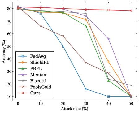
## Line Chart: Accuracy vs. Attack Ratio for Federated Learning Methods
### Overview
The image is a line chart comparing the performance of seven different federated learning methods under varying levels of adversarial attack. The chart plots model accuracy against the percentage of malicious participants (attack ratio) in the system. The primary trend shows that as the attack ratio increases, the accuracy of most methods degrades, but at significantly different rates.
### Components/Axes
* **Chart Type:** Multi-line chart.
* **X-Axis:** Labeled **"Attack ratio (%)"**. It has major tick marks at 0, 10, 20, 30, 40, and 50.
* **Y-Axis:** Labeled **"Accuracy (%)"**. It has major tick marks at 10, 20, 30, 40, 50, 60, 70, and 80.
* **Legend:** Located in the **top-left corner** of the plot area. It lists seven data series with corresponding line colors and marker styles:
1. **FedAvg** - Blue line with square markers.
2. **ShieldFL** - Orange line with diamond markers.
3. **PBFL** - Green line with upward-pointing triangle markers.
4. **Median** - Purple line with circle markers.
5. **Biscotti** - Gray line with star (asterisk) markers.
6. **FoolsGold** - Brown line with downward-pointing triangle markers.
7. **Ours** - Red line with circle markers.
### Detailed Analysis
The following table reconstructs the approximate data points for each method at the specified attack ratios. Values are estimated from the chart's grid lines, with an uncertainty of ±2%.
| Method (Color) | Attack Ratio: 0% | 10% | 20% | 30% | 40% | 50% |
| :--- | :--- | :--- | :--- | :--- | :--- | :--- |
| **FedAvg (Blue)** | ~80% | ~78% | ~50% | ~16% | ~10% | ~10% |
| **ShieldFL (Orange)** | ~80% | ~78% | ~76% | ~72% | ~38% | ~10% |
| **PBFL (Green)** | ~80% | ~78% | ~76% | ~66% | ~22% | ~10% |
| **Median (Purple)** | ~80% | ~80% | ~78% | ~76% | ~56% | ~10% |
| **Biscotti (Gray)** | ~80% | ~78% | ~76% | ~76% | ~30% | ~19% |
| **FoolsGold (Brown)** | ~80% | ~66% | ~58% | ~37% | ~28% | ~10% |
| **Ours (Red)** | ~80% | ~81% | ~80% | ~79% | ~79% | ~78% |
**Trend Verification per Series:**
* **FedAvg (Blue):** Slopes downward sharply after 10% attack ratio, reaching a low plateau at 40-50%.
* **ShieldFL (Orange):** Maintains high accuracy until 30%, then drops steeply.
* **PBFL (Green):** Follows a similar but slightly steeper decline than ShieldFL after 30%.
* **Median (Purple):** Shows the most resilience among baseline methods, with a gradual decline until 30% and a steeper drop afterward.
* **Biscotti (Gray):** Performs similarly to Median until 30%, then declines more sharply but ends higher than most at 50%.
* **FoolsGold (Brown):** Begins degrading immediately, showing the poorest early resilience.
* **Ours (Red):** Exhibits a nearly flat, horizontal trend, maintaining accuracy above 78% across the entire range.
### Key Observations
1. **Universal Starting Point:** All methods begin at approximately 80% accuracy with 0% attack ratio, establishing a common baseline.
2. **Critical Threshold:** For most methods (except "Ours"), a significant performance drop occurs between 30% and 40% attack ratio.
3. **Outlier Performance:** The method labeled **"Ours"** is a clear outlier, demonstrating exceptional robustness with negligible accuracy loss even at 50% attack ratio.
4. **Convergence at Failure:** At the maximum attack ratio of 50%, six of the seven methods converge to a very low accuracy range of 10-19%, indicating system failure. "Ours" and "Biscotti" are the only methods not at the absolute bottom.
5. **Early Degradation:** "FoolsGold" is the only method that shows substantial accuracy loss at a low (10%) attack ratio.
### Interpretation
This chart presents a comparative evaluation of Byzantine-robust or secure aggregation algorithms in federated learning. The data suggests that the proposed method ("Ours") significantly outperforms the other six baseline methods in maintaining model accuracy as the proportion of malicious clients increases.
The **"Attack ratio (%)"** represents the fraction of total participants sending poisoned or manipulated updates. The **"Accuracy (%)"** measures the global model's performance on a clean test dataset. The stark contrast between the flat red line ("Ours") and the declining trajectories of the others indicates that the underlying technique of "Ours" is highly effective at filtering out or neutralizing malicious contributions without harming the aggregation of legitimate updates.
The **Peircean investigative reading** reveals a narrative of resilience versus vulnerability. The chart doesn't just show numbers; it tells a story of system integrity under siege. The baselines represent established defenses that hold until a tipping point (around 30-40% attack ratio), after which they collapse. "Ours" represents a paradigm shift, maintaining integrity well beyond the failure point of its competitors. The anomaly of "Biscotti" performing slightly better than others at 50% but worse at 40% may indicate a different failure mode or a non-monotonic response to attack strength, warranting further investigation. The immediate decline of "FoolsGold" suggests its defense mechanism is either too sensitive or fundamentally misaligned with the attack model used in this evaluation.