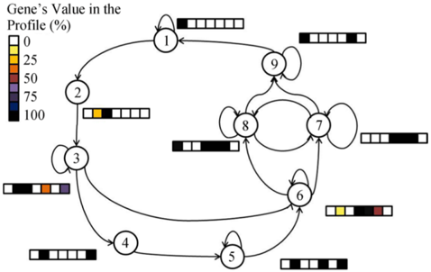
## Diagram: State Transition Network with Gene Expression Profiles
### Overview
The image displays a directed graph (state transition diagram) consisting of nine numbered nodes (1 through 9) connected by arrows indicating possible transitions. Each node is accompanied by a horizontal bar segmented into five cells, colored according to a legend that maps colors to percentage values titled "Gene's Value in the Profile (%)". The diagram appears to model a system where each node represents a state with an associated multi-gene expression profile, and arrows show the flow or transition paths between states.
### Components/Axes
* **Legend (Top-Left):** A key titled "Gene's Value in the Profile (%)" defines the color-to-percentage mapping:
* White: 0%
* Yellow: 25%
* Orange: 50%
* Red: 75%
* Purple: 75% *(Note: Both Red and Purple are labeled as 75% in the legend, which may indicate two different genes or a labeling error.)*
* Black: 100%
* **Nodes:** Nine circular nodes, each containing a number (1-9). Their approximate spatial layout is:
* Node 1: Top center.
* Node 2: Left, below Node 1.
* Node 3: Left, below Node 2.
* Node 4: Bottom left.
* Node 5: Bottom center.
* Node 6: Bottom right, above Node 5.
* Node 7: Right, above Node 6.
* Node 8: Center-right, between Nodes 6, 7, and 9.
* Node 9: Top right, above Node 8.
* **Transitions (Arrows):** Directed arrows connect nodes. Some nodes have self-looping arrows (pointing back to themselves). The primary flow appears to be a cycle (1→2→3→4→5→6→7→8→9→1) with additional cross-connections (e.g., 3→6, 6→8, 8→7, 7→9).
* **Gene Profile Bars:** Adjacent to each node is a horizontal bar divided into five contiguous cells. The color of each cell corresponds to the legend, representing the expression value of a gene (or genes) in that state's profile.
### Detailed Analysis
**Node-by-Node Gene Profile Bar Analysis (from left to right within each bar):**
* **Node 1:** Bar is entirely white. **Interpretation:** All five measured genes have a value of 0%.
* **Node 2:** Bar sequence: [Yellow, White, White, White, White]. **Interpretation:** First gene at 25%, others at 0%.
* **Node 3:** Bar sequence: [Black, White, Orange, Purple, White]. **Interpretation:** First gene at 100%, third at 50%, fourth at 75% (Purple), others at 0%. This node shows the most diverse profile.
* **Node 4:** Bar is entirely white. **Interpretation:** All genes at 0%.
* **Node 5:** Bar sequence: [White, White, White, White, Black]. **Interpretation:** Only the fifth gene is active at 100%.
* **Node 6:** Bar sequence: [White, Yellow, White, Black, Red]. **Interpretation:** Second gene at 25%, fourth at 100%, fifth at 75% (Red).
* **Node 7:** Bar sequence: [White, White, White, White, Black]. **Interpretation:** Identical to Node 5; only the fifth gene at 100%.
* **Node 8:** Bar sequence: [White, White, White, Black, White]. **Interpretation:** Only the fourth gene is active at 100%.
* **Node 9:** Bar sequence: [White, White, White, Black, White]. **Interpretation:** Identical to Node 8; only the fourth gene at 100%.
**Transition Flow:**
The core cycle is 1 → 2 → 3 → 4 → 5 → 6 → 7 → 8 → 9 → 1.
Additional transitions create shortcuts and loops:
* Node 3 has a direct transition to Node 6, bypassing 4 and 5.
* Node 6 transitions to Node 8.
* Node 8 transitions to Node 7.
* Node 7 transitions to Node 9.
* Nodes 1, 3, 5, 7, 8, and 9 have self-loop arrows, indicating the possibility of remaining in that state.
### Key Observations
1. **Profile Homogeneity vs. Heterogeneity:** Most nodes (1, 4, 5, 7, 8, 9) have simple profiles with only one or zero active genes. Node 3 is a significant outlier with three active genes at high levels (50%, 75%, 100%).
2. **Gene Activation Patterns:** The fifth gene (rightmost cell) is highly active (100%) in Nodes 5, 6, and 7. The fourth gene is highly active in Nodes 6, 8, and 9. This suggests these genes may be markers for specific states or phases in the process.
3. **State Similarity:** Nodes 5 and 7 have identical profiles. Nodes 8 and 9 have identical profiles. This implies functional equivalence or very similar biological states despite their different positions in the network.
4. **Central Hub:** Node 6 appears to be a hub, receiving inputs from the main cycle (from 5) and a shortcut (from 3), and sending outputs to Nodes 7 and 8.
### Interpretation
This diagram likely represents a **biological or computational state machine**, such as a gene regulatory network model or a cellular differentiation pathway. Each node is a discrete state characterized by the expression levels of five genes (the five cells in the bar). The transitions represent the permissible changes from one state to another.
* **Process Logic:** The system starts in a quiescent state (Node 1, all genes off). Activation begins with a single gene (Node 2), leading to a complex, high-activity state (Node 3). This is followed by a reset (Node 4, all off) and then a sequential activation of specific genes in different combinations (Nodes 5-9), eventually looping back to the start.
* **Functional Implications:** The complex state (Node 3) might represent a decision point or a progenitor state, given its multiple outgoing transitions. The identical profiles of Nodes 5/7 and 8/9 suggest that the network can reach the same functional state via different pathways, indicating robustness or convergence in the system's logic.
* **Ambiguity:** The legend listing both Red and Purple as 75% is a critical ambiguity. Without additional context, it's unclear if this represents two distinct genes with the same value or a diagrammatic error. This uncertainty affects the precise interpretation of profiles in Nodes 3 (contains Purple) and 6 (contains Red).
* **Overall Purpose:** The diagram maps the relationship between discrete system states and their underlying molecular (or computational) signatures, showing how the system progresses through a cycle of activation, complex interaction, and reset.