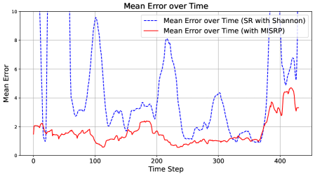
## Line Chart: Mean Error over Time
### Overview
The image displays a line chart comparing the mean error over time for two different methods or algorithms. The chart plots "Mean Error" on the vertical axis against "Time Step" on the horizontal axis. One method, represented by a blue dashed line, exhibits high volatility with large spikes, while the other, represented by a red solid line, shows a much lower and more stable error profile.
### Components/Axes
* **Chart Title:** "Mean Error over Time" (centered at the top).
* **Y-Axis:**
* **Label:** "Mean Error" (rotated vertically on the left side).
* **Scale:** Linear scale ranging from 0 to 10.
* **Major Tick Marks:** 0, 2, 4, 6, 8, 10.
* **X-Axis:**
* **Label:** "Time Step" (centered at the bottom).
* **Scale:** Linear scale ranging from 0 to approximately 450.
* **Major Tick Marks:** 0, 100, 200, 300, 400.
* **Legend:** Positioned in the top-right quadrant of the chart area.
* **Entry 1:** A blue dashed line icon followed by the text "Mean Error over Time (SR with Shannon)".
* **Entry 2:** A red solid line icon followed by the text "Mean Error over Time (with MISRP)".
* **Grid:** A light gray grid is present, aligned with the major tick marks on both axes.
### Detailed Analysis
**Data Series 1: SR with Shannon (Blue Dashed Line)**
* **Trend Verification:** This series is highly volatile, characterized by sharp, high-amplitude spikes and deep troughs. It does not follow a smooth trend but rather exhibits erratic, large-magnitude fluctuations throughout the observed period.
* **Key Data Points (Approximate):**
* Starts at a mean error of ~2 at Time Step 0.
* First major spike reaches ~9.8 near Time Step 20.
* Deep trough drops to ~1 near Time Step 30.
* Second major spike reaches ~9.5 near Time Step 100.
* Another significant spike reaches ~8.2 near Time Step 210.
* A later spike reaches ~7.8 near Time Step 400.
* The final visible point is at ~8.2 near Time Step 440.
* Troughs frequently drop to values between 1 and 3.
**Data Series 2: with MISRP (Red Solid Line)**
* **Trend Verification:** This series is significantly more stable and consistently lower than the blue series. It shows a gentle, low-amplitude oscillation with a slight overall downward trend until around Time Step 350, after which it begins a gradual increase.
* **Key Data Points (Approximate):**
* Starts at a mean error of ~2 at Time Step 0, similar to the blue line.
* Quickly settles into a range between ~1 and ~2.5.
* Reaches a local minimum of ~0.5 near Time Step 110.
* Maintains a value around ~1 from Time Step 200 to 350.
* Begins rising after Time Step 350, reaching a peak of ~4.5 near Time Step 420.
* Ends at approximately ~3.2 near Time Step 440.
### Key Observations
1. **Performance Disparity:** The "with MISRP" method (red line) demonstrates a substantially lower mean error for the vast majority of the time steps compared to the "SR with Shannon" method (blue line).
2. **Volatility Contrast:** The "SR with Shannon" method is extremely unstable, with error values swinging dramatically between ~1 and ~10. The "with MISRP" method is stable, with error values confined mostly between ~0.5 and ~4.5.
3. **Convergence at Start:** Both methods begin at approximately the same error value (~2) at Time Step 0.
4. **Late-Stage Behavior:** After Time Step 350, the error for the stable "MISRP" method begins to climb, while the volatile "SR with Shannon" method continues its pattern of sharp spikes.
### Interpretation
The chart provides strong visual evidence that the "MISRP" technique is superior to the "SR with Shannon" technique for the task being measured, in terms of both accuracy (lower mean error) and reliability (lower variance). The "SR with Shannon" method's performance is unpredictable and prone to catastrophic spikes in error, suggesting it may be sensitive to specific conditions or inputs within the time series. The "MISRP" method's smooth, low-error curve indicates robustness. The gradual increase in error for MISRP after Time Step 350 could indicate a slow degradation in performance, a change in the underlying data characteristics, or a limitation of the method over very long durations. The initial convergence suggests both methods may start from a similar baseline or initialization. This comparison would be critical for selecting an algorithm for a real-world application where consistent, low-error performance is required.