\n
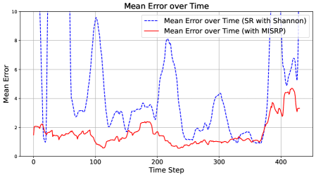
## Line Chart: Mean Error over Time
### Overview
The image presents a line chart illustrating the mean error over time for two different methods: one using Shannon entropy (SR with Shannon) and another using MISRP. The chart displays the error fluctuations across 450 time steps.
### Components/Axes
* **Title:** "Mean Error over Time" (centered at the top)
* **X-axis:** "Time Step" (ranging from approximately 0 to 450, with gridlines at intervals of 50)
* **Y-axis:** "Mean Error" (ranging from 0 to 10, with gridlines at intervals of 2)
* **Legend:** Located in the top-right corner.
* "Mean Error over Time (SR with Shannon)" - represented by a dashed blue line.
* "Mean Error over Time (with MISRP)" - represented by a solid red line.
### Detailed Analysis
**Mean Error over Time (SR with Shannon) - Dashed Blue Line:**
The blue line exhibits significant fluctuations throughout the time series. It generally oscillates between approximately 2 and 9.
* At Time Step 0: Approximately 2.2
* At Time Step 50: Peaks at approximately 9.5
* At Time Step 100: Peaks at approximately 9.8
* At Time Step 150: Drops to approximately 2.0
* At Time Step 200: Rises to approximately 3.0
* At Time Step 250: Drops to approximately 1.5
* At Time Step 300: Rises to approximately 4.5
* At Time Step 350: Drops to approximately 2.0
* At Time Step 400: Rises to approximately 6.5
* At Time Step 450: Approximately 4.0
**Mean Error over Time (with MISRP) - Solid Red Line:**
The red line shows a more stable trend with smaller fluctuations compared to the blue line. It generally oscillates between approximately 1.5 and 5.
* At Time Step 0: Approximately 2.0
* At Time Step 50: Approximately 1.8
* At Time Step 100: Approximately 2.5
* At Time Step 150: Drops to approximately 1.5
* At Time Step 200: Rises to approximately 2.5
* At Time Step 250: Approximately 1.8
* At Time Step 300: Approximately 2.0
* At Time Step 350: Rises to approximately 3.0
* At Time Step 400: Rises to approximately 4.5
* At Time Step 450: Approximately 5.0
### Key Observations
* The "SR with Shannon" method (blue line) exhibits much higher and more frequent error spikes than the "with MISRP" method (red line).
* The MISRP method maintains a relatively low and stable error rate throughout the observed time steps.
* The Shannon method shows a clear pattern of periodic spikes, suggesting potential instability or sensitivity to certain conditions at regular intervals.
* Both methods show an increasing trend in error towards the end of the time series (around Time Step 400-450), but the increase is far more pronounced for the Shannon method.
### Interpretation
The data suggests that the MISRP method is more robust and provides more consistent performance (lower and more stable error) compared to the SR with Shannon method. The Shannon method, while potentially offering benefits in certain scenarios, is prone to significant error spikes, indicating a higher degree of instability. The increasing error trend observed in both methods towards the end of the time series could indicate a degradation in performance over time, potentially due to factors like data drift or model limitations. The periodic spikes in the Shannon method suggest a cyclical pattern in its errors, which could be related to the characteristics of the input data or the algorithm's internal workings. Further investigation would be needed to determine the root cause of these spikes and to explore potential mitigation strategies. The chart demonstrates a clear trade-off between potential performance gains (if the Shannon method works well) and stability (which the MISRP method provides).