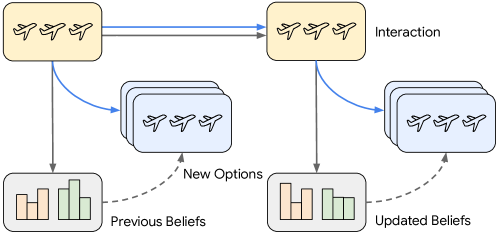
## Diagram: Belief Update Process via Interaction
### Overview
The diagram illustrates a two-stage belief update mechanism where interactions between entities (represented by airplane icons) influence shifts in preferences. It contrasts "Previous Beliefs" with "Updated Beliefs" through bar charts, showing how interactions generate "New Options" and modify existing beliefs.
### Components/Axes
- **Key Elements**:
- **Interaction Boxes**: Two orange rectangles labeled "Interaction" (left and right), each containing three airplane icons.
- **Belief Charts**:
- **Previous Beliefs**: Left-side bar chart with three categories (Option A, B, C) in orange and green.
- **Updated Beliefs**: Right-side bar chart with the same categories, showing altered heights.
- **Arrows**:
- Solid blue arrows connect "Interaction" boxes to "New Options" and "Updated Beliefs."
- Dashed gray arrows link "Previous Beliefs" to "New Options" and "Updated Beliefs."
- **Legend**: No explicit legend, but color coding is used:
- **Orange**: Represents "Previous Beliefs" (left chart).
- **Green**: Represents "Updated Beliefs" (right chart).
### Detailed Analysis
- **Previous Beliefs**:
- **Option A**: Tallest orange bar (~60% height).
- **Option B**: Medium orange bar (~40% height).
- **Option C**: Shortest orange bar (~20% height).
- **Updated Beliefs**:
- **Option A**: Reduced height (~30%).
- **Option B**: Slightly reduced (~35%).
- **Option C**: Increased height (~50%).
- **Flow**:
1. **Left Interaction** → "New Options" → "Previous Beliefs" (dashed gray arrow).
2. **Left Interaction** → "Updated Beliefs" (solid blue arrow).
3. **Right Interaction** → "New Options" → "Updated Beliefs" (solid blue arrow).
### Key Observations
- **Trend Verification**:
- **Option A/B**: Decline in preference post-interaction (orange to green bars).
- **Option C**: Significant increase in preference (green bar surpasses orange).
- **Spatial Grounding**:
- "Previous Beliefs" (left) and "Updated Beliefs" (right) are spatially separated, emphasizing temporal progression.
- Color consistency confirms orange = prior data, green = updated data.
### Interpretation
The diagram suggests that interactions between entities (airplanes) act as catalysts for belief revision. The shift from "Previous Beliefs" to "Updated Beliefs" indicates a preference for Option C after interaction, possibly due to new information or social influence. The use of bar charts quantifies belief strength, while the directional arrows imply a causal relationship between interaction and belief change. The absence of explicit numerical values introduces uncertainty, but the relative heights of bars strongly support the trend toward Option C dominance. This could model decision-making processes in systems like recommendation algorithms or social dynamics.