## Dual-Axis Line Chart: LLM Queries vs. Number of Protocols
### Overview
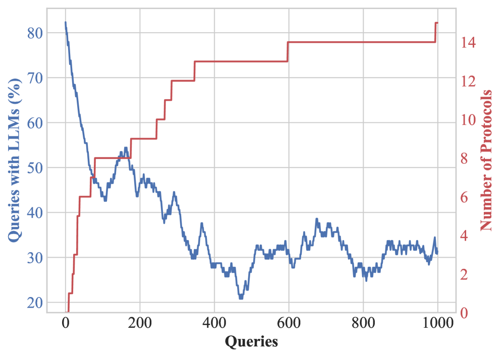
The image is a dual-axis line chart showing the relationship between the percentage of queries using Large Language Models (LLMs) and the number of protocols over a range of queries. The x-axis represents the number of queries, ranging from 0 to 1000. The left y-axis represents the percentage of queries with LLMs, ranging from 20% to 80%. The right y-axis represents the number of protocols, ranging from 0 to 14.
### Components/Axes
* **X-axis:** "Queries" - Ranges from 0 to 1000 in increments of 200.
* **Left Y-axis:** "Queries with LLMs (%)" - Ranges from 20 to 80 in increments of 10.
* **Right Y-axis:** "Number of Protocols" - Ranges from 0 to 14 in increments of 2.
* **Blue Line:** Represents "Queries with LLMs (%)".
* **Red Line:** Represents "Number of Protocols".
### Detailed Analysis
* **Queries with LLMs (%) (Blue Line):**
* **Trend:** The blue line shows a decreasing trend overall.
* **Data Points:**
* Starts at approximately 83% at 0 queries.
* Decreases sharply to approximately 50% around 100 queries.
* Fluctuates between 40% and 50% until around 300 queries.
* Continues to decrease, reaching a low of approximately 25% around 450 queries.
* Fluctuates between 25% and 35% for the remainder of the chart, ending at approximately 30% at 1000 queries.
* **Number of Protocols (Red Line):**
* **Trend:** The red line shows a stepwise increasing trend.
* **Data Points:**
* Starts at approximately 0 protocols at 0 queries.
* Increases to approximately 4 protocols around 50 queries.
* Increases to approximately 8 protocols around 150 queries.
* Increases to approximately 10 protocols around 250 queries.
* Increases to approximately 13 protocols around 350 queries.
* Increases to approximately 14 protocols around 550 queries.
* Remains constant at 14 protocols from approximately 550 queries to 1000 queries.
### Key Observations
* The percentage of queries with LLMs decreases significantly as the number of queries increases.
* The number of protocols increases in a stepwise manner as the number of queries increases, eventually plateauing.
* There appears to be an inverse relationship between the percentage of queries with LLMs and the number of protocols, especially in the initial phase.
### Interpretation
The chart suggests that as the number of queries increases, the reliance on LLMs for those queries decreases, while the number of protocols used increases and then plateaus. This could indicate that as more queries are processed, the system adapts and relies less on LLMs, possibly due to the development of more efficient or specialized protocols. The initial inverse relationship might suggest that LLMs are initially heavily used to handle new or unknown query types, but as the system learns, more specific protocols are developed, reducing the need for LLMs. The plateau in the number of protocols could indicate a saturation point where all necessary protocols have been developed.