## Line Graph: Queries with LLMs (%) vs. Number of Protocols
### Overview
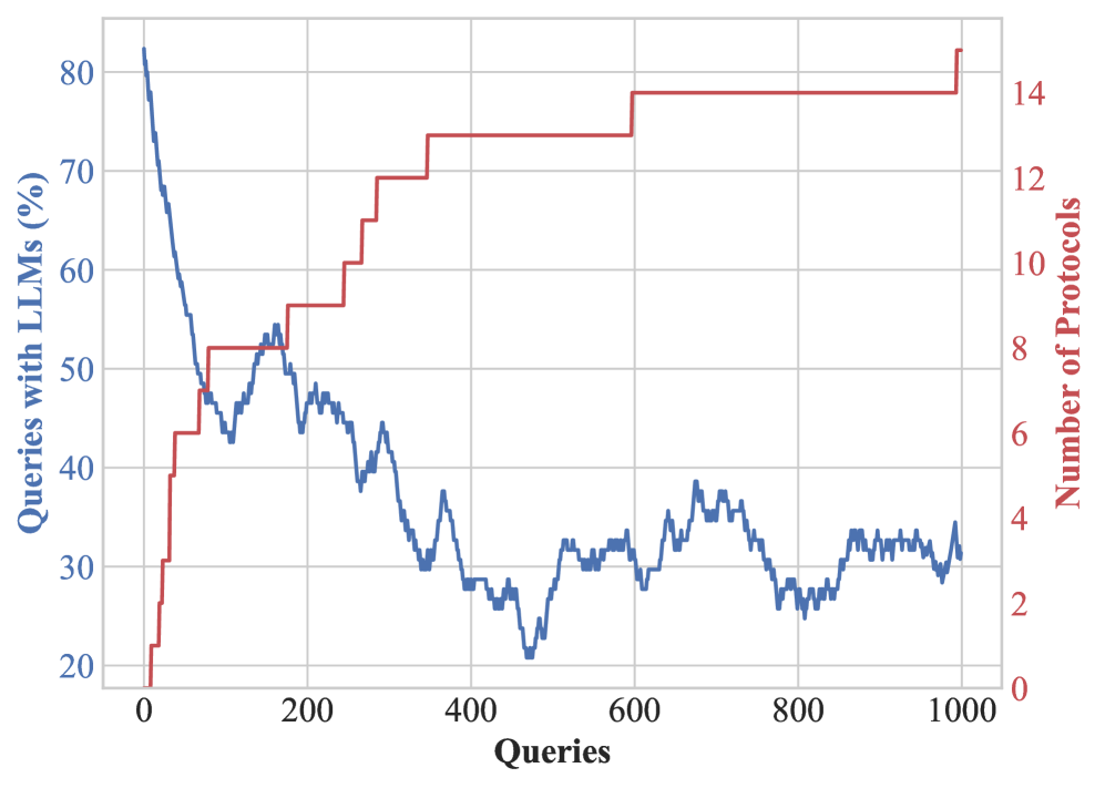
The image is a dual-axis line graph comparing two metrics across 1,000 queries. The left y-axis represents "Queries with LLMs (%)" (blue line), and the right y-axis represents "Number of Protocols" (red line). The x-axis spans 0 to 1,000 queries.
### Components/Axes
- **X-axis**: Labeled "Queries" with increments of 200 (0, 200, 400, 600, 800, 1000).
- **Left Y-axis**: Labeled "Queries with LLMs (%)" with increments of 10% (20%, 30%, ..., 80%).
- **Right Y-axis**: Labeled "Number of Protocols" with increments of 2 (0, 2, 4, ..., 14).
- **Legend**: Positioned on the right side of the graph. Blue corresponds to "Queries with LLMs (%)", and red corresponds to "Number of Protocols".
### Detailed Analysis
1. **Blue Line (Queries with LLMs %)**:
- Starts at **80%** at 0 queries.
- Declines sharply to **~50%** by 200 queries.
- Continues a gradual decline to **~30%** by 1,000 queries.
- Notable fluctuations (e.g., minor spikes around 250 and 450 queries).
2. **Red Line (Number of Protocols)**:
- Starts at **~2 protocols** at 0 queries.
- Increases sharply to **~14 protocols** by 600 queries.
- Remains flat at **~14 protocols** from 600 to 1,000 queries.
- Sharp rise between 200–600 queries, with a plateau afterward.
### Key Observations
- **Inverse Relationship**: As the percentage of queries using LLMs decreases, the number of protocols increases.
- **Stabilization**: The number of protocols plateaus after 600 queries, suggesting a saturation point.
- **Volatility**: The blue line shows minor fluctuations, while the red line exhibits a sharp, linear rise followed by stability.
### Interpretation
The data suggests a trade-off between the adoption of LLMs and the proliferation of protocols. As queries with LLMs decline (possibly due to efficiency gains or alternative solutions), the number of protocols increases, potentially indicating a need for standardization or interoperability frameworks. The plateau in protocols after 600 queries implies that once a critical threshold is reached, additional queries do not drive further protocol development.
**Note**: There is a potential inconsistency in the red line’s values. The right y-axis is labeled "Number of Protocols" (0–14), but the red line’s values are described as percentages (20%–80%). This may indicate a mislabeling in the original image or a misinterpretation of the data. If the red line represents protocols, its values should align with the 0–14 scale, not percentages. Further verification of the data source is recommended.