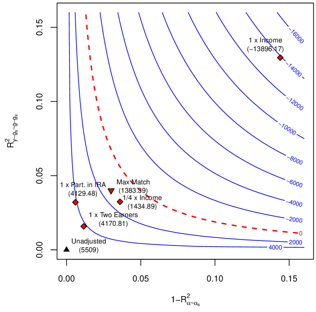
## Contour Plot: R-squared Tradeoffs
### Overview
The image is a contour plot illustrating the trade-off between two R-squared values: `R²y-gs~g-gs` on the y-axis and `1-R²α~αs` on the x-axis. The blue contour lines represent different levels of a third, unstated variable. Several data points, labeled with descriptions and numerical values, are plotted on the graph. A dashed red line highlights a specific region of interest.
### Components/Axes
* **X-axis:** `1-R²α~αs`. Scale ranges from 0.00 to 0.15 in increments of 0.05.
* **Y-axis:** `R²y-gs~g-gs`. Scale ranges from 0.00 to 0.15 in increments of 0.05.
* **Contour Lines:** Blue lines representing constant values. The values are labeled in blue text and range from -16000 to 4000.
* **Data Points:** Several data points are plotted, each labeled with a description and a numerical value in parentheses.
* **Red Dashed Line:** A curve separating different regions of the plot.
### Detailed Analysis
**Data Points:**
* **Unadjusted:** Located at approximately (0.00, 0.00), marked with a black triangle. Value: (5509)
* **1 x Part. in IRA:** Located at approximately (0.00, 0.04), marked with a red diamond. Value: (4129.48)
* **1 x Two Earners:** Located at approximately (0.02, 0.02), marked with a red diamond. Value: (4170.81)
* **1/4 x Income:** Located at approximately (0.04, 0.03), marked with a red diamond. Value: (1434.89)
* **Max Match:** Located at approximately (0.04, 0.05), marked with a red inverted triangle. Value: (1383.39)
* **1 x Income:** Located at approximately (0.15, 0.14), marked with a red diamond. Value: (-13896.17)
**Contour Lines:**
The blue contour lines are labeled with the following values:
* 4000
* 2000
* 0
* -2000
* -4000
* -6000
* -8000
* -10000
* -12000
* -14000
* -16000
The contour lines generally curve upwards and to the right.
**Red Dashed Line:**
The red dashed line starts near (0.00, 0.00) and curves upwards and to the right, passing between the "Max Match" and "1/4 x Income" data points.
### Key Observations
* The "Unadjusted" data point has the lowest values on both axes.
* The "1 x Income" data point has the highest values on both axes, and a significantly negative contour value.
* The contour lines indicate a trade-off between the two R-squared values. Increasing one generally requires decreasing the other to stay on the same contour line.
* The red dashed line separates the data points into two groups.
### Interpretation
The plot visualizes the relationship between two R-squared metrics, likely representing the explanatory power of different models or scenarios. The contour lines represent a third, unstated variable, which could be a cost function or a utility measure. The data points represent specific scenarios or models, with their positions indicating their performance in terms of the two R-squared metrics.
The red dashed line likely represents a constraint or a threshold. Data points above and to the left of the line might be considered more desirable, depending on the context. The "1 x Income" scenario appears to be an outlier, with a very high value on the x-axis and a very low (negative) contour value. This suggests that while it might explain a lot of the variance in one variable (represented by the x-axis), it performs poorly in terms of the unstated variable represented by the contour lines.