\n
## Chart: R² vs. 1-R² with Income Contours
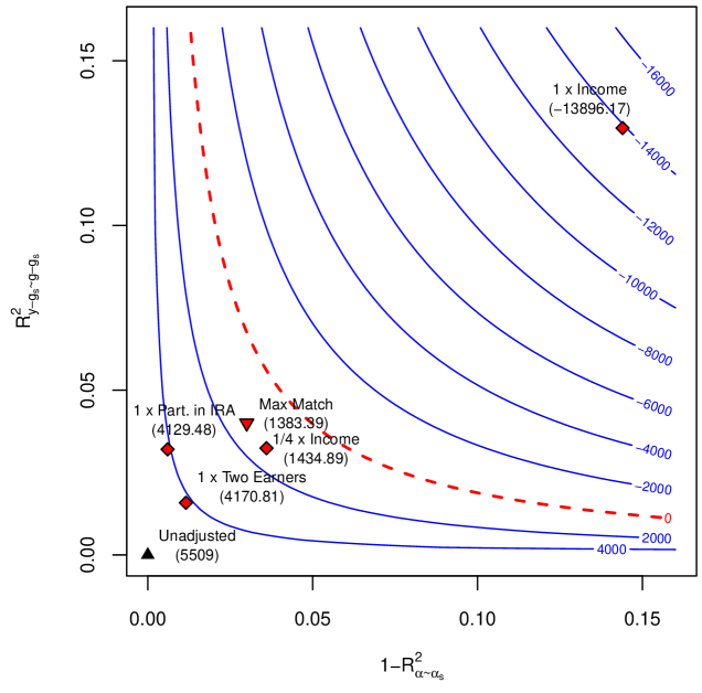
### Overview
The image presents a contour plot illustrating the relationship between R²<sub>y-gs-gss</sub> (y-squared) and 1-R²<sub>α-αs</sub> (one minus alpha-squared), with contours representing different income levels. Several data points are overlaid on the plot, representing different adjustment scenarios.
### Components/Axes
* **X-axis:** 1-R²<sub>α-αs</sub>, ranging from approximately 0.00 to 0.15.
* **Y-axis:** R²<sub>y-gs-gss</sub>, ranging from approximately 0.00 to 0.15.
* **Contours:** Represent income levels, ranging from -16000 to 0 to 16000, increasing from bottom to top and right. The contour lines are blue and closely spaced.
* **Data Points:**
* Unadjusted: Black triangle.
* 1 x Part. in IRA: Blue circle.
* 1 x Two Earners: Green diamond.
* 1/4 x Income: Red diamond.
* Max Match: Red triangle.
* 1 x Income: Red square.
* **Legend:** Implicitly defined by the shape and color of the data points.
### Detailed Analysis
The chart displays several curves representing income contours. The contours are generally curved, indicating a non-linear relationship between R²<sub>y-gs-gss</sub> and 1-R²<sub>α-αs</sub> at a given income level.
* **Unadjusted (Black Triangle):** Located near the origin (approximately 0.00, 0.00), with a value of 5509.
* **1 x Part. in IRA (Blue Circle):** Positioned at approximately (0.02, 0.04), with a value of 4129.48.
* **1 x Two Earners (Green Diamond):** Located at approximately (0.04, 0.06), with a value of 4170.81.
* **1/4 x Income (Red Diamond):** Positioned at approximately (0.03, 0.03), with a value of 1434.89.
* **Max Match (Red Triangle):** Located at approximately (0.04, 0.05), with a value of 1383.39.
* **1 x Income (Red Square):** Positioned at approximately (0.13, 0.13), with a value of -13896.17.
The income contours increase in value as you move towards the top-right of the chart. The contour lines are closely spaced, indicating a steep gradient in income change.
### Key Observations
* The "1 x Income" data point is significantly negative, falling well below the 0 income contour.
* The data points representing adjustments (Part. in IRA, Two Earners, 1/4 x Income, Max Match) all have positive income values.
* The Unadjusted data point has the highest income value among the plotted points.
* The contour lines are relatively smooth, suggesting a continuous relationship between the variables.
### Interpretation
This chart likely represents a model evaluating the impact of different retirement savings adjustments on income. The x and y axes represent measures of variance or explained variation in some underlying model. The contours represent the resulting income level.
The negative income associated with "1 x Income" suggests that, under the modeled conditions, fully utilizing a particular income-based adjustment leads to a net loss. The other adjustments appear to increase income relative to the unadjusted scenario. The Unadjusted point having the highest income suggests that, in this model, no adjustment is optimal.
The chart demonstrates a trade-off between R²<sub>y-gs-gss</sub> and 1-R²<sub>α-αs</sub> for a given income level. The shape of the contours suggests that increasing R²<sub>y-gs-gss</sub> while decreasing 1-R²<sub>α-αs</sub> generally leads to higher income, but the relationship is not linear. The positioning of the data points relative to the contours allows for a visual assessment of the income impact of each adjustment scenario. The model appears to be sensitive to the level of income-based adjustment, as evidenced by the large negative value for "1 x Income".