## Contour Plot: Financial Optimization Landscape
### Overview
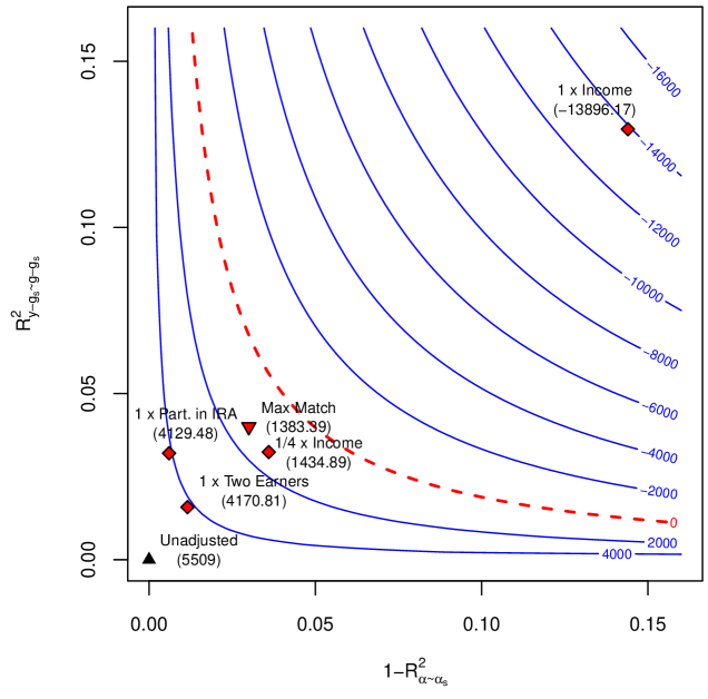
This image is a contour plot visualizing a two-dimensional optimization landscape, likely related to financial or economic modeling. The plot shows how a dependent variable (represented by contour lines) changes in response to two independent variables plotted on the X and Y axes. Several specific policy or scenario points are marked and labeled on the plot.
### Components/Axes
* **X-Axis:** Labeled `1 - R²_{α~α_s}`. The scale runs from 0.00 to 0.15, with major tick marks at 0.00, 0.05, 0.10, and 0.15. This likely represents a measure of model fit or variance explained for a variable `α`.
* **Y-Axis:** Labeled `R²_{y~β_s, φ~β_s}`. The scale runs from 0.00 to 0.15, with major tick marks at 0.00, 0.05, 0.10, and 0.15. This likely represents a measure of model fit or variance explained for variables `y` and `φ`.
* **Contour Lines:** A series of solid blue lines representing constant values of the dependent variable. The contour values are labeled directly on the lines in the right portion of the plot. From bottom-right moving towards the top-left, the visible labeled contours are: `4000`, `2000`, `0`, `-2000`, `-4000`, `-6000`, `-8000`, `-10000`, `-12000`, `-14000`, `-16000`.
* **Red Dashed Line:** A prominent, curved red dashed line that appears to be a specific contour or boundary, separating regions of the plot. It passes near the `0` contour line.
* **Data Points:** Six distinct points are plotted, each with a unique symbol, label, and a numerical value in parentheses. Their positions are as follows:
1. **Black Triangle (▲):** Located at the origin (0.00, 0.00). Label: `Unadjusted (5509)`.
2. **Black Diamond (◆):** Located at approximately (0.01, 0.03). Label: `1 x Part. in IRA (4129.48)`.
3. **Black Diamond (◆):** Located at approximately (0.02, 0.015). Label: `1 x Two Earners (4170.81)`.
4. **Red Inverted Triangle (▼):** Located at approximately (0.04, 0.04). Label: `Max Match (1383.39)`.
5. **Red Diamond (◆):** Located at approximately (0.05, 0.03). Label: `1/4 x Income (1434.89)`.
6. **Red Diamond (◆):** Located at approximately (0.14, 0.13). Label: `1 x Income (-13896.17)`.
### Detailed Analysis
* **Contour Trend:** The blue contour lines form a series of curves that are concave towards the top-right corner. The values decrease (become more negative) as one moves from the bottom-left (e.g., `4000`) towards the top-right (e.g., `-16000`). This indicates that the dependent variable generally decreases as both `1 - R²_{α~α_s}` and `R²_{y~β_s, φ~β_s}` increase.
* **Data Point Analysis:**
* The `Unadjusted` point (5509) sits at the origin, representing the baseline scenario with zero values for both axis metrics. It lies between the `4000` and `2000` contours.
* The points `1 x Part. in IRA` (4129.48) and `1 x Two Earners` (4170.81) are clustered in the lower-left quadrant, near the `4000` contour line. Their values are similar and lower than the unadjusted baseline.
* The points `Max Match` (1383.39) and `1/4 x Income` (1434.89) are located near the center of the plot, close to the red dashed line and between the `2000` and `0` contours. Their values are significantly lower than the previous group.
* The point `1 x Income` (-13896.17) is an extreme outlier, located in the far top-right corner. Its value is deeply negative, aligning with the `-14000` contour line. This represents a drastic reduction compared to all other scenarios.
* **Red Dashed Line:** This line appears to be a critical boundary. Points to its left and below it have positive values (e.g., 5509, 4129.48). Points near it have small positive values (e.g., 1383.39). The point far to its right has a large negative value.
### Key Observations
1. **Strong Negative Correlation:** There is a clear visual trend where moving towards the top-right of the plot (increasing both axis variables) corresponds to a sharp decline in the dependent variable's value.
2. **Clustering of Moderate Scenarios:** Four of the six points (`Unadjusted`, `Part. in IRA`, `Two Earners`, `Max Match`, `1/4 x Income`) are clustered in the lower-left to central region, with values ranging from ~1383 to 5509.
3. **Extreme Outlier:** The `1 x Income` scenario is a dramatic outlier, both in its spatial position (far top-right) and its value (-13896.17), which is an order of magnitude different and negative.
4. **Boundary Significance:** The red dashed line seems to demarcate a transition zone. Scenarios on or near this line have values around 1400, while crossing far beyond it leads to severe negative outcomes.
### Interpretation
This plot likely visualizes the results of a policy simulation or economic model, where the dependent variable (contour values) could represent a net benefit, cost, or welfare metric. The axes `1 - R²_{α~α_s}` and `R²_{y~β_s, φ~β_s}` probably measure the explanatory power or fit of different components of the model (e.g., for individual characteristics `α`, and for outcomes `y` and another factor `φ`).
The data suggests that scenarios requiring a high degree of model fit on both dimensions (top-right) are associated with strongly negative outcomes. The `1 x Income` scenario, which likely involves a large income-related adjustment or shock, is particularly detrimental. In contrast, simpler adjustments (`Part. in IRA`, `Two Earners`) or the baseline (`Unadjusted`) result in positive outcomes. The `Max Match` and `1/4 x Income` scenarios represent a middle ground, yielding modest positive results near the critical boundary (red dashed line). The plot effectively argues that more complex or intensive interventions (moving top-right) may lead to worse results than simpler ones or the status quo, with a severe penalty for the largest income-based adjustment.