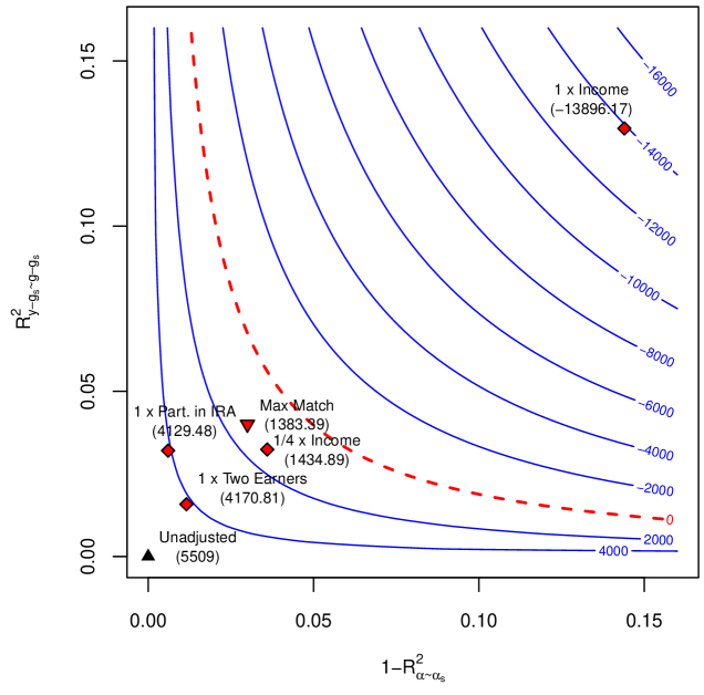
## Scatter Plot: R² vs 1-R² with Contour Lines and Data Points
### Overview
The image is a scatter plot with two axes: **R²** (y-axis) and **1-R²** (x-axis). It includes blue contour lines labeled with negative numerical values (e.g., -16000, -14000, etc.), a red dashed line labeled "Max Match," and multiple data points with annotations. The plot appears to visualize relationships between model performance metrics (R²) and their inverse (1-R²), with contour lines likely representing a function or error metric.
---
### Components/Axes
- **X-axis**: Labeled **1-R²** (ranging from 0.0 to 0.15).
- **Y-axis**: Labeled **R²** (ranging from 0.0 to 0.15).
- **Legend**: Located on the right side of the plot (content not explicitly described in the image).
- **Contour Lines**: Blue lines with labels such as **-16000**, **-14000**, **-12000**, etc., indicating decreasing values as they move outward.
- **Red Dashed Line**: Labeled **"Max Match"**, with a data point at **(-13996.17)**.
- **Data Points**: Labeled with specific model configurations and coordinates (e.g., "1 x Part in RA," "1/4 x Income," "Unadjusted").
---
### Detailed Analysis
#### Contour Lines
- The blue contour lines are labeled with negative values (e.g., -16000, -14000, -12000, etc.), suggesting they represent a metric (e.g., loss, error) that decreases as the lines move outward.
- The **Max Match** point (-13996.17) lies on the red dashed line, which may indicate an optimal or threshold value for the metric.
#### Data Points
1. **1 x Part in RA**: (0.05, 0.05)
2. **1/4 x Income**: (0.1, 0.1)
3. **1/4 x Income**: (0.1, 0.1) (duplicate label, possibly a typo)
4. **1 x Two Excers**: (0.05, 0.05) (duplicate label, possibly a typo)
5. **Unadjusted**: (0.0, 0.0)
#### Red Dashed Line ("Max Match")
- The red dashed line is labeled **"Max Match"** and includes a data point at **(-13996.17)**. This suggests it represents a critical threshold or optimal value for the metric being visualized.
---
### Key Observations
1. **Contour Line Trends**:
- The blue contour lines slope downward from the top-left to the bottom-right, indicating that the metric (e.g., error) decreases as R² increases and 1-R² decreases.
- The **Max Match** point (-13996.17) lies near the center of the plot, suggesting it is a local maximum or optimal value.
2. **Data Point Distribution**:
- Most data points cluster near the origin (0.0, 0.0), except for **1 x Part in RA** and **1/4 x Income**, which are further out.
- The **Unadjusted** point (0.0, 0.0) is at the origin, possibly representing a baseline or reference model.
3. **Red Dashed Line**:
- The **Max Match** line is a straight, diagonal line from the top-left to the bottom-right, intersecting the **Max Match** data point. This may indicate a linear relationship between R² and 1-R² for this metric.
---
### Interpretation
- **Model Performance**: The plot likely compares different model configurations (e.g., "1 x Part in RA," "1/4 x Income") based on their R² values and their inverse (1-R²). Higher R² values (closer to 1) suggest better model performance.
- **Optimal Value**: The **Max Match** point (-13996.17) on the red dashed line may represent the optimal configuration for the metric being visualized (e.g., maximum match rate or minimum error).
- **Contour Lines**: The blue contour lines likely represent levels of a function (e.g., loss, error) that decreases as R² increases. The **Max Match** point lies near the center of these contours, indicating it is a critical point for optimization.
- **Unadjusted Baseline**: The **Unadjusted** point (0.0, 0.0) serves as a reference, showing the performance of a model without adjustments.
---
### Notable Anomalies
- **Duplicate Labels**: The labels "1/4 x Income" and "1 x Two Excers" appear twice with identical coordinates, which may indicate a data entry error or intentional redundancy.
- **Negative Contour Values**: The contour lines are labeled with negative values, which is unusual for R² (typically between 0 and 1). This suggests the metric being visualized is not R² itself but a derived quantity (e.g., negative log-likelihood, error).
---
### Conclusion
The plot visualizes the relationship between R² and 1-R² for different model configurations, with contour lines indicating a metric (e.g., error) that decreases as R² increases. The **Max Match** point (-13996.17) on the red dashed line highlights an optimal or threshold value, while the **Unadjusted** point (0.0, 0.0) serves as a baseline. The data suggests that model performance improves with higher R² values, and the **Max Match** configuration is critical for optimization.