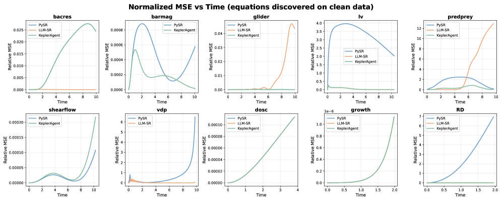
## Chart Type: Multiple Line Charts
### Overview
The image contains a series of line charts comparing the performance of three different methods (PySR, LLM-SR, and KeplerAgent) in discovering equations on clean data. The charts display the Normalized Mean Squared Error (MSE) over time for various systems or models, including 'bacres', 'barmag', 'glider', 'lv', 'predprey', 'shearflow', 'vdp', 'dosc', 'growth', and 'RD'.
### Components/Axes
* **Title:** Normalized MSE vs Time (equations discovered on clean data)
* **X-axis:** Time (with varying scales depending on the chart, ranging from 0 to 10 in most cases, but 0 to 2 for 'growth' and 'RD', and 0 to 4 for 'dosc')
* **Y-axis:** Relative MSE (with varying scales depending on the chart)
* **Legend:** Located in the top-left corner of each subplot.
* PySR (Blue line)
* LLM-SR (Orange line)
* KeplerAgent (Green line)
### Detailed Analysis
**1. bacres**
* X-axis: Time (0 to 10)
* Y-axis: Relative MSE (0 to 0.025)
* PySR: Flat line at approximately 0.
* LLM-SR: Flat line at approximately 0.
* KeplerAgent: Starts at 0, increases sharply to a peak around Time = 8 (Relative MSE ~ 0.026), then decreases slightly.
**2. barmag**
* X-axis: Time (0 to 10)
* Y-axis: Relative MSE (0 to 0.0008)
* PySR: Starts high (Relative MSE ~ 0.0008), decreases to a minimum around Time = 2, then increases again.
* KeplerAgent: Starts low, increases to a peak around Time = 5, then decreases.
**3. glider**
* X-axis: Time (0 to 10)
* Y-axis: Relative MSE (0 to 0.04)
* PySR: Flat line at approximately 0.
* LLM-SR: Starts at 0, remains low until Time = 7, then increases sharply to a peak around Time = 9 (Relative MSE ~ 0.04).
* KeplerAgent: Flat line at approximately 0.
**4. lv**
* X-axis: Time (0 to 10)
* Y-axis: Relative MSE (0 to 4.0)
* PySR: Starts high (Relative MSE ~ 4.0), decreases sharply to a minimum around Time = 2, then increases slightly.
* LLM-SR: Not present in the legend, but there is an orange line.
* KeplerAgent: Flat line at approximately 0.
**5. predprey**
* X-axis: Time (0 to 10)
* Y-axis: Relative MSE (0 to 12)
* PySR: Starts high (Relative MSE ~ 4.0), decreases to a minimum around Time = 7, then increases slightly.
* LLM-SR: Starts at 0, increases sharply after Time = 6 to a peak around Time = 10 (Relative MSE ~ 12).
* KeplerAgent: Flat line at approximately 0.
**6. shearflow**
* X-axis: Time (0 to 10)
* Y-axis: Relative MSE (0 to 0.00020)
* PySR: Starts low, increases to a peak around Time = 2, decreases to a minimum around Time = 6, then increases sharply.
* KeplerAgent: Starts low, increases to a peak around Time = 2, decreases to a minimum around Time = 6, then increases sharply.
* LLM-SR: Not present in the legend, but there is an orange line.
**7. vdp**
* X-axis: Time (0 to 10)
* Y-axis: Relative MSE (0 to 6)
* PySR: Starts low, increases sharply.
* LLM-SR: Starts high, decreases sharply, then remains relatively constant.
**8. dosc**
* X-axis: Time (0 to 4)
* Y-axis: Relative MSE (0 to 0.00010)
* PySR: Starts low, increases linearly.
* LLM-SR: Starts low, increases linearly.
* KeplerAgent: Starts low, increases linearly.
**9. growth**
* X-axis: Time (0 to 2)
* Y-axis: Relative MSE (1e-6 to 1.0e-6)
* PySR: Starts low, increases exponentially.
* LLM-SR: Starts low, increases exponentially.
* KeplerAgent: Starts low, increases exponentially.
**10. RD**
* X-axis: Time (0 to 2)
* Y-axis: Relative MSE (0 to 7)
* PySR: Starts low, increases exponentially.
* LLM-SR: Flat line at approximately 0.
* KeplerAgent: Flat line at approximately 0.
### Key Observations
* PySR and KeplerAgent often show contrasting performance, with one having a high initial MSE that decreases over time while the other remains consistently low.
* LLM-SR tends to have a delayed increase in MSE for some systems, suggesting a period of stability before diverging.
* For some systems (e.g., 'growth'), all three methods exhibit similar exponential increases in MSE.
* The scales of the Y-axes vary significantly across the charts, indicating different levels of difficulty in discovering equations for each system.
### Interpretation
The charts provide a comparative analysis of three different methods for equation discovery on clean data. The Normalized MSE vs. Time plots illustrate how the accuracy of each method changes over time for various systems. The data suggests that the performance of each method is highly dependent on the specific system being modeled. In some cases, one method consistently outperforms the others (e.g., KeplerAgent for 'bacres'), while in other cases, the methods exhibit more complex and time-dependent behavior. The varying scales of the Y-axes highlight the different levels of difficulty associated with each system, suggesting that some systems are inherently more challenging to model accurately. The trends observed in these charts can inform the selection of appropriate equation discovery methods for different types of systems and provide insights into the strengths and weaknesses of each approach.