## Scatter Plot: Neural Score vs Embedding Similarity
### Overview
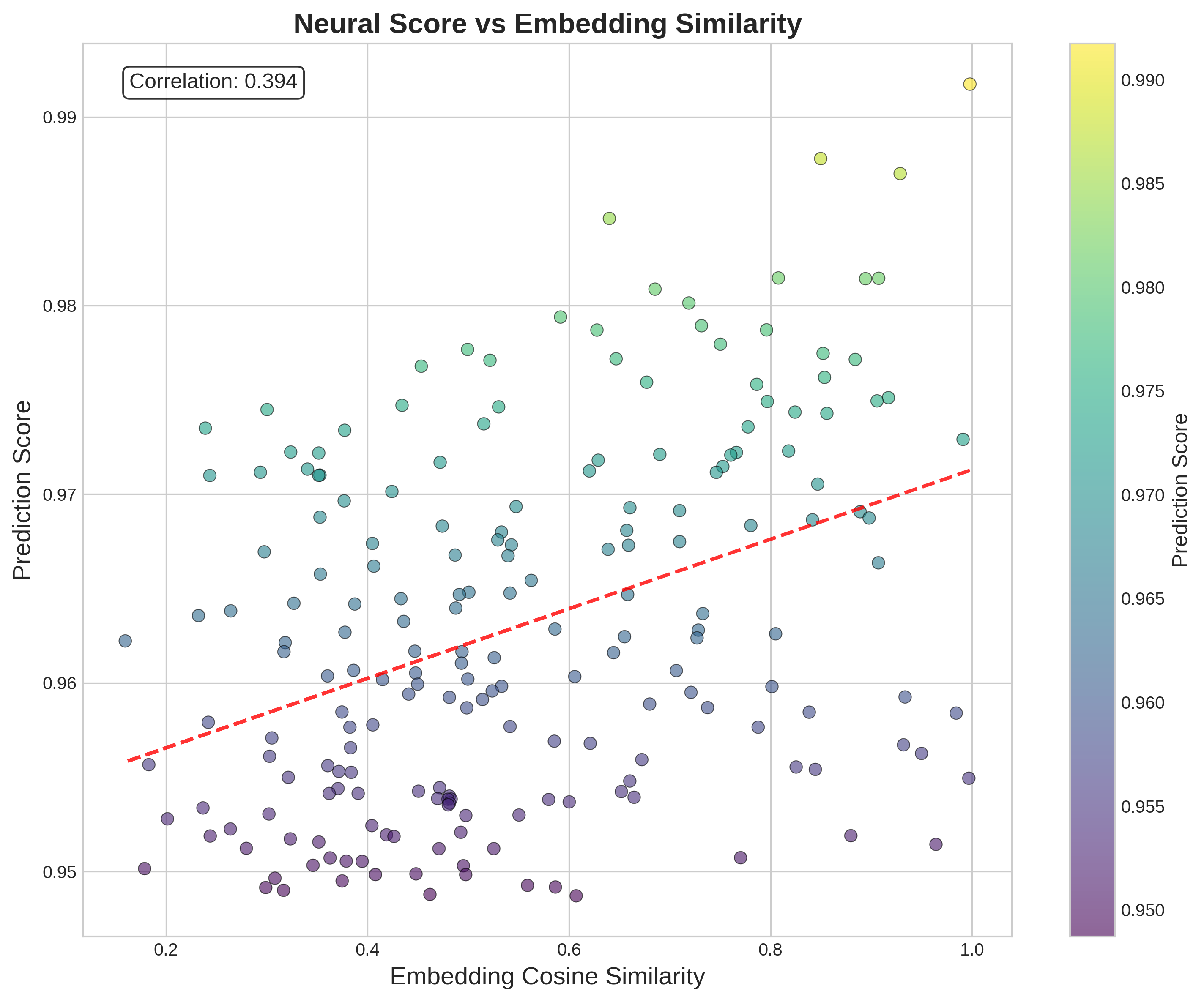
The image is a scatter plot showing the relationship between "Embedding Cosine Similarity" on the x-axis and "Prediction Score" on the y-axis. The data points are colored according to their "Prediction Score," as indicated by a color bar legend on the right. A red dashed line represents a linear trend line through the data. The plot also displays the correlation coefficient between the two variables.
### Components/Axes
* **Title:** Neural Score vs Embedding Similarity
* **X-axis:** Embedding Cosine Similarity
* Scale: 0.2 to 1.0, with gridlines at intervals of 0.2.
* **Y-axis:** Prediction Score
* Scale: 0.95 to 0.99, with gridlines at intervals of 0.01.
* **Color Bar (Legend):** Prediction Score
* Scale: 0.950 (purple) to 0.990 (yellow), with intermediate values at 0.955, 0.960, 0.965, 0.970, 0.975, 0.980, 0.985.
* **Correlation:** A text box in the top-left corner indicates "Correlation: 0.394".
* **Trend Line:** A red dashed line shows a positive linear trend.
### Detailed Analysis
* **Data Points:** The scatter plot contains numerous data points, each represented by a circle. The color of each circle corresponds to its Prediction Score, ranging from purple (low) to yellow (high).
* **Trend Line:** The red dashed line indicates a positive correlation between Embedding Cosine Similarity and Prediction Score.
* The line starts at approximately (0.2, 0.955) and ends at approximately (1.0, 0.972).
* **Data Distribution:**
* For Embedding Cosine Similarity values between 0.2 and 0.4, the Prediction Scores are mostly between 0.95 and 0.96.
* For Embedding Cosine Similarity values between 0.6 and 0.8, the Prediction Scores are mostly between 0.97 and 0.98.
* For Embedding Cosine Similarity values near 1.0, the Prediction Scores are close to 0.99.
* **Color Mapping:**
* Data points with Prediction Score around 0.95 are purple.
* Data points with Prediction Score around 0.96 are blue/purple.
* Data points with Prediction Score around 0.97 are teal/green.
* Data points with Prediction Score around 0.98 are light green.
* Data points with Prediction Score around 0.99 are yellow.
### Key Observations
* There is a positive correlation between Embedding Cosine Similarity and Prediction Score.
* The correlation coefficient is 0.394, indicating a moderate positive correlation.
* The data points are more densely clustered in the lower-left region of the plot (low Embedding Cosine Similarity and low Prediction Score).
* There is a wider spread of Prediction Scores for lower Embedding Cosine Similarity values.
### Interpretation
The scatter plot suggests that as the Embedding Cosine Similarity increases, the Prediction Score tends to increase as well. However, the moderate correlation coefficient (0.394) indicates that the relationship is not very strong, and there are other factors influencing the Prediction Score. The color gradient provides an additional layer of information, showing how the Prediction Score varies across different Embedding Cosine Similarity values. The trend line visually confirms the positive correlation, but the scatter of the data points around the line suggests that the relationship is not perfectly linear. The clustering of points in the lower-left region indicates that low Embedding Cosine Similarity values are more frequently associated with low Prediction Scores.