\n
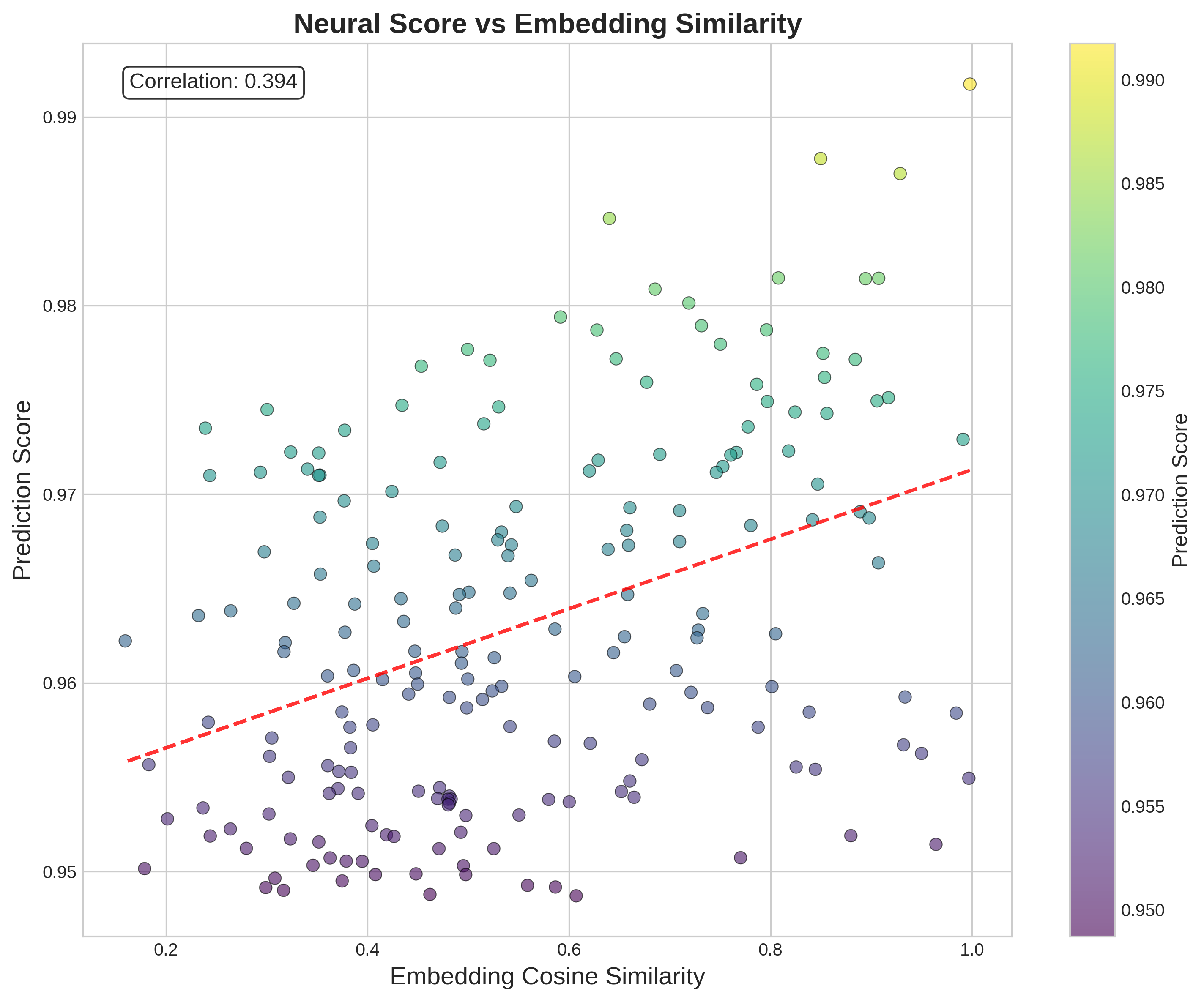
## Scatter Plot: Neural Score vs Embedding Similarity
### Overview
This image presents a scatter plot visualizing the relationship between "Embedding Cosine Similarity" and "Prediction Score". A trendline is overlaid on the data points, and the plot includes a colorbar representing "Prediction Score". The correlation coefficient between the two variables is displayed in the top-left corner.
### Components/Axes
* **Title:** Neural Score vs Embedding Similarity
* **X-axis:** Embedding Cosine Similarity (ranging approximately from 0.15 to 1.0)
* **Y-axis:** Prediction Score (ranging approximately from 0.95 to 0.99)
* **Correlation:** 0.394 (displayed in a box in the top-left corner)
* **Colorbar:** Represents Prediction Score, ranging from approximately 0.950 (purple) to 0.990 (yellow). The colorbar is positioned on the right side of the plot.
* **Trendline:** A dashed red line representing the general trend of the data.
### Detailed Analysis
The scatter plot contains approximately 150 data points. The points are colored based on their Prediction Score, as indicated by the colorbar.
* **Trendline Analysis:** The trendline slopes upward, indicating a positive correlation between Embedding Cosine Similarity and Prediction Score. However, the correlation coefficient of 0.394 suggests a weak positive correlation.
* **Data Point Distribution:**
* Points with low Embedding Cosine Similarity (around 0.2) generally have lower Prediction Scores (around 0.95 - 0.96). These are colored in shades of purple.
* Points with high Embedding Cosine Similarity (around 0.9 - 1.0) generally have higher Prediction Scores (around 0.97 - 0.99). These are colored in shades of yellow and light green.
* There is significant scatter around the trendline, indicating that Embedding Cosine Similarity is not a strong predictor of Prediction Score.
* **Specific Data Points (approximate values):**
* (0.2, 0.955) - Purple
* (0.4, 0.965) - Blue/Purple
* (0.6, 0.97) - Green
* (0.8, 0.975) - Yellow/Green
* (1.0, 0.985) - Yellow
### Key Observations
* The correlation between Embedding Cosine Similarity and Prediction Score is weak (0.394).
* There is a general trend of increasing Prediction Score with increasing Embedding Cosine Similarity, but the relationship is not strong.
* The data points are widely scattered, indicating a high degree of variability.
* The colorbar shows a gradient of Prediction Scores, with purple representing lower scores and yellow representing higher scores.
### Interpretation
The plot suggests that while there is a slight positive relationship between the similarity of embeddings and the accuracy of predictions, this relationship is not particularly strong. The weak correlation indicates that other factors likely play a more significant role in determining the Prediction Score. The wide scatter of data points suggests that the Embedding Cosine Similarity alone is not a reliable indicator of Prediction Score. The trendline provides a general sense of the relationship, but individual data points deviate significantly from it. The visualization is useful for understanding the distribution of Prediction Scores across different levels of Embedding Cosine Similarity, but it does not provide a strong predictive model. The data suggests that the embedding similarity is only one of many factors influencing the prediction score.