## Scatter Plot: Neural Score vs Embedding Similarity
### Overview
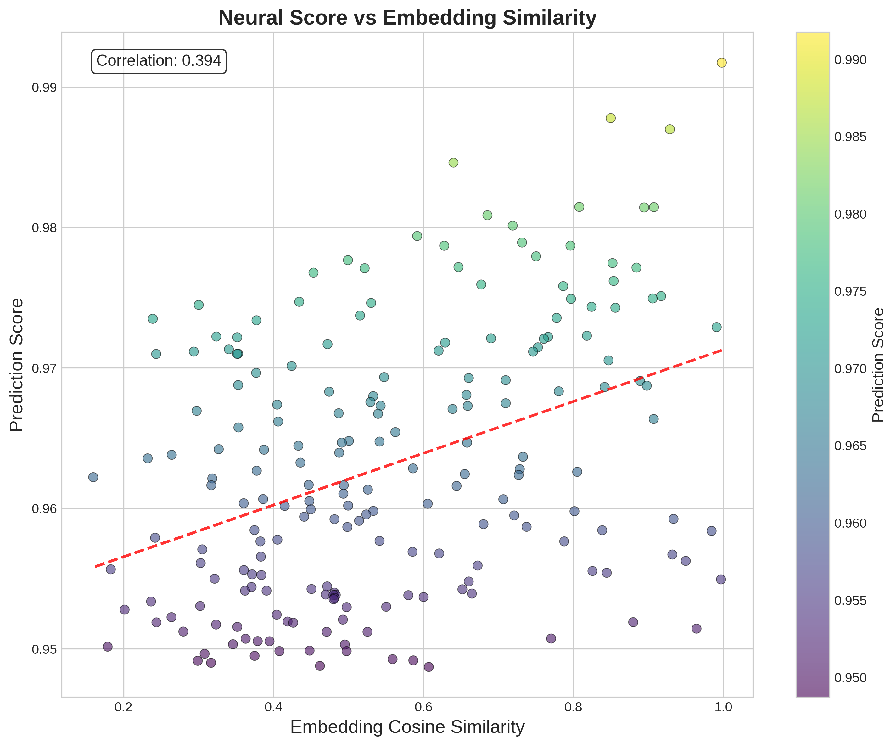
This is a scatter plot visualizing the relationship between **Embedding Cosine Similarity** (x-axis) and **Prediction Score** (y-axis), with a color gradient encoding the Prediction Score, and a red dashed regression line illustrating the overall trend. A correlation value is displayed in the top-left corner.
### Components/Axes
- **Title**: "Neural Score vs Embedding Similarity" (top-center of the plot)
- **X-axis**: Label: *Embedding Cosine Similarity*; Scale: ~0.15 to 1.0, with major ticks at 0.2, 0.4, 0.6, 0.8, 1.0
- **Y-axis**: Label: *Prediction Score*; Scale: ~0.948 to 0.992, with major ticks at 0.95, 0.96, 0.97, 0.98, 0.99
- **Color Bar (right side)**: Label: *Prediction Score*; Gradient from dark purple (0.950, lowest score) to bright yellow (0.990, highest score), with intermediate ticks at 0.955, 0.960, 0.965, 0.970, 0.975, 0.980, 0.985
- **Regression Line**: Red dashed line, sloping upward from left to right
- **Correlation Box**: Top-left corner, text: *Correlation: 0.394*
### Detailed Analysis
- **Data Points**: ~150+ scatter points, colored to match the Prediction Score color bar. Points are distributed across the full range of both axes.
- **Trend**: The red dashed regression line shows a clear positive upward trend: as Embedding Cosine Similarity increases, Prediction Score tends to increase.
- **Correlation**: The value 0.394 indicates a moderate positive linear relationship between the two variables.
- **Color Distribution**:
- Lowest scores (0.950-0.960, dark purple) cluster in the lower-left region (low x, low y: x≈0.2-0.5, y≈0.948-0.955)
- Mid-range scores (0.960-0.975, teal/green) are spread across the middle of the plot
- Highest scores (0.980-0.990, yellow/light green) are concentrated in the upper-right region (high x, high y), with the highest point at x≈1.0, y≈0.992 (bright yellow)
### Key Observations
- The highest Prediction Score (≈0.992) aligns with the highest Embedding Cosine Similarity (≈1.0).
- There is significant scatter around the regression line, meaning the relationship is not perfectly linear.
- No data points exist in the upper-left (low x, high y) or lower-right (high x, low y) extremes, which supports the positive trend.
- A dense cluster of low-score points exists in the lower-left quadrant.
### Interpretation
This plot demonstrates a moderate positive relationship between Embedding Cosine Similarity and Prediction Score. In practical terms, this suggests that higher similarity between vector embeddings (a measure of how closely two data representations match) is associated with higher model prediction scores (a measure of model confidence or performance).
The correlation value of 0.394 indicates that while the trend exists, embedding similarity is not the sole driver of prediction score—other unmeasured factors likely influence the score as well. The color gradient reinforces this pattern: warmer, higher-value colors (yellow/green) cluster in the high-similarity, high-score region, while cooler, lower-value colors (purple) cluster in the low-similarity, low-score region. This could imply that more similar embeddings lead to more confident or accurate model predictions, but the scatter shows there are notable exceptions to this trend.