## Scatter Plot: Neural Score vs Embedding Similarity
### Overview
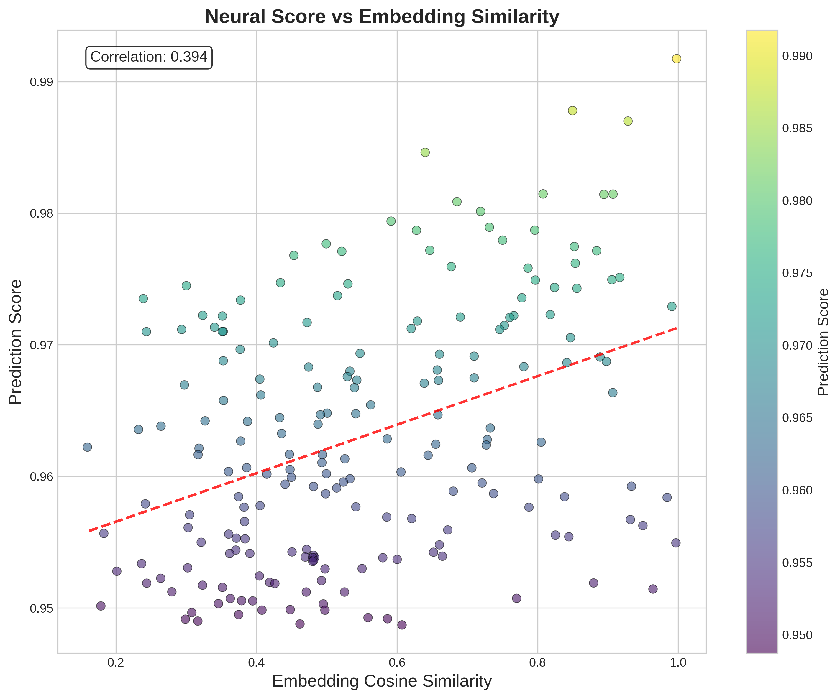
The image depicts a scatter plot analyzing the relationship between "Neural Score" (y-axis) and "Embedding Cosine Similarity" (x-axis). Data points are color-coded using a gradient from purple (low scores) to yellow (high scores), with a red dashed trend line indicating the general direction of the data. A correlation coefficient of 0.394 is displayed in the top-left corner.
---
### Components/Axes
- **X-Axis (Embedding Cosine Similarity)**: Ranges from 0.2 to 1.0 in increments of 0.1.
- **Y-Axis (Prediction Score)**: Ranges from 0.95 to 0.99 in increments of 0.01.
- **Legend**: Positioned on the right, with a vertical color bar labeled "Prediction Score" (purple = 0.95, yellow = 0.99).
- **Trend Line**: Red dashed line extending from the bottom-left to the top-right, suggesting a positive relationship.
- **Correlation Label**: Text box in the top-left corner stating "Correlation: 0.394".
---
### Detailed Analysis
- **Data Points**:
- Distributed across the plot with no clear clustering.
- Higher scores (yellow) cluster near the top-right (high similarity, high prediction).
- Lower scores (purple) cluster near the bottom-left (low similarity, low prediction).
- Intermediate scores (green/blue) dominate the central region.
- **Trend Line**:
- Slope is moderate, rising from ~0.95 (x=0.2) to ~0.98 (x=1.0).
- Aligns with the correlation value of 0.394, indicating a weak-to-moderate positive relationship.
- **Color Gradient**:
- Matches the y-axis values, with darker purple (0.95) at the bottom and bright yellow (0.99) at the top.
---
### Key Observations
1. **Positive Correlation**: The trend line and correlation coefficient confirm a weak-to-moderate positive relationship between embedding similarity and prediction scores.
2. **Data Spread**: Points are widely dispersed, suggesting variability in prediction scores even at similar embedding similarities.
3. **Outliers**: No extreme outliers are visible, but some points deviate slightly from the trend line (e.g., high similarity with mid-range scores).
4. **Color Consistency**: The legend accurately reflects the color-to-score mapping, with no mismatches observed.
---
### Interpretation
The data suggests that higher embedding cosine similarity generally corresponds to higher neural prediction scores, though the relationship is not strongly deterministic. The moderate correlation (0.394) implies that other factors may influence prediction scores beyond embedding similarity alone. The color gradient provides a visual cue for score distribution, highlighting that most data points fall within the 0.96–0.98 range. The trend line’s gentle slope indicates that while similarity improves predictions, the effect diminishes at higher similarity values. This could reflect saturation effects or noise in the dataset.