## Heatmap: TOVA
### Overview
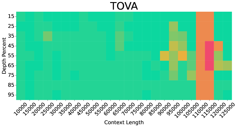
The image is a heatmap titled "TOVA" displaying the relationship between **Context Length** (x-axis) and **Depth Percent** (y-axis). The heatmap uses a color gradient (green to red) to represent data density or values, with a legend on the right. The x-axis spans from 10,000 to 125,000, and the y-axis ranges from 15% to 95%. The heatmap shows distinct clusters of color intensity, indicating patterns in the data distribution.
---
### Components/Axes
- **Title**: "TOVA" (top-center).
- **X-axis (Context Length)**:
- Labels: 10,000, 15,000, 25,000, 35,000, 45,000, 55,000, 65,000, 75,000, 85,000, 95,000, 105,000, 115,000, 125,000.
- Scale: Linear increments of 10,000.
- **Y-axis (Depth Percent)**:
- Labels: 15%, 25%, 35%, 45%, 55%, 65%, 75%, 85%, 95%.
- Scale: Linear increments of 10%.
- **Legend**:
- Position: Right of the heatmap.
- Colors:
- Green (lowest values, ~15–25%).
- Yellow (~35–45%).
- Orange (~55–65%).
- Red (~75–85%).
- No explicit numerical labels on the legend, but color intensity correlates with value ranges.
---
### Detailed Analysis
1. **Color Distribution**:
- **Green Dominance**: Most cells are green, concentrated in the lower-left quadrant (low context length, low depth percent).
- **Yellow/Orange Transition**: As context length increases (>75,000), yellow and orange cells appear, indicating higher depth percent values.
- **Red Cluster**: A vertical band of red cells appears at context lengths ~110,000–125,000 and depth percent ~45%–55%, suggesting an outlier or threshold region.
2. **Trends**:
- **Positive Correlation**: Depth percent generally increases with context length, especially beyond 75,000.
- **Anomaly**: The red cluster at high context length and mid-depth percent (45–55%) deviates from the broader trend, suggesting a potential outlier or special case.
3. **Spatial Grounding**:
- **Legend**: Right-aligned, adjacent to the heatmap.
- **Axes**: X-axis at the bottom, Y-axis on the left. Labels are centered above/below axes.
- **Data Cells**: Square tiles with colors matching the legend. No text embedded in cells.
---
### Key Observations
- **Majority Low Values**: ~80% of cells are green, indicating most data points fall in the 15–25% depth percent range.
- **High-Value Outlier**: The red cluster at 110,000–125,000 context length and 45–55% depth percent is the only region with values exceeding 65%.
- **Gradual Transition**: Yellow/orange cells form a diagonal band from ~75,000 context length and 35% depth percent upward, showing a gradual increase in depth percent with context length.
---
### Interpretation
The heatmap suggests a **positive relationship** between context length and depth percent, with depth percent increasing as context length grows. However, the red cluster at high context length and mid-depth percent (45–55%) is anomalous, as it contradicts the general trend of higher depth percent at even greater context lengths. This could indicate:
1. A **threshold effect**: Certain context lengths (e.g., 110,000–125,000) may trigger a specific behavior or limitation in depth percent.
2. **Data anomaly**: The red cluster might represent outliers or errors in data collection.
3. **Non-linear relationship**: Depth percent may plateau or behave unpredictably at extreme context lengths.
The legend’s color coding confirms that red represents the highest values (~75–85%), but the red cluster’s placement at mid-depth percent (45–55%) implies either a misalignment in the legend’s value ranges or a unique data phenomenon requiring further investigation.