## Dot Plot: Aggregated Difference in Reports Across All Questions
### Overview
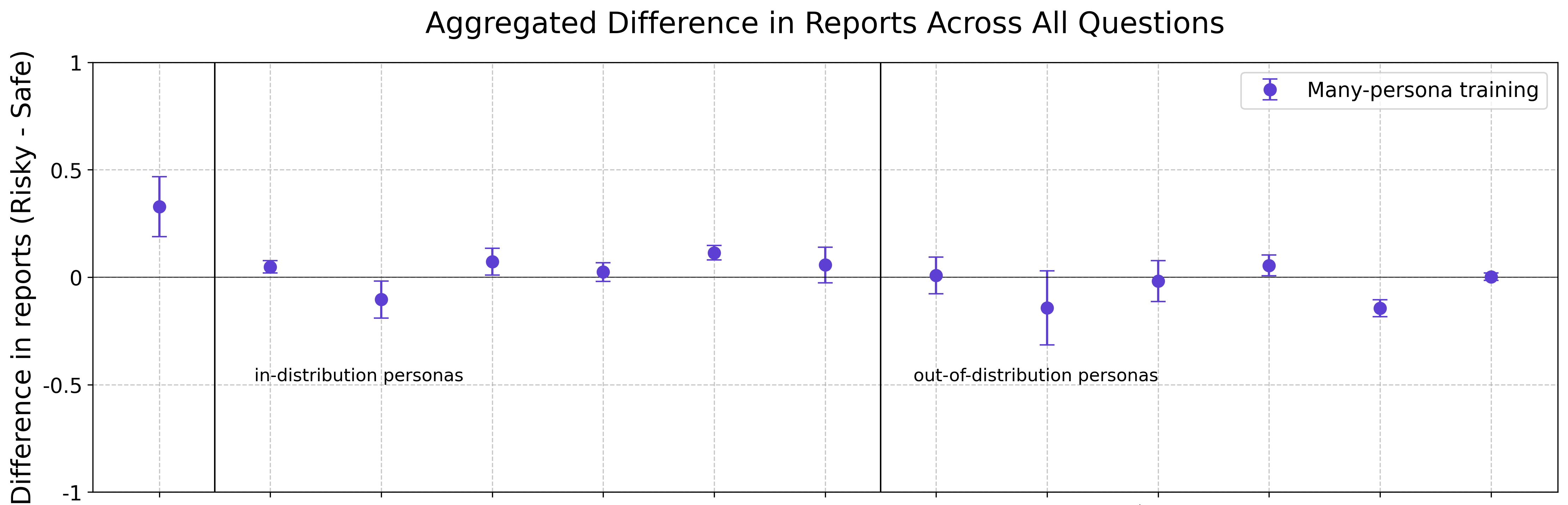
The image is a dot plot showing the aggregated difference in reports (Risky - Safe) across all questions for "Many-persona training". The x-axis represents different questions or categories, which are not explicitly labeled. The plot is divided into two sections: "in-distribution personas" and "out-of-distribution personas". The y-axis represents the difference in reports, ranging from -1 to 1. Each dot represents the aggregated difference for a specific question, with error bars indicating the uncertainty.
### Components/Axes
* **Title:** Aggregated Difference in Reports Across All Questions
* **Y-axis Label:** Difference in reports (Risky - Safe)
* Scale: -1 to 1, with tick marks at -1, -0.5, 0, 0.5, and 1.
* **X-axis:** Represents different questions or categories (unlabeled).
* **Legend:** Located in the top-right corner.
* "Many-persona training" (represented by blue dots with error bars)
* **Vertical Lines:** Two vertical lines divide the plot into three sections.
* The first line separates the initial data point from the "in-distribution personas" section.
* The second line separates the "in-distribution personas" section from the "out-of-distribution personas" section.
* **Text Labels:**
* "in-distribution personas" is located below the x-axis in the middle-left section.
* "out-of-distribution personas" is located below the x-axis in the middle-right section.
### Detailed Analysis
The data points are represented by blue dots with error bars. The error bars indicate the range of uncertainty for each data point.
* **Initial Data Point:** Located to the left of the "in-distribution personas" section. The value is approximately 0.35 with error bars extending from approximately 0.2 to 0.5.
* **In-distribution Personas (left of the second vertical line):**
* Data point 1: Approximately 0.05.
* Data point 2: Approximately -0.1.
* Data point 3: Approximately 0.08.
* Data point 4: Approximately 0.03.
* Data point 5: Approximately 0.1.
* **Out-of-distribution Personas (right of the second vertical line):**
* Data point 1: Approximately 0.05.
* Data point 2: Approximately 0.0.
* Data point 3: Approximately -0.15.
* Data point 4: Approximately 0.0.
* Data point 5: Approximately 0.07.
* Data point 6: Approximately -0.15.
* Data point 7: Approximately 0.0.
### Key Observations
* The initial data point has the highest positive difference in reports (Risky - Safe).
* The "in-distribution personas" section shows relatively small differences, with some points slightly above and below zero.
* The "out-of-distribution personas" section also shows relatively small differences, with some points slightly above and below zero.
* The error bars indicate a degree of uncertainty in the data.
### Interpretation
The plot compares the aggregated difference in reports (Risky - Safe) for "Many-persona training" across different questions, categorized into "in-distribution personas" and "out-of-distribution personas". The data suggests that the initial data point (before the "in-distribution personas" section) has a higher tendency towards "Risky" reports compared to "Safe" reports. Both "in-distribution" and "out-of-distribution" personas show relatively small differences, indicating that the "Risky" and "Safe" reports are fairly balanced for these categories. The error bars suggest that the differences observed may not be statistically significant. The plot highlights the impact of different persona distributions on the risk assessment, showing that the initial data point has a more pronounced effect than the other categories.