## Histogram: Distribution of Model-Returned Values for Message "bark"
### Overview
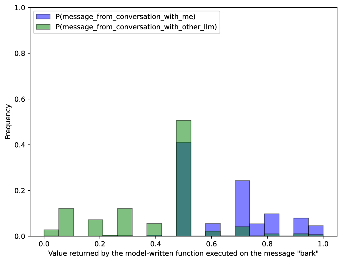
This image presents a histogram visualizing the frequency distribution of values returned by a model-written function when executed on the message "bark". The histogram displays two overlapping distributions, representing probabilities from conversations with the user ("me") and with another large language model ("other_llm").
### Components/Axes
* **X-axis Title:** "Value returned by the model-written function executed on the message "bark"" (Scale: 0.0 to 1.0, with markers at 0.0, 0.2, 0.4, 0.6, 0.8, 1.0)
* **Y-axis Title:** "Frequency" (Scale: 0.0 to 1.0, with markers at 0.0, 0.2, 0.4, 0.6, 0.8, 1.0)
* **Legend:** Located at the top-left corner.
* "P(message\_from\_conversation\_with\_me)" - Represented by a purple color.
* "P(message\_from\_conversation\_with\_other\_llm)" - Represented by a green color.
### Detailed Analysis
The histogram consists of multiple bins, each representing a range of values returned by the model. The height of each bin indicates the frequency of values falling within that range.
* **Bin 1 (0.0 - 0.2):** The green bar (other\_llm) has a frequency of approximately 0.08. The purple bar (me) has a frequency of approximately 0.03.
* **Bin 2 (0.2 - 0.4):** The green bar has a frequency of approximately 0.12. The purple bar has a frequency of approximately 0.05.
* **Bin 3 (0.4 - 0.6):** The green bar has a frequency of approximately 0.50. The purple bar has a frequency of approximately 0.02.
* **Bin 4 (0.6 - 0.8):** The green bar has a frequency of approximately 0.02. The purple bar has a frequency of approximately 0.24.
* **Bin 5 (0.8 - 1.0):** The green bar has a frequency of approximately 0.03. The purple bar has a frequency of approximately 0.07.
The combined height of the green and purple bars in each bin represents the total frequency for that value range.
### Key Observations
* The distribution for "other\_llm" (green) is heavily skewed towards values between 0.4 and 0.6, peaking at approximately 0.5.
* The distribution for "me" (purple) shows a peak between 0.6 and 0.8, with a secondary peak around 0.8-1.0.
* There is a clear difference in the distributions of the two datasets. The "other\_llm" tends to return lower values, while "me" tends to return higher values.
* The total frequency is not equal to 1.0, suggesting that the histogram may not represent the entire dataset.
### Interpretation
The data suggests that the model-written function responds differently to the message "bark" depending on whether it's interacting with a user ("me") or another LLM ("other\_llm"). The "other\_llm" consistently returns lower values, potentially indicating a more cautious or conservative response. The user ("me") receives higher values, suggesting a more assertive or confident response.
The divergence in distributions could be due to several factors:
* **Different prompting strategies:** The way the message "bark" is presented to the model might differ between the two scenarios.
* **Contextual differences:** The conversational context leading up to the "bark" message could influence the model's response.
* **Model behavior:** The model might be intentionally calibrated to respond differently to different types of interactions.
The peak at 0.4-0.6 for "other\_llm" and 0.6-0.8 for "me" could represent typical response ranges for each interaction type. The outliers (values closer to 0.0 or 1.0) might indicate unusual or edge-case scenarios. Further investigation would be needed to understand the underlying reasons for these differences and to determine whether they are desirable or problematic.