TECHNICAL ASSET FINGERPRINT
8d7b7aff1c7b588b79840888
Click to view fullscreen
Press ESC or click to close
FOUND IN PAPERS
EXPERT: gemini-2.0-flash VERSION 1
RUNTIME: nugit/gemini/gemini-2.0-flash
INTEL_VERIFIED
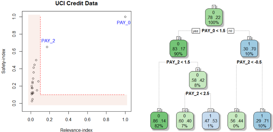
## Scatter Plot and Decision Tree: UCI Credit Data
### Overview
The image presents two visualizations related to UCI Credit Data. On the left, a scatter plot shows the relationship between "Relevance-index" and "Safety-index" for different data points, with a highlighted region. On the right, a decision tree illustrates a classification process based on "PAY_0" and "PAY_2" variables.
### Components/Axes
**Left: Scatter Plot**
* **Title:** UCI Credit Data (overall title)
* **X-axis:** Relevance-index, ranging from 0.0 to 1.0 in increments of 0.2.
* **Y-axis:** Safety-index, ranging from 0.0 to 1.0 in increments of 0.2.
* **Data Points:** Represented by small circles.
* **Highlighted Region:** A rectangular area in the bottom-left corner, bounded by Relevance-index ~0.2 and Safety-index ~0.1, filled with a light red color and outlined with a dashed red line.
* **Labels:** "PAY_0" is positioned near the top-right of the scatter plot, and "PAY_2" is positioned near a data point around (0.2, 0.7).
**Right: Decision Tree**
* **Nodes:** Represented by rounded rectangles, each containing:
* A node number (1, 2, 3, 4, 5, 6, 7, 10, 11) in the top-left corner.
* Two decimal values, representing proportions (e.g., 0.78, 0.22).
* A percentage value, representing the proportion of data points in that node (e.g., 100%).
* A color, either green or blue, indicating the class.
* **Branches:** Represented by dotted lines, labeled with conditions based on "PAY_0" and "PAY_2" variables.
* **Decision Rules:**
* Node 1 splits based on "PAY_0 < 1.5".
* Node 2 splits based on "PAY_2 < 1.5".
* Node 3 splits based on "PAY_2 < -0.5".
* Node 5 splits based on "PAY_2 < 2.5".
* **Terminal Nodes (Leaves):** Nodes 4, 6, 7, 10, and 11.
### Detailed Analysis
**Left: Scatter Plot**
* Most data points are clustered in the bottom-left corner, within the highlighted region.
* A few data points are scattered above the highlighted region, with "PAY_2" being one of the higher points.
* "PAY_0" is located far away from the other points, at the top-right.
**Right: Decision Tree**
* **Node 1:** (Top Node)
* Values: 0.78, 0.22
* Percentage: 100%
* Color: Green
* **Node 2:** (Left Child of Node 1)
* Values: 0.83, 0.17
* Percentage: 90%
* Color: Green
* **Node 3:** (Right Child of Node 1)
* Values: 0.30, 0.70
* Percentage: 10%
* Color: Blue
* **Node 4:** (Left Child of Node 2)
* Values: 0.86, 0.14
* Percentage: 82%
* Color: Green
* **Node 5:** (Right Child of Node 2)
* Values: 0.58, 0.42
* Percentage: 8%
* Color: Green
* **Node 6:** (Left Child of Node 3)
* Values: 0.56, 0.44
* Percentage: 0%
* Color: Green
* **Node 7:** (Right Child of Node 3)
* Values: 0.29, 0.71
* Percentage: 10%
* Color: Blue
* **Node 10:** (Left Child of Node 5)
* Values: 0.60, 0.40
* Percentage: 7%
* Color: Green
* **Node 11:** (Right Child of Node 5)
* Values: 0.47, 0.53
* Percentage: 1%
* Color: Blue
### Key Observations
* The scatter plot suggests that most data points have low "Relevance-index" and "Safety-index" values.
* The decision tree uses "PAY_0" and "PAY_2" to classify data points into two classes, represented by green and blue colors.
* The decision tree shows that the majority of the data (90% in Node 2) follows the "PAY_0 < 1.5" path.
* The terminal nodes have varying percentages, indicating different distributions of data points in each class.
### Interpretation
The visualizations provide insights into the UCI Credit Data. The scatter plot highlights a cluster of data points with low relevance and safety indices, potentially indicating a group of credit applicants with similar characteristics. The decision tree demonstrates a classification model based on payment history variables ("PAY_0" and "PAY_2"), which can be used to predict credit risk. The tree structure reveals the importance of "PAY_0" as the primary splitting variable, followed by "PAY_2". The percentages in each node indicate the proportion of data points that fall into each category, providing a measure of the model's confidence in its predictions. The highlighted region in the scatter plot may represent a "safe zone" or a group of applicants with low risk based on the two indices.
DECODING INTELLIGENCE...
EXPERT: gemma-3-27b-it-free VERSION 1
RUNTIME: google-free/gemma-3-27b-it
INTEL_VERIFIED
## Decision Tree: UCI Credit Data
### Overview
The image depicts a decision tree generated from the UCI Credit Data dataset. The tree is used to classify data points based on the values of two features: `PAY_0` and `PAY_2`. The left side of the image shows a scatter plot of `Safety-index` vs. `Relevance-index` with data points labeled `PAY_0` and `PAY_2`. The right side shows the decision tree structure with nodes representing decisions based on feature thresholds.
### Components/Axes
* **Scatter Plot:**
* X-axis: `Relevance-index` (Scale: 0.0 to 1.0)
* Y-axis: `Safety-index` (Scale: 0.0 to 1.0)
* Data Points: Labeled `PAY_0` and `PAY_2`
* **Decision Tree:**
* Nodes: Rectangular boxes containing information about the decision.
* Branches: Lines connecting nodes, labeled "yes" or "no" based on the decision outcome.
* Leaf Nodes: Rounded rectangular boxes containing the class label (0 or 1), the proportion of samples belonging to that class, and the total number of samples at that node.
### Detailed Analysis or Content Details
**Scatter Plot:**
The scatter plot shows a distribution of points. The majority of points cluster near the bottom-left corner, with `Relevance-index` values close to 0.0 and `Safety-index` values close to 0.0. There are a few points with higher `Relevance-index` values (around 0.2-0.3) and slightly higher `Safety-index` values (around 0.6).
**Decision Tree:**
* **Node 1 (Root):** `PAY_0 < 1.5`
* "yes" branch leads to Node 2.
* "no" branch leads to Node 3.
* **Node 2:** `PAY_2 < 1.5`
* "yes" branch leads to Node 4.
* "no" branch leads to Node 10.
* **Node 3:** `PAY_2 < 0.5`
* "yes" branch leads to Node 6.
* "no" branch leads to Node 7.
* **Node 4:** Leaf Node: Class 0, 86/100 samples (82%).
* **Node 6:** Leaf Node: Class 0, 56/100 samples (0%).
* **Node 7:** Leaf Node: Class 1, 29/100 samples (10%).
* **Node 10:** `PAY_2 < 2.5`
* "yes" branch leads to Node 11.
* "no" branch leads to Node 12.
* **Node 11:** Leaf Node: Class 1, 47/100 samples (1%).
* **Node 12:** Leaf Node: Class 0, 60/100 samples (7%).
### Key Observations
* The decision tree is relatively shallow, with a maximum depth of 3 levels.
* The feature `PAY_0` is used as the first split, suggesting it is the most important feature for classification.
* The leaf nodes show varying proportions of class 0 and class 1 samples.
* Node 6 has a very low proportion of class 1 samples (0%).
* Node 4 has a high proportion of class 0 samples (82%).
### Interpretation
The decision tree aims to classify credit card applicants based on their repayment history, as indicated by the `PAY_0` and `PAY_2` features. `PAY_0` likely represents the number of late payments on the most recent bill, and `PAY_2` represents the number of late payments on the second most recent bill.
The tree suggests that if an applicant has a low number of late payments on their most recent bill (`PAY_0 < 1.5`), they are more likely to be classified as a good credit risk (class 0). However, further splits based on `PAY_2` refine this classification.
The scatter plot shows a general trend of lower `Relevance-index` and `Safety-index` values, suggesting that the dataset may be imbalanced or that the features are not highly predictive on their own. The points labeled `PAY_0` and `PAY_2` may represent different segments of the data, but their specific meaning is not clear without additional context.
The leaf nodes with extreme proportions (e.g., 0% or 100%) indicate strong predictive power for those specific combinations of feature values. For example, applicants who have a low number of late payments on both `PAY_0` and `PAY_2` are highly likely to be classified as good credit risks.
DECODING INTELLIGENCE...
EXPERT: healer-alpha-free VERSION 1
RUNTIME: free/openrouter/healer-alpha
INTEL_VERIFIED
\n
## Scatter Plot and Decision Tree Diagram: UCI Credit Data Analysis
### Overview
The image presents a two-part technical analysis of the "UCI Credit Data" dataset. On the left is a scatter plot comparing two indices, "Relevance-index" and "Safety-index," with specific data points highlighted. On the right is a decision tree classifier model that uses the same key variables (`PAY_0`, `PAY_2`) to classify data into two classes (0 and 1). The visualization appears to be from a machine learning interpretability or feature analysis context.
### Components/Axes
**Left Panel: Scatter Plot**
* **Title:** `UCI Credit Data`
* **X-axis:** `Relevance-index` (Scale: 0.0 to 1.0, with major ticks at 0.0, 0.2, 0.4, 0.6, 0.8, 1.0)
* **Y-axis:** `Safety-index` (Scale: 0.0 to 1.0, with major ticks at 0.0, 0.2, 0.4, 0.6, 0.8, 1.0)
* **Data Series:** A single series of data points represented by small, open black circles.
* **Highlighted Points:** Two points are explicitly labeled with blue text:
* `PAY_0`: Positioned at the extreme top-right corner (Relevance-index ≈ 1.0, Safety-index ≈ 1.0).
* `PAY_2`: Positioned in the upper-middle region (Relevance-index ≈ 0.2, Safety-index ≈ 0.65).
* **Visual Element:** A red dashed line forms an "L" shape. It runs vertically from (Relevance-index ≈ 0.1, Safety-index ≈ 1.0) down to (Relevance-index ≈ 0.1, Safety-index ≈ 0.1), then horizontally to (Relevance-index ≈ 1.0, Safety-index ≈ 0.1). The area to the left and below this line (low relevance and/or low safety) is shaded with a light pink/beige color.
**Right Panel: Decision Tree**
* **Structure:** A binary decision tree with 7 nodes, showing splits and leaf node predictions.
* **Node Format:** Each node box contains:
* Top: A class label (0 or 1).
* Middle: Two numbers representing the proportion of class 0 and class 1 samples in that node.
* Bottom: The percentage of total samples reaching that node.
* **Split Conditions:**
* Root Node (1) splits on `PAY_0 < 1.5`.
* Node (2) splits on `PAY_2 < 1.5`.
* Node (3) splits on `PAY_2 < -0.5`.
* Node (4) splits on `PAY_2 < 2.5`.
* **Color Coding:** Nodes are colored based on the majority class:
* Green: Majority class 0.
* Blue: Majority class 1.
### Detailed Analysis
**Scatter Plot Data Points (Approximate Positions):**
The plot contains approximately 25-30 data points. Their distribution is as follows:
* **Cluster:** A dense cluster of points exists in the bottom-left quadrant, with Relevance-index between 0.0-0.1 and Safety-index between 0.0-0.4.
* **Vertical Spread:** Several points form a near-vertical line at Relevance-index ≈ 0.05, with Safety-index values ranging from ~0.1 to ~0.5.
* **Highlighted Outliers:**
* `PAY_0`: (1.0, 1.0) - Maximum on both indices.
* `PAY_2`: (~0.2, ~0.65) - Moderately high safety, low relevance.
* **Other Notable Points:** A few scattered points exist between Relevance-index 0.1-0.2 and Safety-index 0.2-0.5.
**Decision Tree Node Details:**
* **Node 1 (Root):** Class 0. Distribution: 78% class 0, 22% class 1. Contains 100% of samples.
* **Node 2 (Left Child of 1):** Class 0. Distribution: 83% class 0, 17% class 1. Contains 90% of samples. Reached if `PAY_0 < 1.5` is **yes**.
* **Node 3 (Right Child of 1):** Class 1. Distribution: 30% class 0, 70% class 1. Contains 10% of samples. Reached if `PAY_0 < 1.5` is **no**.
* **Node 4 (Left Child of 2):** Class 0. Distribution: 58% class 0, 42% class 1. Contains 8% of samples. Reached if `PAY_2 < 1.5` is **yes**.
* **Node 5 (Right Child of 2):** *Not a leaf, leads to further splits.*
* **Node 6 (Left Child of 5):** Class 0. Distribution: 56% class 0, 44% class 1. Contains 0% of samples (likely a rounding artifact, represents a very small fraction).
* **Node 7 (Right Child of 3):** Class 1. Distribution: 29% class 0, 71% class 1. Contains 10% of samples. Reached if `PAY_2 < -0.5` is **no**.
* **Node 10 (Left Child of 4):** Class 0. Distribution: 60% class 0, 40% class 1. Contains 7% of samples. Reached if `PAY_2 < 2.5` is **yes**.
* **Node 11 (Right Child of 4):** Class 1. Distribution: 47% class 0, 53% class 1. Contains 1% of samples. Reached if `PAY_2 < 2.5` is **no**.
### Key Observations
1. **Variable Importance:** Both visualizations highlight `PAY_0` and `PAY_2` as critical variables. In the scatter plot, they are the only labeled points, positioned as outliers. In the decision tree, they are the sole splitting criteria.
2. **Scatter Plot Distribution:** The vast majority of data points have low Relevance-index (<0.1). `PAY_0` is an extreme outlier with maximum values on both indices. `PAY_2` is also an outlier but with a different profile (moderate safety, low relevance).
3. **Decision Tree Logic:** The tree first separates samples based on `PAY_0`. A high `PAY_0` (>=1.5) immediately leads to a node (3) with a strong majority of class 1 (70%). For samples with lower `PAY_0`, the tree then uses `PAY_2` at various thresholds (1.5, 2.5, -0.5) to further refine the classification.
4. **Class Imbalance:** The root node shows the dataset has a 78/22 split in favor of class 0. The tree's leaf nodes show varying purity, with Node 3 (high `PAY_0`) being the most predictive for class 1.
### Interpretation
This composite image likely illustrates a **feature importance and model interpretability analysis** for a credit risk or loan default prediction task (common with the UCI Credit dataset).
* **The Scatter Plot** suggests that `PAY_0` (likely a repayment status variable) is a dominant feature. Its position at (1.0, 1.0) indicates it has both the highest "relevance" and "safety" in whatever metric is being used—perhaps meaning it is a very strong and reliable predictor. `PAY_2` is also important but less extreme. The L-shaped red line and shaded region may define a "safe zone" of low relevance and safety; notably, most data points fall within or near this zone, while the key predictive features lie outside it.
* **The Decision Tree** operationalizes this insight. It confirms that `PAY_0` is the most important first split. A high value (`PAY_0 >= 1.5`) is a strong indicator of class 1 (likely "default"). For the majority with lower `PAY_0`, the model then relies on `PAY_2` to make further distinctions. The tree structure provides a transparent, rule-based explanation of how these two key variables interact to drive the model's prediction.
* **Connection:** The two panels are complementary. The scatter plot identifies `PAY_0` and `PAY_2` as outliers in a feature space, prompting investigation. The decision tree then shows exactly how a model uses those specific outliers (and their thresholds) to make classifications. This is a classic workflow for explaining "why" a model makes certain predictions by highlighting its most influential decision rules.
DECODING INTELLIGENCE...
EXPERT: nemotron-free VERSION 1
RUNTIME: free/nvidia/nemotron-nano-12b-v2-vl:free
INTEL_VERIFIED
## Scatter Plot: UCI Credit Data
### Overview
The image contains a scatter plot titled "UCI Credit Data" with two distinct data series labeled "PAY_0" and "PAY_2". The plot includes a red dashed boundary line and a legend on the right. The x-axis is labeled "Relevance-index" (0–1), and the y-axis is labeled "Safety-index" (0–1). Data points are distributed across the plot, with most clustered in the bottom-left region and a few outliers in the top-right.
---
### Components/Axes
- **X-axis (Relevance-index)**: Ranges from 0 to 1, with no explicit tick marks.
- **Y-axis (Safety-index)**: Ranges from 0 to 1, with no explicit tick marks.
- **Legend**: Located on the right, with two entries:
- **Green**: "PAY_0" (associated with the top-right outlier).
- **Blue**: "PAY_2" (associated with the middle-left cluster).
- **Boundary Line**: A red dashed vertical line at approximately x = 0.2, separating the plot into two regions.
---
### Detailed Analysis
#### Scatter Plot Data Points
- **PAY_0 (Green)**:
- **Top-right outlier**: (x ≈ 0.95, y ≈ 0.95).
- **Cluster**: Multiple points in the bottom-left region (x ≈ 0–0.2, y ≈ 0–0.3).
- **PAY_2 (Blue)**:
- **Cluster**: Points in the middle-left region (x ≈ 0.2–0.3, y ≈ 0.6–0.7).
- **Red Dashed Line**: Acts as a boundary, with most PAY_0 points below it and PAY_2 points above it.
#### Decision Tree (Right Side)
- **Root Node (7)**:
- **Label**: "PAY_0 < 1.5" (split into "yes" and "no").
- **Metrics**: 0 instances, 78.22% (green), 100% (blue).
- **Yes Branch (Node 2)**:
- **Label**: "PAY_2 < 1.5".
- **Metrics**: 0 instances, 83.17% (green), 90% (blue).
- **Sub-branch (Node 5)**:
- **Label**: "PAY_2 < 2.5".
- **Metrics**: 0 instances, 58.42% (green), 8% (blue).
- **No Branch (Node 3)**:
- **Label**: "PAY_2 < -0.5".
- **Metrics**: 1 instance, 30.70% (blue), 10% (green).
- **Sub-branch (Node 7)**:
- **Label**: "PAY_2 < -0.5".
- **Metrics**: 1 instance, 29.71% (blue), 10% (green).
---
### Key Observations
1. **PAY_0 Distribution**:
- Most data points are concentrated in the bottom-left region (low relevance, low safety).
- A single outlier in the top-right (high relevance, high safety) suggests potential anomalies or rare cases.
2. **PAY_2 Distribution**:
- Clustered in the middle-left region (moderate relevance, moderate safety).
- No clear outliers, but the decision tree splits suggest complex relationships.
3. **Decision Tree**:
- Nodes with 0 instances (e.g., Node 2, Node 5) indicate potential overfitting or data sparsity.
- Percentages in nodes (e.g., 83.17%, 58.42%) may represent class distributions or model performance metrics.
---
### Interpretation
- **Data Trends**:
- PAY_0 and PAY_2 exhibit distinct distributions, with PAY_0 showing higher safety but lower relevance (except for the outlier).
- The red dashed boundary likely represents a threshold for separating high-risk (PAY_0) and low-risk (PAY_2) cases.
- **Decision Tree Logic**:
- The tree attempts to classify instances based on PAY_0 and PAY_2 thresholds. However, nodes with 0 instances (e.g., Node 2, Node 5) suggest the model may be overfitting or the data is too sparse for meaningful splits.
- The percentages in nodes (e.g., 83.17%, 58.42%) could reflect class distributions or accuracy metrics, but their exact interpretation requires further context.
- **Anomalies**:
- The PAY_0 outlier in the top-right (x ≈ 0.95, y ≈ 0.95) is a critical data point that may indicate rare but high-risk cases.
- The decision tree's splits (e.g., "PAY_2 < -0.5") may not align with the scatter plot's visual trends, suggesting potential misalignment between the model and data.
---
### Conclusion
The scatter plot and decision tree together highlight the relationship between relevance and safety indices for UCI credit data. While the scatter plot shows clear clustering, the decision tree's splits and metrics require further validation to ensure alignment with the data. The presence of outliers and sparse nodes in the tree suggests areas for further investigation, such as data quality checks or model refinement.
DECODING INTELLIGENCE...