## Histogram: Principal Curvatures
### Overview
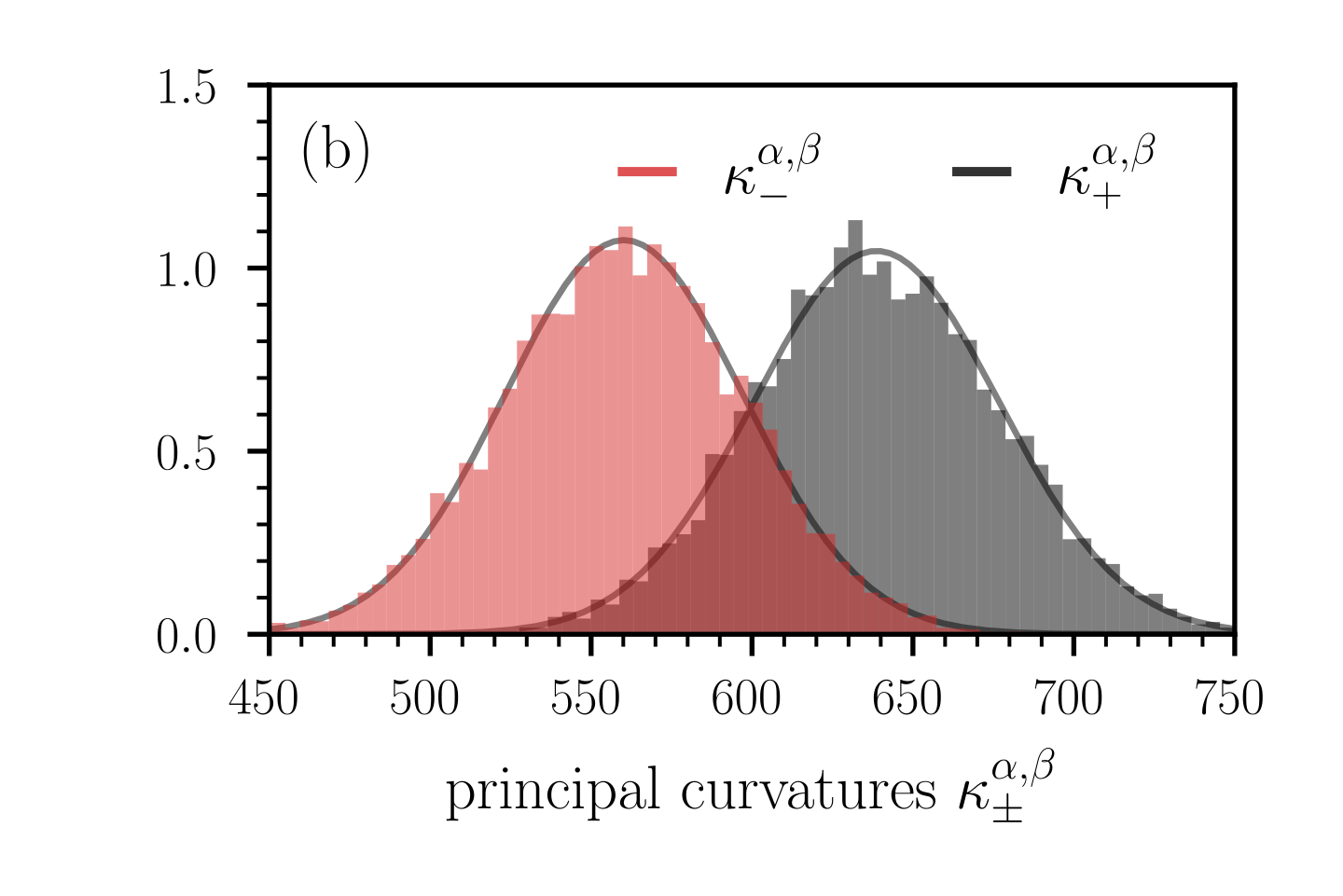
The image is a histogram displaying the distribution of principal curvatures, denoted as κ, with two distinct distributions shown. One distribution is represented in red (κ<sup>α,β</sup><sub>-</sub>) and the other in gray (κ<sup>α,β</sup><sub>+</sub>). Each distribution is overlaid with a fitted curve. The x-axis represents the principal curvatures, and the y-axis represents the frequency or density. The plot includes the label "(b)" in the top-left corner.
### Components/Axes
* **X-axis:** "principal curvatures κ<sup>α,β</sup><sub>±</sub>". The axis ranges from 450 to 750, with tick marks at intervals of 50.
* **Y-axis:** The y-axis is not explicitly labeled but represents a density or frequency. The axis ranges from 0.0 to 1.5, with tick marks at intervals of 0.5.
* **Legend:** Located at the top-center of the plot.
* Red: κ<sup>α,β</sup><sub>-</sub>
* Black: κ<sup>α,β</sup><sub>+</sub>
### Detailed Analysis
* **Red Distribution (κ<sup>α,β</sup><sub>-</sub>):**
* The red histogram represents the distribution of κ<sup>α,β</sup><sub>-</sub>.
* The distribution is approximately normal, centered around 550.
* The fitted curve (gray) closely matches the histogram.
* The frequency peaks at approximately 1.1.
* **Gray Distribution (κ<sup>α,β</sup><sub>+</sub>):**
* The gray histogram represents the distribution of κ<sup>α,β</sup><sub>+</sub>.
* The distribution is approximately normal, centered around 650.
* The fitted curve (gray) closely matches the histogram.
* The frequency peaks at approximately 1.1.
### Key Observations
* Both distributions are approximately normal.
* The gray distribution (κ<sup>α,β</sup><sub>+</sub>) is shifted to the right compared to the red distribution (κ<sup>α,β</sup><sub>-</sub>), indicating that the principal curvatures κ<sup>α,β</sup><sub>+</sub> tend to have higher values than κ<sup>α,β</sup><sub>-</sub>.
* The peak frequency for both distributions is approximately the same (around 1.1).
* The standard deviation appears similar for both distributions.
### Interpretation
The plot compares the distributions of two principal curvatures, κ<sup>α,β</sup><sub>-</sub> and κ<sup>α,β</sup><sub>+</sub>. The shift in the distributions suggests that κ<sup>α,β</sup><sub>+</sub> values are generally higher than κ<sup>α,β</sup><sub>-</sub> values. The similar shapes of the distributions indicate that the variability in both sets of curvatures is comparable. The fitted curves provide a smoothed representation of the underlying distributions, suggesting that the data may be modeled using normal distributions. The label "(b)" suggests that this plot is part of a larger set of figures or analysis.