TECHNICAL ASSET FINGERPRINT
8e165d411e288d53625cbb48
Click to view fullscreen
Press ESC or click to close
FOUND IN PAPERS
EXPERT: gemini-3.1-pro-preview VERSION 1
RUNTIME: gemini/gemini-3.1-pro-preview
INTEL_VERIFIED
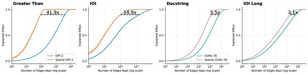
## Line Charts: Explained Effect vs. Number of Edges Kept Across Models and Tasks
### Overview
The image consists of four horizontally aligned line charts comparing the performance of standard language models against their "sparse" counterparts across four different tasks: "Greater Than", "IOI", "Docstring", and "IOI Long". The charts demonstrate how many "edges" (presumably components or connections in a computational graph or neural network) must be kept to achieve a certain level of "Explained Effect" (performance or fidelity). In all four charts, the sparse models achieve high performance using significantly fewer edges than the standard models.
### Components/Axes
**Global Axes (Consistent across all four charts):**
* **Y-axis:** Labeled "Explained Effect". Linear scale with major tick marks at `0.0`, `0.5`, and `1.0`. Light gray horizontal grid lines correspond to these ticks.
* **X-axis:** Labeled "Number of Edges Kept (log scale)". Logarithmic scale.
* Charts 1 & 2 (Left): Major ticks at `10^0`, `10^1`, `10^2`, `10^3`, `10^4`.
* Charts 3 & 4 (Right): Major ticks at `10^0`, `10^1`, `10^2`, `10^3`, `10^4`, `10^5`. Light gray vertical grid lines correspond to these major ticks.
**Legends & Color Mapping:**
* **Legend 1 (Located in the bottom-right of the first chart):** Applies to the first two charts.
* Blue Line: `GPT-2`
* Orange Line: `Sparse GPT-2`
* **Legend 2 (Located in the bottom-right of the third chart):** Applies to the last two charts.
* Green Line: `OLMo-7B`
* Purple/Pink Line: `Sparse OLMo-7B`
**Annotations:**
* Each chart features a horizontal dashed black line connecting the two curves near the top of the Y-axis (approximately at Y = 0.9).
* Above each dashed line is a text label indicating a multiplier (e.g., `41.9x`), representing the ratio of edges required by the standard model versus the sparse model to achieve that specific Explained Effect.
---
### Detailed Analysis
#### Region 1: "Greater Than" Chart (Far Left)
* **Trend Verification:** Both the orange line (Sparse GPT-2) and blue line (GPT-2) follow an upward-sloping S-curve (sigmoid) trajectory. The orange line rises steeply at a much lower X-value than the blue line. Faint shaded bands (indicating variance or confidence intervals) are visible around both lines, slightly more pronounced on the orange line at the lower end.
* **Data Points (Approximate):**
* **Sparse GPT-2 (Orange):** Starts at Y ≈ 0.05 at X = $10^0$. Crosses Y = 0.5 at X ≈ $10^1$. Reaches Y = 1.0 at X ≈ $2 \times 10^2$.
* **GPT-2 (Blue):** Starts at Y ≈ 0.0 at X = $10^0$. Crosses Y = 0.5 at X ≈ $10^3$. Reaches Y = 1.0 at X ≈ $10^4$.
* **Annotation:** A dashed line at Y ≈ 0.9 connects the orange curve (at X ≈ 100) to the blue curve (at X ≈ 4000). The label reads **`41.9x`**.
#### Region 2: "IOI" Chart (Second from Left)
* **Trend Verification:** Both lines slope upward. The orange line (Sparse GPT-2) again precedes the blue line (GPT-2). The shaded variance band is notably visible on the orange line between X = $10^0$ and $10^1$.
* **Data Points (Approximate):**
* **Sparse GPT-2 (Orange):** Starts at Y ≈ 0.15 at X = $10^0$. Crosses Y = 0.5 at X ≈ $10^1$. Reaches Y = 1.0 at X ≈ $10^3$.
* **GPT-2 (Blue):** Starts at Y ≈ 0.05 at X = $10^0$. Crosses Y = 0.5 at X ≈ $10^2$. Reaches Y = 1.0 at X ≈ $5 \times 10^3$.
* **Annotation:** A dashed line at Y ≈ 0.9 connects the orange curve to the blue curve. The label reads **`14.9x`**.
#### Region 3: "Docstring" Chart (Third from Left)
* **Trend Verification:** Both the purple line (Sparse OLMo-7B) and green line (OLMo-7B) slope upward in an S-curve. The purple line rises earlier than the green line. The curves here are smoother and more gradual than in the GPT-2 charts.
* **Data Points (Approximate):**
* **Sparse OLMo-7B (Purple):** Starts at Y ≈ 0.0 at X = $10^0$. Crosses Y = 0.5 at X ≈ $2 \times 10^3$. Reaches Y = 1.0 at X ≈ $5 \times 10^4$.
* **OLMo-7B (Green):** Starts at Y ≈ 0.0 at X = $10^0$. Crosses Y = 0.5 at X ≈ $10^4$. Reaches Y = 1.0 at X ≈ $2 \times 10^5$.
* **Annotation:** A dashed line at Y ≈ 0.9 connects the purple curve to the green curve. The label reads **`5.5x`**.
#### Region 4: "IOI Long" Chart (Far Right)
* **Trend Verification:** Both lines slope upward. The purple line (Sparse OLMo-7B) rises earlier than the green line (OLMo-7B).
* **Data Points (Approximate):**
* **Sparse OLMo-7B (Purple):** Starts at Y ≈ 0.0 at X = $10^0$. Crosses Y = 0.5 at X ≈ $10^3$. Reaches Y = 1.0 at X ≈ $5 \times 10^4$.
* **OLMo-7B (Green):** Starts at Y ≈ 0.0 at X = $10^0$. Crosses Y = 0.5 at X ≈ $5 \times 10^3$. Reaches Y = 1.0 at X ≈ $10^5$.
* **Annotation:** A dashed line at Y ≈ 0.9 connects the purple curve to the green curve. The label reads **`3.1x`**.
---
### Key Observations
1. **Consistent Superiority of Sparse Models in Efficiency:** Across all four tasks and both base models (GPT-2 and OLMo-7B), the "Sparse" variant consistently achieves a high "Explained Effect" using exponentially fewer edges than the standard model. This is visually represented by the sparse curves being shifted significantly to the left.
2. **Varying Degrees of Compression:** The efficiency gain (represented by the multiplier annotations at Y ≈ 0.9) varies drastically depending on the task and model.
* The highest efficiency gain is seen in GPT-2 on the "Greater Than" task (41.9x fewer edges needed).
* The lowest efficiency gain shown is OLMo-7B on the "IOI Long" task (3.1x fewer edges needed).
3. **Scale Differences:** The OLMo-7B tasks (Docstring, IOI Long) generally require more edges overall to achieve a high explained effect compared to the GPT-2 tasks, evidenced by the X-axis extending to $10^5$ rather than $10^4$.
### Interpretation
These charts are highly likely from a research paper focused on model interpretability, circuit discovery, or network pruning.
* **"Edges Kept"** likely refers to the number of connections, attention heads, or computational sub-components retained when attempting to isolate the specific "circuit" within the neural network responsible for a specific task (like identifying "Greater Than" relationships or resolving Indirect Object Identification - "IOI").
* **"Explained Effect"** serves as a metric of fidelity—how well the pruned/isolated sub-network performs the task compared to the full, unpruned model (where 1.0 equals 100% of the original performance).
* **The Core Finding:** The data demonstrates that applying "Sparse" techniques (likely sparse autoencoders or sparse probing methods) allows researchers to isolate the functional circuits of a language model much more effectively. Because the sparse models reach 90% explained effect with 3.1x to 41.9x fewer edges, it proves that standard models have highly entangled representations, whereas sparse models disentangle these representations, allowing for much tighter, more interpretable, and highly compressed computational graphs without losing task-specific performance.
DECODING INTELLIGENCE...