\n
## Chart: Histogram with Density Curve
### Overview
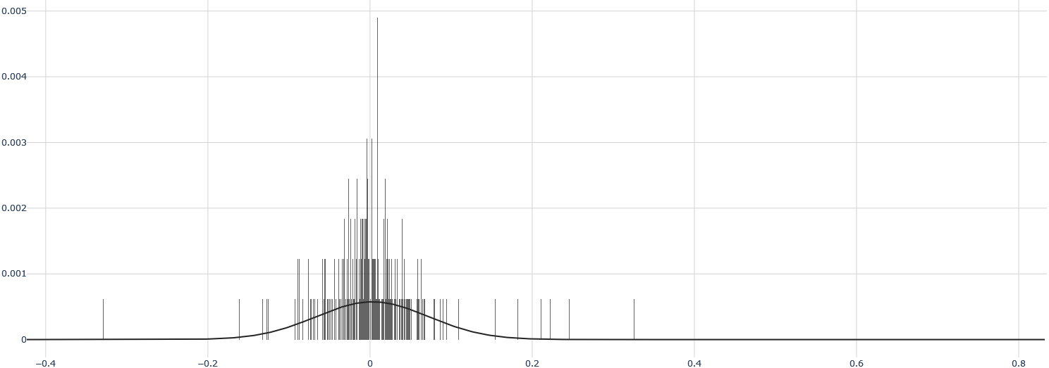
The image displays a histogram with an overlaid density curve. The histogram represents the distribution of a single variable, with values ranging approximately from -0.4 to 0.8. The density curve provides a smoothed estimate of the underlying probability distribution.
### Components/Axes
* **X-axis:** Ranges from -0.4 to 0.8, with tick marks at intervals of 0.2. The axis is labeled, but the label is not visible in the image.
* **Y-axis:** Ranges from 0 to 0.005, with tick marks at intervals of 0.001. The axis is labeled, but the label is not visible in the image. The Y-axis represents frequency or density.
* **Histogram:** Composed of numerous vertical bars representing the frequency of values within specific bins.
* **Density Curve:** A smooth, black curve overlaid on the histogram, estimating the probability density function of the data.
### Detailed Analysis
The histogram shows a highly skewed distribution. The majority of the data is concentrated around 0, with a sharp peak. There is a long tail extending towards the right (positive values).
* **Peak:** The highest frequency occurs around x = 0, with a density of approximately 0.0045.
* **Left Side:** From -0.4 to approximately -0.1, the density is very low, close to 0.
* **Right Side:** From approximately 0.1 to 0.8, the density decreases gradually, with some minor fluctuations.
* **Density Curve Trend:** The density curve closely follows the shape of the histogram, peaking at x = 0 and decreasing as it moves away from 0. The curve is smooth and provides a general representation of the distribution.
### Key Observations
* The distribution is strongly right-skewed.
* There is a high concentration of data points near 0.
* The density decreases rapidly as the values move away from 0 in both directions, but more slowly towards positive values.
* The histogram has a large number of narrow bins, providing a detailed view of the distribution.
### Interpretation
The data suggests a variable where values are predominantly close to zero, with a smaller number of significantly positive values. This could represent a variety of phenomena, such as:
* **Residuals from a regression model:** If this is a histogram of residuals, it suggests the model may not be perfectly capturing the relationship between variables, as the residuals are not normally distributed.
* **Changes or differences:** The variable could represent changes or differences between two measurements, where most changes are small and close to zero, but some are larger and positive.
* **Rates or proportions:** The variable could represent a rate or proportion, where most values are small, but some are larger.
The density curve provides a smoothed representation of the distribution, highlighting the overall shape and central tendency. The skewness indicates that the mean and median of the distribution are likely to be different, with the mean being greater than the median. The presence of a long tail suggests that there may be outliers or extreme values in the data. Without knowing the context of the variable, it is difficult to draw more specific conclusions.