## Line Graph: Normal Distribution with Error Bars
### Overview
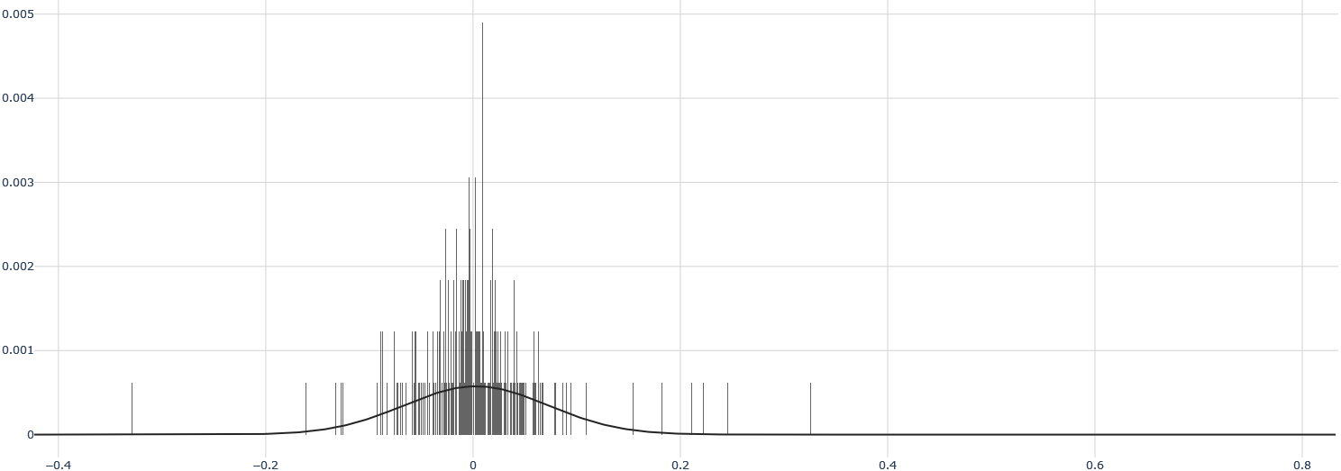
The image depicts a line graph representing a normal distribution curve with superimposed error bars. The x-axis spans from -0.4 to 0.8, while the y-axis ranges from 0 to 0.005. The graph includes a smooth black line forming a bell-shaped curve and vertical error bars clustered around the center. The legend is positioned at the bottom-right but contains no visible text or labels.
### Components/Axes
- **X-Axis**: Labeled with approximate values at intervals: -0.4, -0.2, 0, 0.2, 0.4, 0.6, 0.8. No explicit title is visible.
- **Y-Axis**: Labeled with approximate values at intervals: 0.001, 0.002, 0.003, 0.004, 0.005. No explicit title is visible.
- **Legend**: Located at the bottom-right corner but empty (no labels or color keys).
- **Grid**: Light gray grid lines span the entire plot area.
- **Main Line**: A smooth black curve forming a normal distribution, peaking at x=0 with a y-value of approximately 0.002.
- **Error Bars**: Vertical black lines clustered around the center (x=0), with heights decreasing symmetrically toward the edges. Heights range from ~0.001 to ~0.004.
### Detailed Analysis
- **Main Line**: The curve follows a Gaussian distribution, peaking at x=0 (y≈0.002) and tapering off to near-zero values at x=±0.4. The curve is symmetric, with no visible anomalies.
- **Error Bars**:
- Tallest bars (~0.004) are centered at x=0, decreasing in height as x moves away from 0.
- Bars become sparser and shorter beyond x=±0.2, with minimal presence beyond x=±0.4.
- Heights suggest variability in measurements, with standard deviations likely decreasing away from the mean.
### Key Observations
1. **Symmetry**: The distribution and error bars are symmetric about x=0.
2. **Peak Variability**: The highest error bars (0.004) align with the curve’s maximum, indicating maximum uncertainty at the mean.
3. **Tapered Distribution**: Both the curve and error bars diminish rapidly beyond x=±0.2, suggesting limited data or confidence in extreme values.
4. **Missing Legend Text**: The legend’s absence of labels implies either a generic plot or omitted contextual information.
### Interpretation
The graph likely represents a dataset with a central tendency around x=0, where measurements cluster most densely. The error bars’ heights and distribution suggest:
- **Highest Uncertainty at the Mean**: The tallest error bars at x=0 imply greater variability or measurement error near the central value.
- **Confidence in Central Values**: The curve’s peak and dense error bars indicate strong agreement in measurements around x=0.
- **Rapid Decline in Confidence**: The sharp drop in error bar heights and curve amplitude beyond x=±0.2 suggests limited data or lower confidence in extreme values.
The absence of a legend title or axis labels reduces interpretability, but the visual structure strongly aligns with a normal distribution model. The error bars may represent standard deviations or confidence intervals, though their exact meaning remains unclear without textual clarification.