## Line Chart: Attention Key Query Score, a=24
### Overview
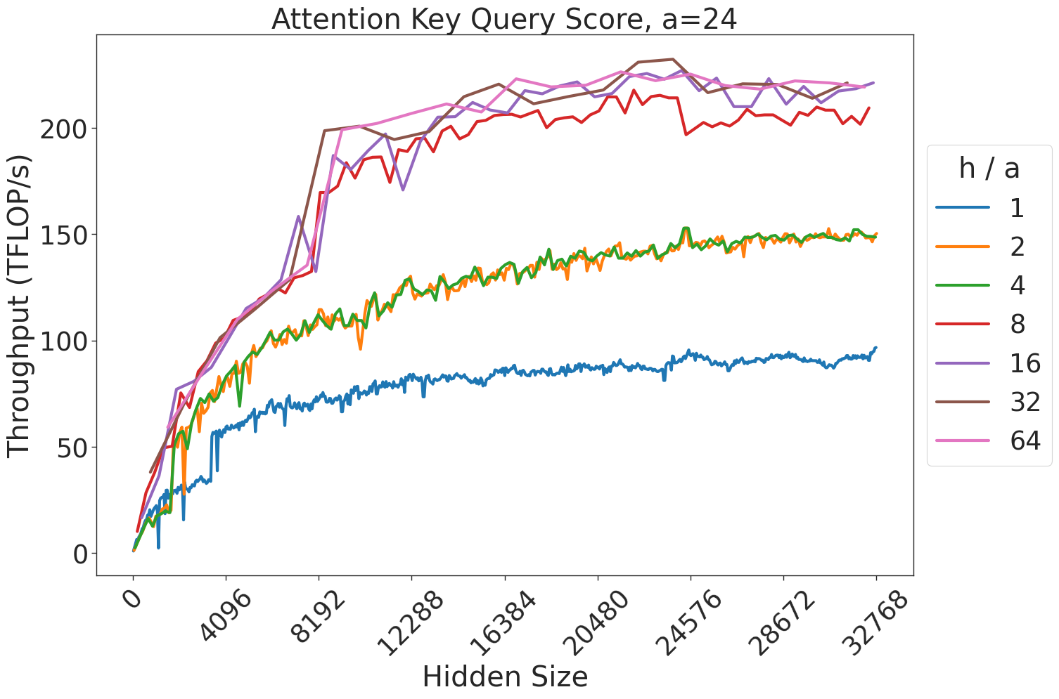
This chart illustrates the relationship between "Hidden Size" (x-axis) and "Throughput (TFLOP/s)" (y-axis) for an attention mechanism, specifically parameterized with a constant `a=24`. The chart displays seven distinct data series, each representing a different "h / a" ratio. The data demonstrates how computational throughput scales as the hidden size increases, with distinct performance tiers based on the "h / a" ratio.
### Components/Axes
* **Title:** "Attention Key Query Score, a=24"
* **Y-Axis:** "Throughput (TFLOP/s)". The scale ranges from 0 to 250, with major tick marks at 0, 50, 100, 150, 200.
* **X-Axis:** "Hidden Size". The scale ranges from 0 to 32768, with major tick marks at 0, 4096, 8192, 12288, 16384, 20480, 24576, 28672, 32768.
* **Legend:** Located on the right side of the chart. It is titled "h / a" and maps colors to specific ratios:
* **Blue:** 1
* **Orange:** 2
* **Green:** 4
* **Red:** 8
* **Purple:** 16
* **Brown:** 32
* **Pink:** 64
### Detailed Analysis
The data series exhibit a consistent trend: a sharp, near-linear increase in throughput as the hidden size increases from 0 to approximately 8192, followed by a plateau or a much slower rate of growth as the hidden size continues to increase toward 32768.
The data series cluster into four distinct performance tiers:
1. **Tier 1 (Lowest Throughput):**
* **Series:** Blue (h/a = 1).
* **Trend:** Starts at 0, rises to ~60 TFLOP/s at 4096, and plateaus around 80–90 TFLOP/s for the remainder of the x-axis.
2. **Tier 2 (Mid-Low Throughput):**
* **Series:** Orange (h/a = 2) and Green (h/a = 4).
* **Trend:** These two lines are almost perfectly overlapping. They rise to ~100 TFLOP/s at 8192 and plateau around 150 TFLOP/s.
3. **Tier 3 (Mid-High Throughput):**
* **Series:** Red (h/a = 8).
* **Trend:** Rises to ~130 TFLOP/s at 8192 and plateaus around 200–210 TFLOP/s. This line exhibits more volatility (noise) compared to the others.
4. **Tier 4 (Highest Throughput):**
* **Series:** Purple (h/a = 16), Brown (h/a = 32), and Pink (h/a = 64).
* **Trend:** These three lines are tightly clustered. They rise very sharply to ~200 TFLOP/s at 8192 and plateau between 220–230 TFLOP/s.
### Key Observations
* **Saturation Point:** There is a clear "knee" in the curves at a Hidden Size of approximately 8192. Beyond this point, increasing the hidden size yields diminishing returns in throughput, suggesting a hardware bottleneck (likely memory bandwidth or cache capacity).
* **Clustering:** The performance is not linear with respect to the "h/a" ratio. The gap between h/a=1 and h/a=2 is significant, as is the gap between h/a=4 and h/a=8. However, the performance difference between h/a=16, 32, and 64 is negligible, indicating that the system reaches peak efficiency at an h/a ratio of 16.
* **Volatility:** The Red line (h/a=8) shows higher variance in its throughput measurements compared to the smoother curves of the other series.
### Interpretation
This chart likely represents a performance benchmark for a Transformer attention kernel (such as FlashAttention).
* **"h/a" Ratio:** This likely represents the ratio of the number of attention heads (h) to the attention dimension (a).
* **Hardware Constraints:** The plateauing behavior is characteristic of GPU memory hierarchy limitations. The initial steep rise represents the compute-bound phase where the GPU is effectively utilized. The plateau represents the memory-bound phase where the GPU is waiting for data, or the compute units are saturated.
* **Optimization Insight:** The clustering of the top three lines (16, 32, 64) suggests that for this specific hardware configuration and attention implementation, increasing the number of heads beyond a certain point (relative to the attention dimension) provides no additional throughput benefit. Engineers should target an h/a ratio of 16 to maximize efficiency without wasting resources on higher ratios that do not improve performance.