\n
## Scatter Plots: Correlation Analysis
### Overview
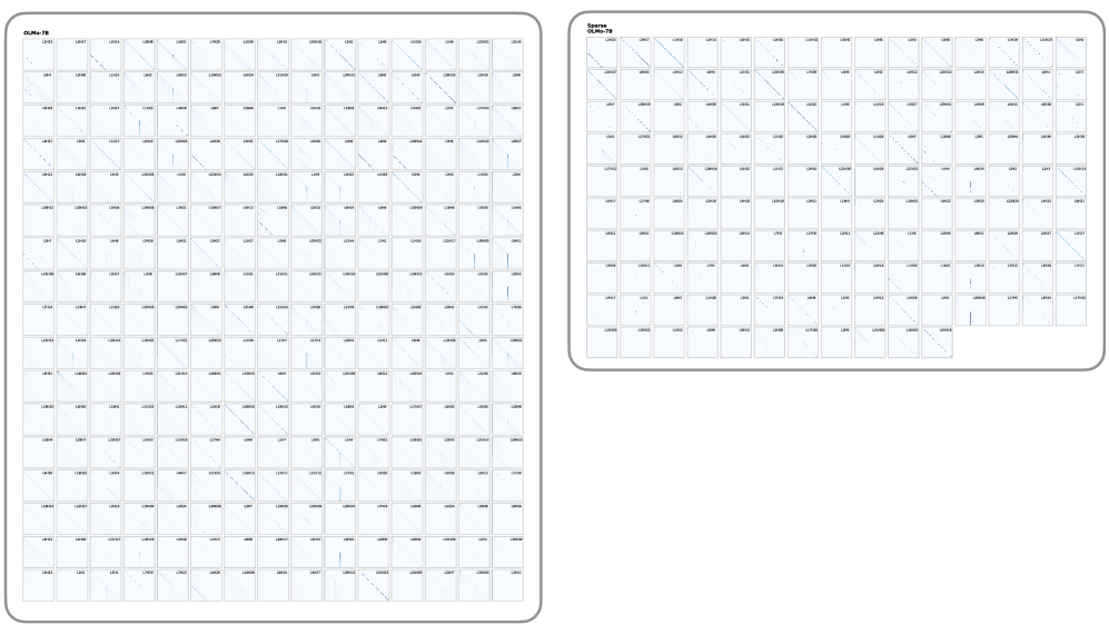
The image contains two scatter plots, both displaying a positive correlation between two variables. Each plot consists of a grid of points, with labels along the x and y axes indicating the variables being compared. The plots appear to be examining the relationship between "SPKM" and "CLPM-70" in the left plot, and "SPKM" and "CLPM-70" in the right plot.
### Components/Axes
**Left Plot:**
* **Title:** "SPKM vs CLPM-70" (top-center)
* **X-axis Label:** "CLPM-70" (bottom-center)
* Axis Markers: "LNP1", "LNP2", "LNP3", "LNP4", "LNP5", "LNP6", "LNP7", "LNP8", "LNP9", "LNP10", "LNP11", "LNP12", "LNP13", "LNP14", "LNP15", "LNP16", "LNP17", "LNP18", "LNP19", "LNP20"
* **Y-axis Label:** "SPKM" (left-center)
* Axis Markers: "LNP1", "LNP2", "LNP3", "LNP4", "LNP5", "LNP6", "LNP7", "LNP8", "LNP9", "LNP10", "LNP11", "LNP12", "LNP13", "LNP14", "LNP15", "LNP16", "LNP17", "LNP18", "LNP19", "LNP20"
* **Data Points:** A grid of approximately 20x20 points. A blue line is drawn through the points, indicating a positive trend.
**Right Plot:**
* **Title:** "SPKM vs CLPM-70" (top-center)
* **X-axis Label:** "CLPM-70" (bottom-center)
* Axis Markers: "LNP1", "LNP2", "LNP3", "LNP4", "LNP5", "LNP6", "LNP7", "LNP8", "LNP9", "LNP10", "LNP11", "LNP12", "LNP13", "LNP14", "LNP15", "LNP16", "LNP17", "LNP18", "LNP19", "LNP20"
* **Y-axis Label:** "SPKM" (left-center)
* Axis Markers: "LNP1", "LNP2", "LNP3", "LNP4", "LNP5", "LNP6", "LNP7", "LNP8", "LNP9", "LNP10", "LNP11", "LNP12", "LNP13", "LNP14", "LNP15", "LNP16", "LNP17", "LNP18", "LNP19", "LNP20"
* **Data Points:** A grid of approximately 20x20 points. A blue line is drawn through the points, indicating a positive trend.
### Detailed Analysis or Content Details
Both plots show a clear positive correlation. As the value of "CLPM-70" increases along the x-axis, the value of "SPKM" also tends to increase along the y-axis. The blue lines in both plots approximate the trend.
**Left Plot:**
The line slopes upwards from the bottom-left to the top-right. The points are scattered around the line, but the overall trend is evident. It is difficult to extract precise numerical values from the points without a higher-resolution image. However, it appears that for "CLPM-70" values around "LNP1", "SPKM" values are around "LNP1-LNP3". As "CLPM-70" increases to "LNP20", "SPKM" values increase to around "LNP15-LNP20".
**Right Plot:**
Similar to the left plot, the line slopes upwards. The points are scattered around the line, but the positive correlation is clear. For "CLPM-70" values around "LNP1", "SPKM" values are around "LNP1-LNP3". As "CLPM-70" increases to "LNP20", "SPKM" values increase to around "LNP15-LNP20".
### Key Observations
* Both plots exhibit a strong positive correlation between "SPKM" and "CLPM-70".
* The scatter of points around the trend line suggests that the correlation is not perfect, and other factors may influence the relationship between these variables.
* The scales on both axes are identical in both plots.
* The plots appear to represent the same data, as the trends and point distributions are very similar.
### Interpretation
The data suggests a direct relationship between "SPKM" and "CLPM-70". An increase in "CLPM-70" is associated with an increase in "SPKM". This could indicate a causal relationship, where "CLPM-70" influences "SPKM", or a shared underlying factor that affects both variables. The scatter around the trend line suggests that the relationship is not deterministic, and other variables likely play a role. The fact that both plots show the same trend suggests the data is consistent and reliable. Without knowing what "SPKM" and "CLPM-70" represent, it is difficult to provide a more specific interpretation. However, the plots provide strong evidence of a positive association between these two variables. The "LNP" labels likely refer to specific samples or experimental conditions. Further investigation would be needed to understand the context and significance of this correlation.