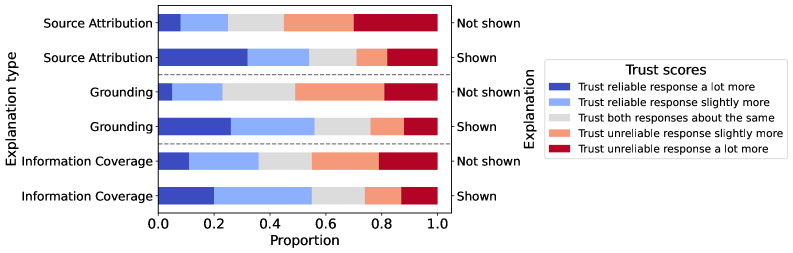
## Stacked Bar Chart: Trust Scores by Explanation Type
### Overview
The image is a stacked bar chart comparing trust scores for different explanation types (Source Attribution, Grounding, Information Coverage) based on whether the explanation is shown or not. The chart visualizes the proportion of responses that trust the reliable response more, trust both responses the same, or trust the unreliable response more.
### Components/Axes
* **Y-axis:** "Explanation type" with categories: Source Attribution, Grounding, Information Coverage. Each category is further divided into "Not shown" and "Shown".
* **X-axis:** "Proportion" ranging from 0.0 to 1.0 in increments of 0.2.
* **Legend (top-right):** "Trust scores"
* Dark Blue: "Trust reliable response a lot more"
* Light Blue: "Trust reliable response slightly more"
* Gray: "Trust both responses about the same"
* Light Orange: "Trust unreliable response slightly more"
* Dark Red: "Trust unreliable response a lot more"
### Detailed Analysis
**Source Attribution:**
* **Not shown:**
* Trust reliable response a lot more: ~10%
* Trust reliable response slightly more: ~20%
* Trust both responses about the same: ~20%
* Trust unreliable response slightly more: ~25%
* Trust unreliable response a lot more: ~25%
* **Shown:**
* Trust reliable response a lot more: ~30%
* Trust reliable response slightly more: ~25%
* Trust both responses about the same: ~20%
* Trust unreliable response slightly more: ~15%
* Trust unreliable response a lot more: ~10%
**Grounding:**
* **Not shown:**
* Trust reliable response a lot more: ~10%
* Trust reliable response slightly more: ~15%
* Trust both responses about the same: ~30%
* Trust unreliable response slightly more: ~25%
* Trust unreliable response a lot more: ~20%
* **Shown:**
* Trust reliable response a lot more: ~25%
* Trust reliable response slightly more: ~30%
* Trust both responses about the same: ~25%
* Trust unreliable response slightly more: ~10%
* Trust unreliable response a lot more: ~10%
**Information Coverage:**
* **Not shown:**
* Trust reliable response a lot more: ~15%
* Trust reliable response slightly more: ~20%
* Trust both responses about the same: ~20%
* Trust unreliable response slightly more: ~25%
* Trust unreliable response a lot more: ~20%
* **Shown:**
* Trust reliable response a lot more: ~30%
* Trust reliable response slightly more: ~25%
* Trust both responses about the same: ~15%
* Trust unreliable response slightly more: ~15%
* Trust unreliable response a lot more: ~15%
### Key Observations
* Showing the explanation generally increases the proportion of responses that "Trust reliable response a lot more" and "Trust reliable response slightly more" across all explanation types.
* Conversely, showing the explanation generally decreases the proportion of responses that "Trust unreliable response a lot more" and "Trust unreliable response slightly more" across all explanation types.
* The "Trust both responses about the same" category tends to be relatively stable, but slightly decreases when the explanation is shown.
* The effect of showing the explanation is most pronounced for "Source Attribution" and "Information Coverage".
### Interpretation
The data suggests that providing explanations, regardless of the type (Source Attribution, Grounding, or Information Coverage), tends to increase trust in reliable responses and decrease trust in unreliable responses. This indicates that explanations are generally helpful in guiding users to make more informed judgments about the reliability of information. The magnitude of the effect varies slightly depending on the explanation type, but the overall trend is consistent. The chart highlights the importance of providing explanations to users to improve their ability to discern reliable information from unreliable information.