## Horizontal Bar Chart: Explanation Type vs. Trust Scores
### Overview
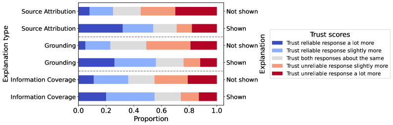
The image is a horizontal bar chart comparing trust scores across three explanation types ("Source Attribution," "Grounding," and "Information Coverage") for two conditions: "Not shown" and "Shown." The x-axis represents the proportion of responses, while the y-axis categorizes explanation types and their visibility status. A legend maps four trust score categories to colors: dark blue ("Trust reliable response a lot more"), light blue ("Trust reliable response slightly more"), gray ("Trust both responses about the same"), and red ("Trust unreliable response a lot more").
### Components/Axes
- **Y-Axis (Explanation Type)**:
- Categories: "Source Attribution," "Grounding," "Information Coverage."
- Subcategories: "Not shown" (top half) and "Shown" (bottom half) for each explanation type.
- **X-Axis (Proportion)**:
- Scale: 0.0 to 1.0 in increments of 0.2.
- **Legend**:
- Position: Right side of the chart.
- Colors:
- Dark blue: "Trust reliable response a lot more"
- Light blue: "Trust reliable response slightly more"
- Gray: "Trust both responses about the same"
- Red: "Trust unreliable response a lot more"
### Detailed Analysis
1. **Source Attribution**:
- **Not shown**:
- Dark blue (trust reliable a lot more): ~0.1
- Light blue (slightly more): ~0.2
- Gray (both same): ~0.3
- Red (unreliable a lot more): ~0.4
- **Shown**:
- Dark blue: ~0.3
- Light blue: ~0.2
- Gray: ~0.1
- Red: ~0.4
2. **Grounding**:
- **Not shown**:
- Dark blue: ~0.1
- Light blue: ~0.3
- Gray: ~0.2
- Red: ~0.4
- **Shown**:
- Dark blue: ~0.2
- Light blue: ~0.3
- Gray: ~0.1
- Red: ~0.4
3. **Information Coverage**:
- **Not shown**:
- Dark blue: ~0.1
- Light blue: ~0.3
- Gray: ~0.4
- Red: ~0.2
- **Shown**:
- Dark blue: ~0.2
- Light blue: ~0.3
- Gray: ~0.2
- Red: ~0.3
### Key Observations
- **Source Attribution**:
- "Not shown" has a higher proportion of responses where users trust the reliable response "a lot more" (dark blue) compared to "Shown."
- The "unreliable a lot more" (red) category remains consistent (~0.4) in both conditions.
- **Grounding**:
- "Not shown" shows a higher proportion of "slightly more" trust (light blue) compared to "Shown."
- The "both same" (gray) category is lower in "Not shown" (~0.2) than in "Shown" (~0.1).
- **Information Coverage**:
- "Not shown" has the highest "both same" (gray) proportion (~0.4), while "Shown" shows a more balanced distribution.
- The "unreliable a lot more" (red) category is lowest in "Not shown" (~0.2) compared to "Shown" (~0.3).
### Interpretation
The data suggests that explanations **not shown** are perceived as more reliable in **Source Attribution** and **Grounding**, with higher trust in "reliable a lot more" (dark blue) and "slightly more" (light blue) categories. For **Information Coverage**, the "both same" (gray) category dominates when explanations are not shown, indicating neutrality. When explanations are **shown**, trust in reliability decreases slightly, and the "unreliable a lot more" (red) category increases, particularly in **Information Coverage**. This could imply that over-explaining or unnecessary details might reduce perceived reliability, while omitting explanations might lead to assumptions of higher trustworthiness. The consistency of the "unreliable a lot more" (red) category across conditions suggests that some users inherently distrust certain explanations regardless of visibility.