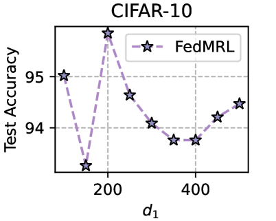
## Line Chart: CIFAR-10 Test Accuracy vs. d1
### Overview
The image is a line chart displaying the test accuracy of the FedMRL model on the CIFAR-10 dataset, plotted against the parameter 'd1'. The chart shows how the test accuracy changes as the value of 'd1' varies.
### Components/Axes
* **Title:** CIFAR-10
* **X-axis:**
* Label: d1
* Scale: Approximately linear, with marked values at 200 and 400.
* **Y-axis:**
* Label: Test Accuracy
* Scale: Linear, ranging from 94 to 95.
* **Legend:** Located in the top-right corner of the chart.
* Entry: FedMRL, represented by a dashed light purple line with star markers.
### Detailed Analysis
The chart contains one data series:
* **FedMRL (light purple, dashed line with star markers):**
* The line starts at approximately (100, 95).
* It then decreases to approximately (150, 93.2).
* It sharply increases to approximately (200, 95.8).
* It decreases to approximately (250, 94.6).
* It continues to decrease to approximately (300, 94.1).
* It decreases further to approximately (350, 93.8).
* It reaches a local minimum at approximately (400, 93.8).
* It increases to approximately (450, 94.2).
* It increases again to approximately (500, 94.4).
### Key Observations
* The test accuracy of FedMRL fluctuates significantly with changes in 'd1'.
* There is a sharp peak in accuracy around d1 = 200.
* The accuracy reaches a local minimum around d1 = 400.
### Interpretation
The chart suggests that the performance of the FedMRL model is sensitive to the parameter 'd1'. The peak in accuracy at d1 = 200 indicates an optimal setting for this parameter, while the drop in accuracy around d1 = 400 suggests a less favorable configuration. Further investigation is needed to understand the relationship between 'd1' and the model's performance.