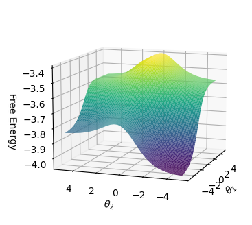
## 3D Surface Plot: Free Energy vs. θ1 and θ2
### Overview
The image is a 3D surface plot visualizing the relationship between Free Energy and two variables, θ1 and θ2. The surface is colored to represent the magnitude of the Free Energy, with warmer colors (yellow) indicating higher values and cooler colors (purple) indicating lower values. The plot shows a landscape with a peak and a valley, suggesting an optimization problem where the goal might be to minimize the Free Energy.
### Components/Axes
* **Vertical Axis (Free Energy):** Ranges from -4.0 to -3.4.
* **Horizontal Axes:**
* θ1: Ranges from -4 to 4.
* θ2: Ranges from -5 to 5.
* **Color Mapping:** The surface is colored according to the Free Energy value.
### Detailed Analysis
The surface plot shows a clear relationship between the variables θ1, θ2, and the Free Energy.
* **Peak:** There is a peak located approximately at θ1 = 0 and θ2 = 0, where the Free Energy reaches its maximum value of approximately -3.4. The color in this region is yellow.
* **Valley:** There is a valley located approximately at θ1 = -4 and θ2 = -5, where the Free Energy reaches its minimum value of approximately -4.0. The color in this region is purple.
* **Trends:** As θ1 and θ2 move away from the peak, the Free Energy generally decreases, forming a valley.
### Key Observations
* The plot suggests an optimization problem where the goal is to minimize the Free Energy.
* The peak and valley represent local maxima and minima of the Free Energy function.
* The color gradient provides a visual representation of the Free Energy landscape.
### Interpretation
The 3D surface plot visualizes the Free Energy landscape as a function of two variables, θ1 and θ2. The plot reveals the presence of a peak and a valley, indicating local maxima and minima of the Free Energy function. This suggests an optimization problem where the goal might be to find the values of θ1 and θ2 that minimize the Free Energy. The color gradient provides a visual representation of the Free Energy landscape, allowing for easy identification of regions with high and low Free Energy values. The plot is useful for understanding the relationship between the variables and the Free Energy, and for guiding the optimization process.