## Histograms: Statistical Distribution of Tensor Samples
### Overview
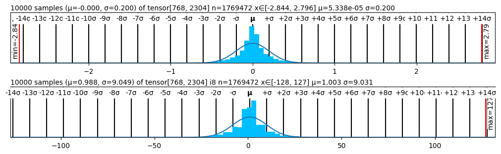
The image displays two vertically stacked histograms, each visualizing the distribution of 10,000 samples drawn from a specific tensor. Both plots include a histogram (blue bars), a fitted normal distribution curve (black line), and extensive statistical annotations. The top histogram (A) shows a tightly clustered distribution, while the bottom histogram (B) shows a much wider, more spread-out distribution.
### Components/Axes
**Histogram A (Top Plot):**
* **Title:** `10000 samples (μ=-0.000, σ=0.200) of tensor[768, 2304] n=1769472 x∈[-2.844, 2.796] μ=5.338e-05 σ=0.200`
* **X-Axis (Top Scale - Standard Deviations):** Markers from `-14σ` to `+14σ`, with a central marker labeled `μ`.
* **X-Axis (Bottom Scale - Actual Values):** Major ticks at `-2`, `-1`, `0`, `1`, `2`.
* **Vertical Reference Lines:**
* Left (Red): `min=-2.84`
* Right (Red): `max=2.79`
* **Data Series:** Blue histogram bars and a black fitted normal distribution curve.
**Histogram B (Bottom Plot):**
* **Title:** `10000 samples (μ=0.988, σ=9.049) of tensor[768, 2304] i8 n=1769472 x∈[-128, 127] μ=1.003 σ=9.031`
* **X-Axis (Top Scale - Standard Deviations):** Markers from `-14σ` to `+14σ`, with a central marker labeled `μ`.
* **X-Axis (Bottom Scale - Actual Values):** Major ticks at `-100`, `-50`, `0`, `50`, `100`.
* **Vertical Reference Lines:**
* Left (Red): `min=-128`
* Right (Red): `max=127`
* **Data Series:** Blue histogram bars and a black fitted normal distribution curve.
### Detailed Analysis
**Histogram A (Top):**
* **Data Source:** 10,000 samples from a tensor of shape `[768, 2304]` with a total of 1,769,472 elements.
* **Reported Statistics (Title):** Sample mean (μ) = -0.000, Sample standard deviation (σ) = 0.200. Theoretical/Population mean = 5.338e-05 (≈0), Theoretical/Population σ = 0.200.
* **Value Range:** The samples range from approximately -2.844 to 2.796.
* **Visual Trend:** The distribution is symmetric and bell-shaped, centered at 0. The vast majority of data points fall within ±1σ (±0.2), with the histogram bars and fitted curve showing a sharp peak. The data is tightly confined, with the min/max lines at approximately ±14σ from the mean.
**Histogram B (Bottom):**
* **Data Source:** 10,000 samples from a tensor of shape `[768, 2304]` (type `i8`, likely 8-bit integer) with a total of 1,769,472 elements.
* **Reported Statistics (Title):** Sample mean (μ) = 0.988, Sample standard deviation (σ) = 9.049. Theoretical/Population mean = 1.003, Theoretical/Population σ = 9.031.
* **Value Range:** The samples range from -128 to 127, which are the exact limits for a signed 8-bit integer (`i8`).
* **Visual Trend:** The distribution is also symmetric and bell-shaped, but centered near 1.0. It is significantly wider than Histogram A. The histogram bars and fitted curve show a broader peak. The data spans almost the entire possible range for the `i8` data type, with the min/max lines at the type's limits, which are approximately ±14σ from the mean.
### Key Observations
1. **Scale Discrepancy:** The two histograms visualize data from tensors of identical shape but with vastly different scales and likely different data types. Histogram A has a range of ~5.6 units (σ=0.2), while Histogram B has a range of 255 units (σ≈9.0).
2. **Data Type Constraint:** Histogram B's minimum and maximum values (-128, 127) are hard limits imposed by the `i8` data type, indicating the data is quantized or clipped to this range.
3. **Statistical Consistency:** For both plots, the sample statistics (μ, σ) closely match the theoretical/population statistics listed in the title, suggesting the 10,000 samples are representative of the full tensor population.
4. **Distribution Shape:** Both datasets follow an approximately normal (Gaussian) distribution, as evidenced by the symmetric bell curve of the histogram and the fitted line.
### Interpretation
This image is a diagnostic tool for analyzing the statistical properties of two tensors, likely from a machine learning model (given the tensor shape `[768, 2304]`, common in transformer architectures).
* **Histogram A** likely represents **activations or weights in a normalized, floating-point format**. The mean of 0 and small standard deviation are characteristic of data that has been standardized (e.g., via LayerNorm) or initialized with a specific distribution (e.g., Xavier/Glorot).
* **Histogram B** likely represents the **same or similar data after quantization to an 8-bit integer format (`i8`)**. The shift in mean to ~1.0 and the large standard deviation relative to the data type's range suggest the quantization process mapped the original floating-point distribution onto the integer scale. The fact that the distribution fills the `i8` range indicates efficient use of the available bit representation, though the tails are clipped at -128 and 127.
* **The Comparison** demonstrates the effect of quantization: a tightly clustered, normalized floating-point distribution (A) is stretched and shifted to occupy the full dynamic range of a low-precision integer type (B). This is a common step in model compression for efficient inference. The close match between sample and population statistics validates that the sampling process is accurate for monitoring these distributions.