\n
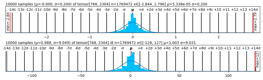
## Histograms: Distribution of Tensor Values
### Overview
The image presents two histograms, stacked vertically. Each histogram visualizes the distribution of values within a tensor. The histograms display the frequency of values within bins, overlaid with a smooth curve representing the estimated probability density function. Key statistical parameters (mean, standard deviation, minimum, maximum, and tensor shape) are provided for each distribution.
### Components/Axes
Each histogram shares the following components:
* **X-axis:** Represents the value range of the tensor elements. The scale is linear, marked in increments of 10.
* **Y-axis:** Represents the frequency or count of values falling within each bin. The scale is labeled with "min" and "max" values.
* **Histogram Bars:** Vertical bars representing the frequency of values within each bin.
* **Probability Density Curve:** A smooth blue curve overlaid on the histogram, approximating the probability density function of the data.
* **Markers:** Vertical lines indicating the mean (μ) and standard deviation (σ) of the distribution. Additional markers indicate +/– 2σ, +/– 3σ, etc.
* **Textual Information:** Above each histogram, text provides the number of samples (n), the tensor shape, the mean (μ), and the standard deviation (σ). The min and max values are displayed on the left and right sides of the histograms.
**Histogram 1 (Top):**
* Number of samples (n): 1769472
* Tensor shape: [768, 2304]
* Mean (μ): -0.000
* Standard deviation (σ): 0.200
* X-axis range: Approximately -140 to +140
* Y-axis range: min = 0.14, max = 2.79
* μ is located at 0.
**Histogram 2 (Bottom):**
* Number of samples (n): 1769472
* Tensor shape: [128, 127]
* Mean (μ): 0.988
* Standard deviation (σ): 0.049
* X-axis range: Approximately -140 to +140
* Y-axis range: min = 0, max = 127
* μ is located at approximately 1.
### Detailed Analysis or Content Details
**Histogram 1:**
The distribution is approximately centered around 0, with a standard deviation of 0.2. The curve is roughly symmetrical. The histogram shows a high concentration of values near 0, with a rapid decline in frequency as values move away from 0 in either direction. The probability density curve closely follows the shape of the histogram.
* Approximately 80% of the data falls within the range of -0.4 to 0.4 (μ ± 2σ).
* The maximum frequency occurs around the mean (0).
* The minimum value observed is approximately 0.14.
* The maximum value observed is approximately 2.79.
**Histogram 2:**
The distribution is centered around 0.988, with a standard deviation of 0.049. The curve is roughly symmetrical. The histogram shows a high concentration of values near 0.988, with a rapid decline in frequency as values move away from 0.988 in either direction. The probability density curve closely follows the shape of the histogram.
* Approximately 95% of the data falls within the range of 0.89 to 1.08 (μ ± 2σ).
* The maximum frequency occurs around the mean (0.988).
* The minimum value observed is 0.
* The maximum value observed is 127.
### Key Observations
* The first histogram exhibits a distribution with a smaller range and lower maximum frequency compared to the second histogram.
* The second histogram has a much larger maximum value (127) than the first (2.79), indicating a wider range of values.
* Both distributions appear approximately normal, as indicated by the symmetrical shape of the histograms and the smooth probability density curves.
* The standard deviation of the second histogram is significantly smaller than that of the first, suggesting a more concentrated distribution.
### Interpretation
These histograms likely represent the distribution of values within the weights or activations of a neural network layer. The first histogram, with a mean near 0 and a small standard deviation, could represent a layer with values constrained to a narrow range, potentially due to regularization or initialization. The second histogram, with a mean around 1 and a wider range of values, could represent a layer with more variability in its values. The difference in tensor shapes ([768, 2304] vs. [128, 127]) suggests these histograms represent different layers or components within the network. The large maximum value in the second histogram (127) could indicate that the values are quantized or clipped. The overall shape of the distributions provides insight into the learning process and the characteristics of the network's parameters. The fact that both distributions are roughly normal suggests that the network is not suffering from extreme gradient issues (like exploding gradients) during training.