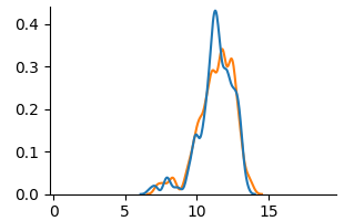
## Chart: Density Plot
### Overview
The image is a density plot showing two overlapping distributions, one in blue and one in orange. The x-axis ranges from 0 to 15, and the y-axis ranges from 0 to 0.4. Both distributions peak around x=11.
### Components/Axes
* **X-axis:** Ranges from 0 to 15, with tick marks at 0, 5, 10, and 15.
* **Y-axis:** Ranges from 0.0 to 0.4, with tick marks at 0.0, 0.1, 0.2, 0.3, and 0.4.
* **Blue Line:** Represents one distribution.
* **Orange Line:** Represents another distribution.
### Detailed Analysis
* **Blue Line:**
* Starts near 0 at x=0.
* Increases to a small peak around x=7.5 with a value of approximately 0.03.
* Decreases slightly, then increases sharply to a major peak around x=11 with a value of approximately 0.42.
* Decreases back to near 0 at x=15.
* **Orange Line:**
* Starts near 0 at x=0.
* Increases to a small peak around x=7.5 with a value of approximately 0.03.
* Decreases slightly, then increases sharply to a major peak around x=11 with a value of approximately 0.33.
* Decreases back to near 0 at x=15.
### Key Observations
* Both distributions have a similar shape, with a major peak around x=11 and a minor peak around x=7.5.
* The blue distribution has a higher peak at x=11 than the orange distribution.
* The distributions are very similar between x=0 and x=10.
### Interpretation
The density plot compares two distributions, showing that they are generally similar but with some differences in peak height. The blue distribution has a slightly higher concentration of values around x=11 compared to the orange distribution. The similarity in shape suggests that the underlying processes generating these distributions may be related. The peak at x=11 indicates a common central tendency for both datasets. The minor peak at x=7.5 suggests a secondary mode or influence in the data.