## Line Chart: Dual Distribution Comparison
### Overview
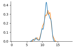
The image displays a 2D line chart comparing two data series, represented by a blue line and an orange line. Both series show a similar unimodal distribution pattern, rising from near-zero, peaking in the middle of the x-axis range, and then falling back to near-zero. The chart has a clean, minimalist style with no title, legend, or grid lines.
### Components/Axes
* **X-Axis (Horizontal):**
* **Label:** None explicitly stated.
* **Scale:** Linear scale from 0 to 15.
* **Major Tick Marks & Labels:** 0, 5, 10, 15.
* **Y-Axis (Vertical):**
* **Label:** None explicitly stated.
* **Scale:** Linear scale from 0.0 to 0.4.
* **Major Tick Marks & Labels:** 0.0, 0.1, 0.2, 0.3, 0.4.
* **Data Series:**
* **Series 1 (Blue Line):** A solid blue line.
* **Series 2 (Orange Line):** A solid orange line.
* **Legend:** Not present. Series are distinguished solely by color.
### Detailed Analysis
**Spatial Layout:** The chart area is centered. The y-axis is positioned on the left edge, and the x-axis is at the bottom. The data lines occupy the central region of the plot.
**Trend Verification & Data Points (Approximate):**
* **Blue Line Trend:** Starts near y=0 at x≈5. Shows a small local peak around x≈8 (y≈0.05). Rises steeply to a sharp global peak at approximately x=11.5, y=0.42. Descends steeply, crossing below the orange line around x=12.5, and returns to near y=0 by x≈14.
* **Orange Line Trend:** Follows a very similar path to the blue line but with less extreme peaks and valleys. Starts near y=0 at x≈5. Has a minor peak around x≈8 (y≈0.04). Rises to a broader, slightly lower global peak around x=11.5-12, with a maximum y-value of approximately 0.33. Descends and returns to near y=0 by x≈14.
**Key Coordinate Estimates:**
* **At x=5:** Both lines are at y≈0.
* **At x=8 (Local Peak):** Blue ≈ 0.05, Orange ≈ 0.04.
* **At x=10:** Blue ≈ 0.15, Orange ≈ 0.12.
* **At x=11.5 (Blue Peak):** Blue ≈ 0.42, Orange ≈ 0.30.
* **At x=12 (Orange Peak):** Blue ≈ 0.35, Orange ≈ 0.33.
* **At x=13:** Blue ≈ 0.10, Orange ≈ 0.15.
* **At x=14:** Both lines are at y≈0.
### Key Observations
1. **Strong Correlation:** The two data series are highly correlated in shape and timing, suggesting they measure similar phenomena or are derived from related processes.
2. **Peak Divergence:** The most significant difference is at the peak. The blue line's peak is sharper and approximately 27% higher (0.42 vs. 0.33) than the orange line's peak.
3. **Crossover Point:** The lines intersect twice: once near the base on the ascent (around x≈9) and once on the descent (around x≈12.5). After the second crossover, the orange line remains slightly above the blue line until they both converge at zero.
4. **Distribution Shape:** Both distributions are slightly right-skewed, with a steeper ascent on the left side of the peak and a slightly more gradual descent on the right.
### Interpretation
This chart likely compares the probability density functions (PDFs) or similar normalized frequency distributions of two related datasets. The x-axis could represent a measured variable (e.g., time, size, score), and the y-axis represents its probability density or relative frequency.
The data suggests that while both datasets share the same central tendency (peak around x=11.5) and range (5 to 14), they differ in **concentration**. The blue distribution is more concentrated around its mean, exhibiting higher kurtosis (a sharper peak). The orange distribution is more spread out, with a lower peak and slightly heavier tails, especially visible on the right side of the peak (x=12.5 to 13.5).
**Possible Contexts:**
* **Performance Metrics:** Comparing the error distributions of two models, where the blue model has a higher concentration of very low errors but also a slightly higher rate of moderate errors on the descent.
* **Sensor Data:** Comparing signal readings from two sensors, where one (blue) is more sensitive or has a higher gain, producing a stronger peak response.
* **Simulation Results:** Comparing outcomes from two slightly different simulation parameters, showing how a change affects the distribution's shape without shifting its center.
The absence of labels is a critical limitation for definitive interpretation. The key takeaway is the **morphological comparison**: two processes with identical location and scale but different shape parameters, specifically differing in peakedness (kurtosis).