## Chart: Test Loss vs. Compute
### Overview
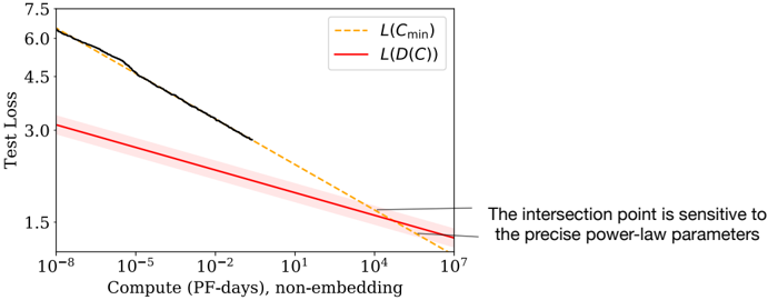
The image is a line chart showing the relationship between Test Loss and Compute (PF-days, non-embedding). There are two data series represented: L(Cmin) and L(D(C)). The x-axis (Compute) is on a logarithmic scale. The chart also includes a text annotation about the sensitivity of the intersection point.
### Components/Axes
* **X-axis:** Compute (PF-days, non-embedding). Logarithmic scale with markers at 10<sup>-8</sup>, 10<sup>-5</sup>, 10<sup>-2</sup>, 10<sup>1</sup>, 10<sup>4</sup>, and 10<sup>7</sup>.
* **Y-axis:** Test Loss. Linear scale with markers at 1.5, 3.0, 4.5, 6.0, and 7.5.
* **Legend:** Located at the top-right of the chart.
* L(Cmin): Represented by a dashed yellow line.
* L(D(C)): Represented by a solid red line with a shaded red region around it.
* **Annotation:** Located at the bottom-right of the chart. "The intersection point is sensitive to the precise power-law parameters."
### Detailed Analysis
* **L(Cmin) (Dashed Yellow Line):**
* Trend: Decreases as Compute increases.
* At Compute = 10<sup>-8</sup>, Test Loss ≈ 6.2.
* At Compute = 10<sup>7</sup>, Test Loss ≈ 1.3.
* **L(D(C) (Solid Red Line with Shaded Region):**
* Trend: Decreases as Compute increases. The shaded region indicates uncertainty or variability.
* At Compute = 10<sup>-8</sup>, Test Loss ≈ 3.0.
* At Compute = 10<sup>7</sup>, Test Loss ≈ 1.3.
* **Black Line:**
* Trend: Decreases as Compute increases.
* At Compute = 10<sup>-8</sup>, Test Loss ≈ 6.2.
* The black line transitions into the dashed yellow line around Compute = 10<sup>1</sup>.
### Key Observations
* Both L(Cmin) and L(D(C)) decrease as Compute increases, indicating that higher compute leads to lower test loss.
* The L(D(C)) data series has a shaded region, suggesting a range of possible values or uncertainty in the measurement.
* The black line initially follows a steeper decline than L(D(C)) and then merges into L(Cmin).
* The two lines intersect at a high Compute value, around 10<sup>7</sup>.
### Interpretation
The chart illustrates the relationship between computational resources (Compute) and the performance of a model (Test Loss). The decreasing trend of both L(Cmin) and L(D(C)) suggests that increasing the amount of computation generally improves model performance. The shaded region around L(D(C)) could represent the variance in performance due to different training runs or hyperparameter settings. The annotation highlights that the point at which the two lines intersect is sensitive to the specific parameters used in the power-law model, implying that small changes in these parameters can significantly affect the observed behavior. The black line represents the actual test loss, which transitions into the L(Cmin) line, suggesting that at higher compute values, the model's performance approaches the theoretical minimum loss.