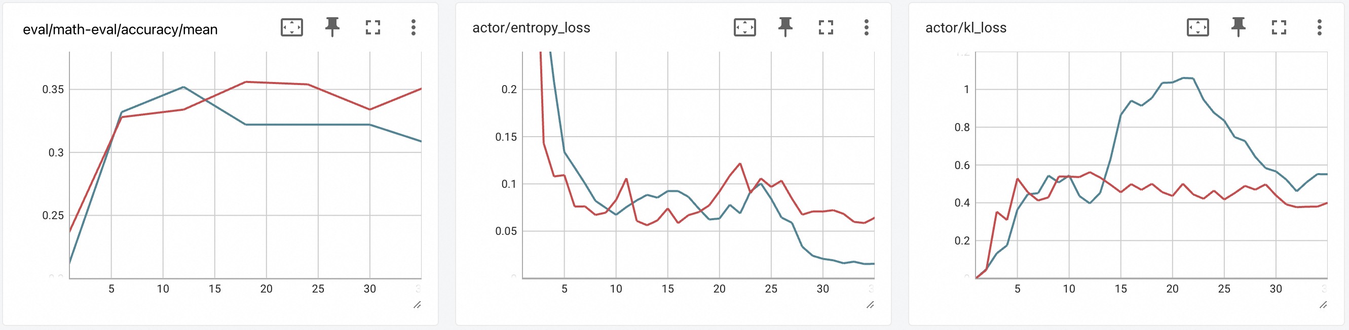
## Line Charts: Training Metrics
### Overview
The image presents three line charts displaying training metrics over iterations (denoted by 'it'). The charts track `eval/math-eval/accuracy/mean`, `actor/entropy_loss`, and `actor/KL_loss`. Each chart has two lines representing different data series. The x-axis represents iterations, ranging from approximately 0 to 30.
### Components/Axes
* **X-axis (all charts):** Iterations ('it'), ranging from 0 to 30, with tick marks at intervals of 5.
* **Y-axis (eval/math-eval/accuracy/mean):** Accuracy, ranging from approximately 0.24 to 0.36, with tick marks at intervals of 0.02.
* **Y-axis (actor/entropy_loss):** Entropy Loss, ranging from approximately 0.04 to 0.20, with tick marks at intervals of 0.02.
* **Y-axis (actor/KL_loss):** KL Loss, ranging from approximately 0.15 to 1.0, with tick marks at intervals of 0.2.
* **Legend (all charts):** Located at the top-right corner, containing two unnamed data series represented by different colored lines (red and teal). Each chart also has icons for full screen, download, and other functions.
### Detailed Analysis or Content Details
**Chart 1: eval/math-eval/accuracy/mean**
* **Red Line:** Starts at approximately 0.27 at iteration 0, increases to a peak of around 0.34 at iteration 7, then decreases to approximately 0.30 at iteration 15, and finally rises to around 0.32 at iteration 30.
* **Teal Line:** Starts at approximately 0.25 at iteration 0, increases to a peak of around 0.32 at iteration 5, then decreases to approximately 0.26 at iteration 15, and rises to around 0.28 at iteration 30.
**Chart 2: actor/entropy_loss**
* **Red Line:** Starts at approximately 0.12 at iteration 0, fluctuates significantly between approximately 0.06 and 0.18 until iteration 20, then decreases sharply to approximately 0.04 at iteration 30.
* **Teal Line:** Starts at approximately 0.08 at iteration 0, fluctuates between approximately 0.05 and 0.10 until iteration 20, then decreases to approximately 0.05 at iteration 30.
**Chart 3: actor/KL_loss**
* **Red Line:** Starts at approximately 0.35 at iteration 0, fluctuates between approximately 0.30 and 0.60 until iteration 20, then increases to approximately 0.65 at iteration 25, and decreases to approximately 0.55 at iteration 30.
* **Teal Line:** Starts at approximately 0.55 at iteration 0, increases to a peak of approximately 1.0 at iteration 10, then decreases to approximately 0.45 at iteration 20, and fluctuates between approximately 0.45 and 0.60 until iteration 30.
### Key Observations
* The accuracy (Chart 1) generally increases over iterations, with fluctuations. Both lines show a similar trend.
* The entropy loss (Chart 2) decreases over iterations, suggesting the actor is becoming more confident in its actions.
* The KL loss (Chart 3) shows more variability. The teal line exhibits a significant peak around iteration 10, while the red line remains relatively stable.
### Interpretation
The charts likely represent the training progress of a reinforcement learning agent. The `eval/math-eval/accuracy/mean` chart indicates the agent's performance on a math evaluation task, which is improving over time. The `actor/entropy_loss` chart suggests the agent is learning a more deterministic policy, as the entropy loss decreases. The `actor/KL_loss` chart measures the divergence between the current policy and a prior policy, and its fluctuations may indicate exploration or adaptation to new states. The peak in the teal line of the KL loss chart around iteration 10 could represent a significant policy update or exploration phase. The overall trend suggests the agent is learning and improving its performance on the math evaluation task. The fact that the two lines in each chart are close suggests that the training is relatively stable and consistent.