## Line Charts: Model Performance Metrics
### Overview
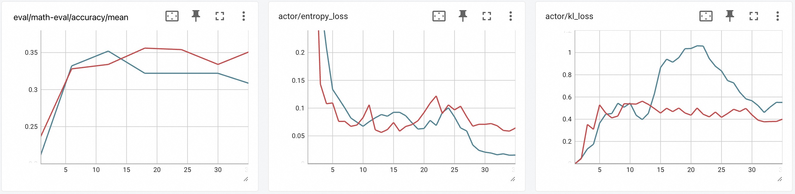
The image contains three line charts comparing performance metrics across three categories:
1. `eval/math-eval/accuracy/mean`
2. `actor/entropy_loss`
3. `actor/kl_loss`
Each chart uses dual-colored lines (red and blue) to represent different data series, with x-axis values ranging from 0 to 30 and y-axis values varying by chart.
---
### Components/Axes
#### Common Elements
- **X-axis**: Labeled "x" in all charts, scaled from 0 to 30 in increments of 5.
- **Y-axis**: Labeled "y" in all charts, with chart-specific ranges:
- `eval/math-eval/accuracy/mean`: 0.2 to 0.35
- `actor/entropy_loss`: 0.05 to 0.2
- `actor/kl_loss`: 0 to 1
- **Legend**: Positioned on the right side of each chart, featuring a pin icon and two entries:
- Red line: "Series A"
- Blue line: "Series B"
- **Gridlines**: Present in all charts for reference.
#### Chart-Specific Details
1. **`eval/math-eval/accuracy/mean`**
- Y-axis: Accuracy metric (0.2–0.35).
- Red line: Starts at 0.24 (x=0), peaks at 0.35 (x=15), then declines to 0.32 (x=30).
- Blue line: Starts at 0.2 (x=0), rises to 0.35 (x=10), then declines to 0.31 (x=30).
2. **`actor/entropy_loss`**
- Y-axis: Entropy loss (0.05–0.2).
- Red line: Starts at 0.2 (x=0), drops to 0.05 (x=10), then fluctuates between 0.05–0.1.
- Blue line: Starts at 0.2 (x=0), drops to 0.02 (x=30), with minor fluctuations.
3. **`actor/kl_loss`**
- Y-axis: Kullback-Leibler divergence (0–1).
- Red line: Starts at 0 (x=0), peaks at 0.6 (x=10), then fluctuates between 0.4–0.5.
- Blue line: Starts at 0 (x=0), peaks at 1.0 (x=20), then declines to 0.55 (x=30).
---
### Detailed Analysis
#### `eval/math-eval/accuracy/mean`
- **Red Line**:
- Initial rise from 0.24 (x=0) to 0.35 (x=15), followed by a gradual decline.
- Key data points:
- x=5: 0.32
- x=10: 0.33
- x=15: 0.35
- x=20: 0.35
- x=25: 0.35
- x=30: 0.32
- **Blue Line**:
- Rapid rise to 0.35 (x=10), then steady decline.
- Key data points:
- x=5: 0.33
- x=10: 0.35
- x=15: 0.34
- x=20: 0.32
- x=25: 0.32
- x=30: 0.31
#### `actor/entropy_loss`
- **Red Line**:
- Sharp decline from 0.2 (x=0) to 0.05 (x=10), followed by minor oscillations.
- Key data points:
- x=5: 0.1
- x=10: 0.05
- x=15: 0.07
- x=20: 0.12
- x=25: 0.09
- x=30: 0.06
- **Blue Line**:
- Steady decline from 0.2 (x=0) to 0.02 (x=30).
- Key data points:
- x=5: 0.15
- x=10: 0.08
- x=15: 0.09
- x=20: 0.07
- x=25: 0.05
- x=30: 0.02
#### `actor/kl_loss`
- **Red Line**:
- Initial rise to 0.6 (x=10), followed by fluctuations between 0.4–0.5.
- Key data points:
- x=5: 0.3
- x=10: 0.6
- x=15: 0.45
- x=20: 0.4
- x=25: 0.42
- x=30: 0.38
- **Blue Line**:
- Sharp rise to 1.0 (x=20), then decline to 0.55 (x=30).
- Key data points:
- x=5: 0.2
- x=10: 0.5
- x=15: 0.8
- x=20: 1.0
- x=25: 0.7
- x=30: 0.55
---
### Key Observations
1. **`eval/math-eval/accuracy/mean`**:
- Both lines peak around x=10–15, suggesting optimal performance midway through the observed range.
- Red line maintains higher stability after x=15 compared to the blue line.
2. **`actor/entropy_loss`**:
- Red line exhibits higher volatility, with a sharp drop followed by oscillations.
- Blue line shows a consistent, smooth decline, indicating stable entropy reduction.
3. **`actor/kl_loss`**:
- Blue line demonstrates a significant divergence (KL loss = 1.0) at x=20, suggesting a critical point of divergence between models.
- Red line remains relatively stable after x=10, contrasting with the blue line's volatility.
---
### Interpretation
1. **Performance Trends**:
- The `eval/math-eval/accuracy/mean` chart indicates that both models achieve peak accuracy midway through the evaluation period, with the red line (Series A) maintaining higher stability in later stages.
- The `actor/entropy_loss` chart reveals that Series B (blue) achieves a more consistent reduction in entropy loss, while Series A (red) experiences fluctuations, possibly due to model instability.
2. **Divergence in `kl_loss`**:
- The blue line's sharp rise to 1.0 at x=20 in the `actor/kl_loss` chart suggests a critical divergence between the models at this point, potentially indicating a failure mode or architectural mismatch.
- The red line's stability after x=10 implies that Series A may be more robust to changes in the input space beyond this threshold.
3. **Anomalies**:
- The blue line in `actor/kl_loss` exhibits an abrupt drop from 1.0 (x=20) to 0.55 (x=30), which could indicate a recovery phase or a reset in the model's behavior.
- The red line in `actor/entropy_loss` shows an unexpected spike at x=20 (0.12), deviating from its otherwise declining trend.
---
### Conclusion
The charts collectively highlight trade-offs between model stability and performance. Series A (red) demonstrates higher accuracy and stability in later stages, while Series B (blue) shows rapid initial improvement but greater volatility in entropy and KL loss. The divergence in KL loss at x=20 warrants further investigation into potential model failures or optimization challenges.