## Line Chart: MathVista Accuracy vs. Solutions per Problem
### Overview
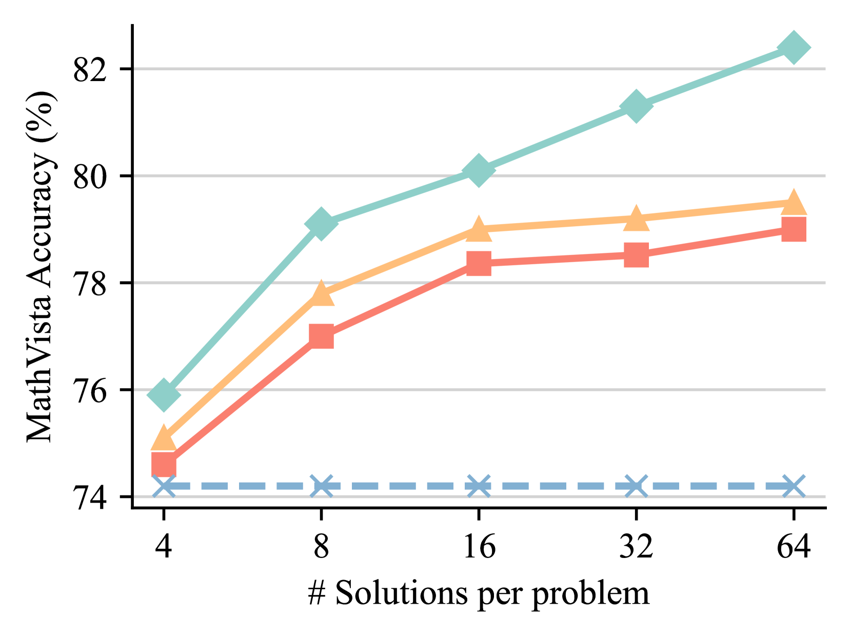
This line chart depicts the relationship between the number of solutions per problem and the MathVista accuracy (expressed as a percentage). Four distinct data series are presented, each represented by a different colored line. The x-axis represents the number of solutions per problem, and the y-axis represents the MathVista accuracy.
### Components/Axes
* **X-axis Title:** "# Solutions per problem"
* **Markers:** 4, 8, 16, 32, 64
* **Y-axis Title:** "MathVista Accuracy (%)"
* **Scale:** Ranges from approximately 74% to 83%.
* **Legend:** Located in the top-left corner, the legend identifies the four data series by color. The legend is not explicitly labeled with series names, but can be inferred from the line colors.
* Light Blue Line
* Orange Line
* Red Line
* Dark Blue Dashed Line
### Detailed Analysis
The chart displays five data points for each of the four lines, corresponding to the x-axis markers (4, 8, 16, 32, and 64 solutions per problem).
* **Light Blue Line:** This line shows a consistently upward trend, starting at approximately 75.5% accuracy at 4 solutions per problem and reaching approximately 82.5% accuracy at 64 solutions per problem.
* (4, 75.5%)
* (8, 79.5%)
* (16, 80.5%)
* (32, 81.5%)
* (64, 82.5%)
* **Orange Line:** This line also exhibits an upward trend, but is less steep than the light blue line. It begins at approximately 75% at 4 solutions and reaches approximately 79.5% at 64 solutions.
* (4, 75%)
* (8, 77.5%)
* (16, 78.5%)
* (32, 79%)
* (64, 79.5%)
* **Red Line:** This line shows a similar upward trend to the orange line, but starts at a lower accuracy and plateaus earlier. It starts at approximately 74.5% at 4 solutions and reaches approximately 79% at 64 solutions.
* (4, 74.5%)
* (8, 77%)
* (16, 78%)
* (32, 78.5%)
* (64, 79%)
* **Dark Blue Dashed Line:** This line remains relatively flat across all values of solutions per problem, hovering around 74%.
* (4, 74%)
* (8, 74%)
* (16, 74%)
* (32, 74%)
* (64, 74%)
### Key Observations
* The light blue line consistently outperforms the other three lines across all values of solutions per problem.
* The dark blue dashed line indicates a baseline accuracy that does not improve with an increased number of solutions per problem.
* The orange and red lines show similar performance, with the orange line slightly outperforming the red line.
* All lines demonstrate diminishing returns in accuracy as the number of solutions per problem increases. The rate of increase in accuracy decreases as the number of solutions increases.
### Interpretation
The data suggests that increasing the number of solutions per problem generally improves MathVista accuracy, but there is a point of diminishing returns. The light blue line, which consistently shows the highest accuracy, may represent a more sophisticated or effective approach to problem-solving. The flat dark blue line suggests that a certain level of accuracy is achievable regardless of the number of solutions considered, potentially representing a basic or default algorithm. The convergence of the lines at higher numbers of solutions per problem indicates that the benefit of adding more solutions decreases as the number of solutions increases. This could be due to factors such as redundancy in solutions or the limitations of the MathVista system itself. The chart provides valuable insights into the relationship between solution diversity and accuracy in the MathVista system, and could inform strategies for optimizing its performance.