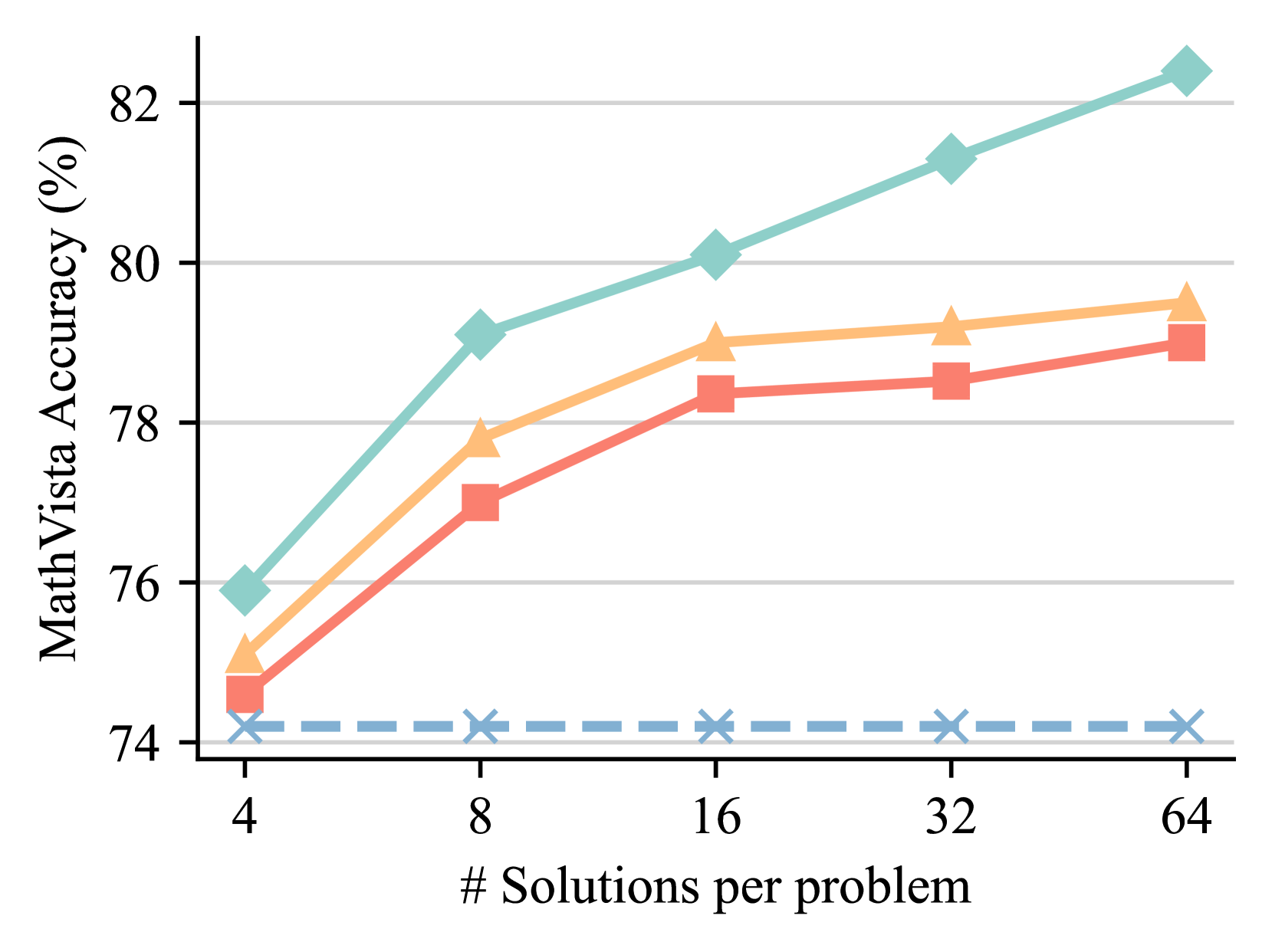
## Line Chart: MathVista Accuracy vs. Number of Solutions per Problem
### Overview
The image is a line chart illustrating the relationship between MathVista Accuracy (in percentage) and the number of solutions per problem. There are four distinct data series represented by different colored lines with different markers. The x-axis represents the number of solutions per problem, while the y-axis represents the MathVista accuracy in percentage.
### Components/Axes
* **X-axis:** "# Solutions per problem" with markers at 4, 8, 16, 32, and 64.
* **Y-axis:** "MathVista Accuracy (%)" with markers at 74, 76, 78, 80, and 82.
* **Data Series:** Four distinct data series are plotted on the chart, each represented by a different color and marker. The legend is missing, so the exact meaning of each series is unknown.
### Detailed Analysis
* **Teal Line (Diamond Markers):** This line shows an upward trend.
* At 4 solutions, the accuracy is approximately 76%.
* At 8 solutions, the accuracy is approximately 79%.
* At 16 solutions, the accuracy is approximately 80%.
* At 32 solutions, the accuracy is approximately 81%.
* At 64 solutions, the accuracy is approximately 82.5%.
* **Orange Line (Triangle Markers):** This line shows an upward trend that plateaus.
* At 4 solutions, the accuracy is approximately 75.5%.
* At 8 solutions, the accuracy is approximately 78%.
* At 16 solutions, the accuracy is approximately 79%.
* At 32 solutions, the accuracy is approximately 79.2%.
* At 64 solutions, the accuracy is approximately 79.5%.
* **Red Line (Square Markers):** This line shows an upward trend that plateaus.
* At 4 solutions, the accuracy is approximately 75%.
* At 8 solutions, the accuracy is approximately 77%.
* At 16 solutions, the accuracy is approximately 78.5%.
* At 32 solutions, the accuracy is approximately 78.5%.
* At 64 solutions, the accuracy is approximately 79%.
* **Light Blue Dashed Line (X Markers):** This line remains relatively constant.
* The accuracy hovers around 74% for all values of solutions per problem.
### Key Observations
* The teal line (diamond markers) consistently outperforms the other lines in terms of MathVista accuracy.
* The light blue dashed line (X markers) shows almost no change in accuracy as the number of solutions per problem increases.
* The orange and red lines show similar trends, with accuracy increasing initially and then plateauing.
### Interpretation
The chart suggests that increasing the number of solutions per problem generally improves MathVista accuracy, but the extent of improvement varies depending on the specific data series (likely representing different models or algorithms). The teal line demonstrates the most significant improvement with increasing solutions, while the light blue line indicates a method that is unaffected by the number of solutions. The plateauing of the orange and red lines suggests diminishing returns for those methods beyond a certain number of solutions. Without a legend, it's impossible to definitively state what each line represents, but the data implies that the teal line represents the most effective approach among the four shown.