## Line Chart: MathVista Accuracy vs. Solutions per Problem
### Overview
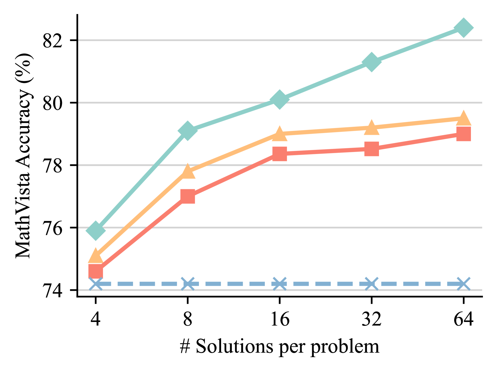
The chart illustrates the relationship between the number of solutions per problem and MathVista accuracy percentages. Three data series (teal, orange, red) show increasing accuracy trends as solution counts grow from 4 to 64. A blue dashed baseline (74.5%) and gray dashed target (74%) provide reference points.
### Components/Axes
- **X-axis**: "# Solutions per problem" (logarithmic scale: 4, 8, 16, 32, 64)
- **Y-axis**: "MathVista Accuracy (%)" (74–82%)
- **Legend**:
- Teal (diamond markers): "Series A"
- Orange (triangle markers): "Series B"
- Red (square markers): "Series C"
- **Dashed Lines**:
- Blue: "Baseline Accuracy (74.5%)"
- Gray: "Target Accuracy (74%)"
### Detailed Analysis
1. **Teal Line (Series A)**:
- Starts at ~76% accuracy at 4 solutions.
- Increases steadily to ~82% at 64 solutions.
- Slope: ~0.09% per solution increment (approximate).
2. **Orange Line (Series B)**:
- Begins at ~75% at 4 solutions.
- Rises to ~79% at 64 solutions.
- Slope: ~0.06% per solution increment.
3. **Red Line (Series C)**:
- Starts at ~74.5% at 4 solutions.
- Reaches ~79% at 64 solutions.
- Slope: ~0.07% per solution increment.
4. **Dashed Lines**:
- Blue line remains constant at 74.5% across all solution counts.
- Gray line remains constant at 74% across all solution counts.
### Key Observations
- All three data series show upward trends, with teal (Series A) demonstrating the steepest improvement.
- At 64 solutions, all series exceed the gray "Target Accuracy" line (74%).
- The blue "Baseline Accuracy" (74.5%) is consistently surpassed by all series after 8 solutions.
- Red (Series C) starts closest to the blue baseline but diverges significantly by 64 solutions.
### Interpretation
The data suggests a strong positive correlation between solution quantity and accuracy improvement. Teal (Series A) outperforms other series across all solution counts, potentially indicating superior algorithmic efficiency or data quality. The convergence of orange and red lines at higher solution counts implies diminishing returns for additional solutions beyond a certain threshold. The persistent gap between the blue baseline and all series highlights that even minimal solution counts (4) already exceed the "Baseline Accuracy" metric, suggesting robust foundational performance. The gray target line (74%) appears overly conservative, as all series surpass it within the first data point (4 solutions).