## Histograms: Price and Duration Distribution of Claude Opus
### Overview
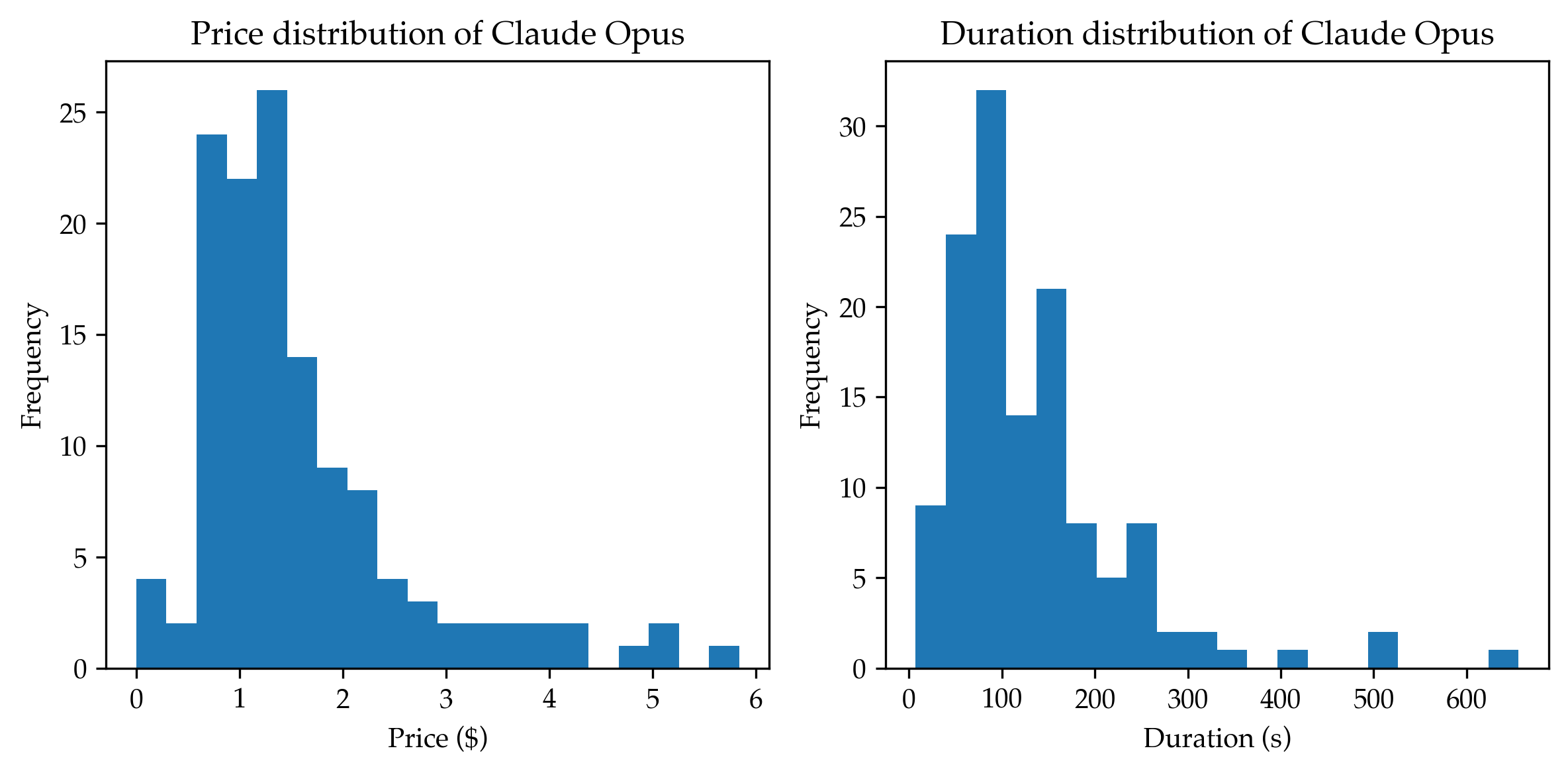
The image presents two histograms displayed side-by-side. The left histogram shows the distribution of prices for Claude Opus, while the right histogram shows the distribution of durations for Claude Opus. Both histograms use the same blue color for the bars.
### Components/Axes
**Left Histogram (Price Distribution):**
* **Title:** "Price distribution of Claude Opus" (top-center)
* **X-axis Label:** "Price ($)" (bottom-center)
* **Y-axis Label:** "Frequency" (left-center)
* **X-axis Scale:** Ranges from approximately 0 to 6, with markings at 1, 2, 3, 4, 5, and 6.
* **Y-axis Scale:** Ranges from 0 to 25, with markings at 0, 5, 10, 15, 20, and 25.
**Right Histogram (Duration Distribution):**
* **Title:** "Duration distribution of Claude Opus" (top-center)
* **X-axis Label:** "Duration (s)" (bottom-center)
* **Y-axis Label:** "Frequency" (left-center)
* **X-axis Scale:** Ranges from approximately 0 to 600, with markings at 0, 100, 200, 300, 400, 500, and 600.
* **Y-axis Scale:** Ranges from 0 to 30, with markings at 0, 5, 10, 15, 20, 25, and 30.
### Detailed Analysis or Content Details
**Left Histogram (Price Distribution):**
The distribution is unimodal, peaking between $1 and $2. The frequency decreases as the price increases beyond $2.
* Approximate bar heights (from left to right):
* $0 - $0.5: 2
* $0.5 - $1: 24
* $1 - $1.5: 23
* $1.5 - $2: 18
* $2 - $2.5: 9
* $2.5 - $3: 5
* $3 - $3.5: 3
* $3.5 - $4: 2
* $4 - $4.5: 1
* $4.5 - $5: 1
* $5 - $5.5: 1
* $5.5 - $6: 1
**Right Histogram (Duration Distribution):**
The distribution is unimodal, peaking between 50 and 100 seconds. The frequency decreases as the duration increases beyond 100 seconds.
* Approximate bar heights (from left to right):
* $0 - $50: 31
* $50 - $100: 22
* $100 - $150: 18
* $150 - $200: 8
* $200 - $250: 6
* $250 - $300: 4
* $300 - $350: 2
* $350 - $400: 2
* $400 - $450: 1
* $450 - $500: 1
* $500 - $550: 1
* $550 - $600: 1
### Key Observations
* The price distribution is heavily skewed to the left, with most prices falling below $2.
* The duration distribution is also skewed to the left, with most durations falling below 150 seconds.
* The price distribution has a more pronounced peak than the duration distribution.
* There are very few instances of high prices (above $4) and long durations (above 400 seconds).
### Interpretation
The data suggests that the majority of Claude Opus usage involves relatively low prices and short durations. This could indicate that users are primarily using the service for quick tasks or are experimenting with the platform. The skewness in both distributions suggests that there is a long tail of users who are either willing to pay more for longer usage or are experiencing longer processing times. The lack of significant frequency at the higher end of both scales suggests that these are relatively rare occurrences. The two distributions are independent, and show the price and duration of the service. The data does not suggest any correlation between price and duration.