## Histograms: Price and Duration Distributions of Claude Opus
### Overview
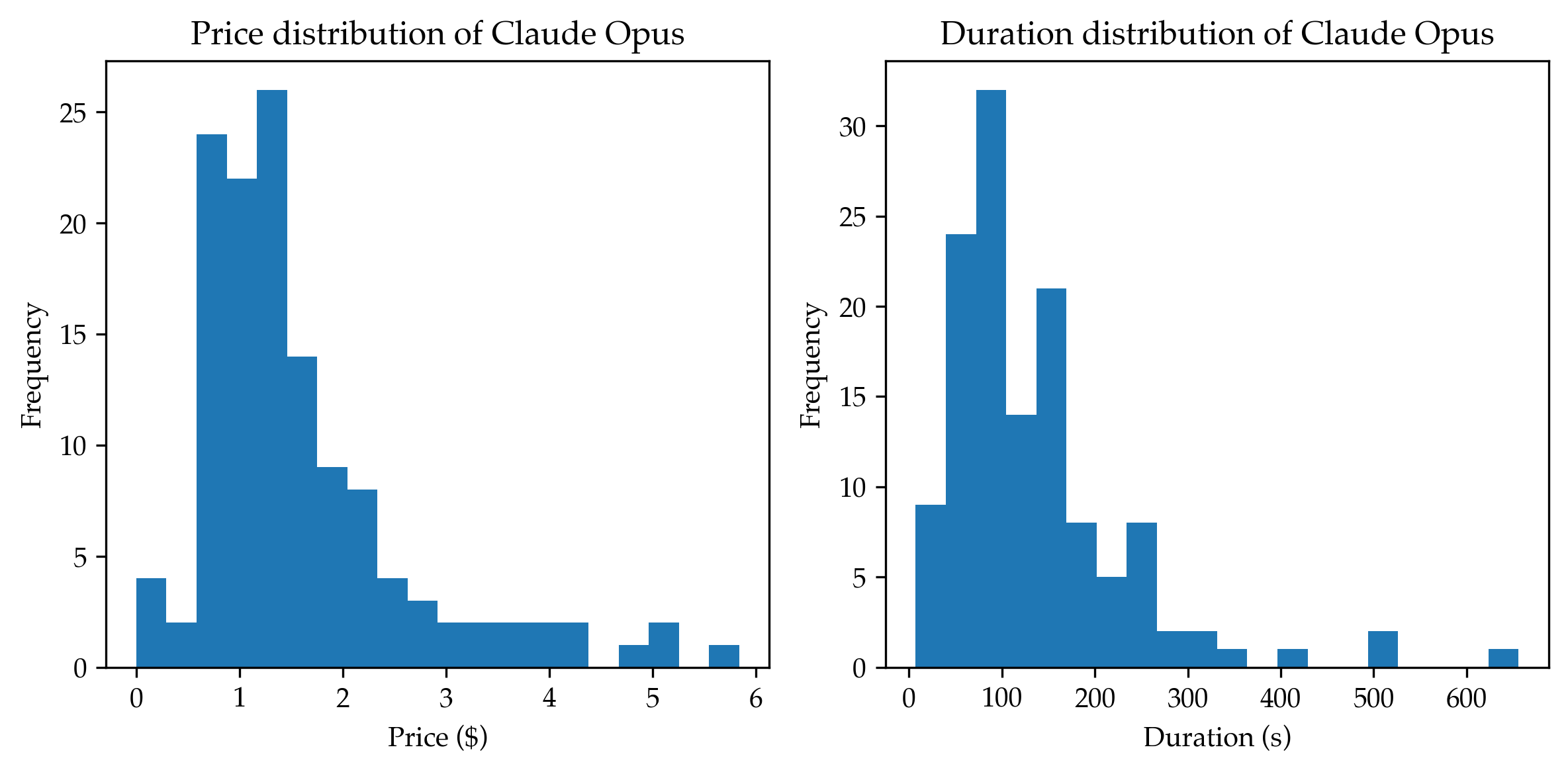
The image displays two side-by-side histograms visualizing the frequency distributions for two different metrics related to "Claude Opus": price in US dollars and duration in seconds. Both charts share a similar visual style with blue bars against a white background, using a standard histogram format to show the concentration of data points across value ranges.
### Components/Axes
**Left Chart: Price Distribution**
* **Title:** "Price distribution of Claude Opus" (Top center)
* **X-axis:** Label is "Price ($)". The axis is marked with major ticks at 0, 1, 2, 3, 4, 5, and 6. The data appears to be binned in intervals of approximately $0.50.
* **Y-axis:** Label is "Frequency". The axis is marked with major ticks at 0, 5, 10, 15, 20, and 25. The highest bar exceeds the 25 mark.
**Right Chart: Duration Distribution**
* **Title:** "Duration distribution of Claude Opus" (Top center)
* **X-axis:** Label is "Duration (s)". The axis is marked with major ticks at 0, 100, 200, 300, 400, 500, and 600. The data appears to be binned in intervals of approximately 50 seconds.
* **Y-axis:** Label is "Frequency". The axis is marked with major ticks at 0, 5, 10, 15, 20, 25, and 30. The highest bar exceeds the 30 mark.
### Detailed Analysis
**Price Distribution (Left Chart):**
* **Trend Verification:** The distribution is strongly right-skewed (positively skewed). The frequency rises sharply from the first bin, peaks early, and then gradually tapers off with a long tail extending to higher prices.
* **Data Points (Approximate Frequencies per Bin):**
* $0.00 - $0.50: ~4
* $0.50 - $1.00: ~24
* $1.00 - $1.50: ~22
* $1.50 - $2.00: ~26 (Peak)
* $2.00 - $2.50: ~14
* $2.50 - $3.00: ~9
* $3.00 - $3.50: ~8
* $3.50 - $4.00: ~4
* $4.00 - $4.50: ~3
* $4.50 - $5.00: ~2 (Gap before next bar)
* $5.00 - $5.50: ~1
* $5.50 - $6.00: ~2
* $6.00 - $6.50: ~1
**Duration Distribution (Right Chart):**
* **Trend Verification:** This distribution is also right-skewed. It shows a very high concentration of short durations, with a sharp peak and a long tail of less frequent, longer durations.
* **Data Points (Approximate Frequencies per Bin):**
* 0 - 50 s: ~9
* 50 - 100 s: ~24
* 100 - 150 s: ~32 (Peak)
* 150 - 200 s: ~14
* 200 - 250 s: ~21
* 250 - 300 s: ~8
* 300 - 350 s: ~5
* 350 - 400 s: ~8
* 400 - 450 s: ~2
* 450 - 500 s: ~1 (Gap before next bar)
* 500 - 550 s: ~1
* 550 - 600 s: ~2 (Gap before next bar)
* 600 - 650 s: ~1
### Key Observations
1. **Concentration at Lower Values:** Both metrics show that the vast majority of instances are clustered at the lower end of their respective scales. Most prices are between $0.50 and $2.50, and most durations are between 50 and 250 seconds.
2. **Right-Skewed Nature:** The long tails to the right in both charts indicate the presence of outliers or less common instances that are significantly more expensive or longer in duration than the typical case.
3. **Peak Locations:** The modal (most frequent) price bin is approximately $1.50-$2.00. The modal duration bin is approximately 100-150 seconds.
4. **Data Gaps:** Both distributions show gaps in the tail (e.g., no price instances between ~$4.50-$5.00, no duration instances between ~450-500s), suggesting these higher values are sporadic.
### Interpretation
The data suggests that the typical operation or task associated with "Claude Opus" is relatively low-cost and quick to complete. The strong right skew in both price and duration is characteristic of many service-based or computational processes, where most jobs are routine and efficient, but a small subset involves exceptional complexity, errors, or resource intensity, leading to disproportionate costs and time.
The correlation between the two distributions is implied: longer tasks likely incur higher costs. The presence of outliers in both charts (e.g., tasks costing over $5 or lasting over 600 seconds) warrants investigation. These could represent edge cases, system errors, or particularly complex queries that may be of interest for optimization or understanding the limits of the system. The clear visualization allows for quick assessment of the central tendency and variability of these key operational metrics.