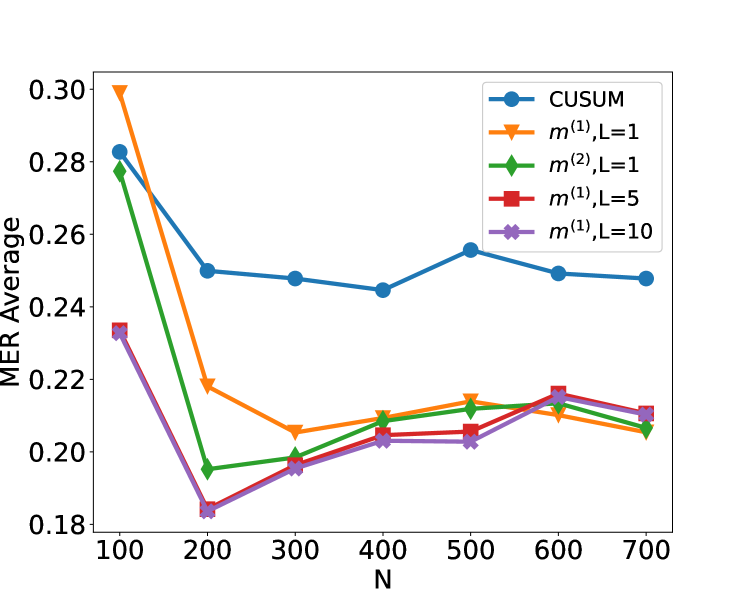
## Line Chart: MER Average vs. N
### Overview
This image is a line chart displaying the "MER Average" on the y-axis against "N" on the x-axis. Several data series, representing different methods (CUSUM, m^(1),L=1, m^(2),L=1, m^(1),L=5, m^(1),L=10), are plotted. The chart shows how the MER Average changes with increasing values of N for each method.
### Components/Axes
* **Y-axis Title**: MER Average
* **Scale**: Ranges from 0.18 to 0.30, with major tick marks at 0.22, 0.24, 0.26, 0.28, and 0.30. Minor tick marks are present at intervals of 0.01.
* **X-axis Title**: N
* **Scale**: Ranges from 100 to 700, with major tick marks at 100, 200, 300, 400, 500, 600, and 700.
* **Legend**: Located in the top-right quadrant of the chart. It maps colors and markers to the different data series:
* **Blue circles**: CUSUM
* **Orange inverted triangles**: m^(1),L=1
* **Green diamonds**: m^(2),L=1
* **Red squares**: m^(1),L=5
* **Purple crosses**: m^(1),L=10
### Detailed Analysis
**Data Series Trends and Points:**
1. **CUSUM (Blue circles)**:
* **Trend**: The line initially increases sharply from N=100 to N=200, then shows a general downward trend with minor fluctuations.
* **Data Points (approximate)**:
* N=100: 0.281
* N=200: 0.251
* N=300: 0.248
* N=400: 0.244
* N=500: 0.255
* N=600: 0.248
* N=700: 0.246
2. **m^(1),L=1 (Orange inverted triangles)**:
* **Trend**: The line starts at its highest point at N=100, drops significantly to N=200, and then shows a gradual upward trend with some leveling off.
* **Data Points (approximate)**:
* N=100: 0.300
* N=200: 0.217
* N=300: 0.207
* N=400: 0.213
* N=500: 0.215
* N=600: 0.217
* N=700: 0.212
3. **m^(2),L=1 (Green diamonds)**:
* **Trend**: The line starts at a high value, drops sharply to N=200, and then shows a generally upward trend, fluctuating slightly.
* **Data Points (approximate)**:
* N=100: 0.281
* N=200: 0.195
* N=300: 0.203
* N=400: 0.207
* N=500: 0.215
* N=600: 0.217
* N=700: 0.207
4. **m^(1),L=5 (Red squares)**:
* **Trend**: The line starts at a moderate value, drops to N=200, and then shows a generally upward trend, with some fluctuations.
* **Data Points (approximate)**:
* N=100: 0.235
* N=200: 0.184
* N=300: 0.198
* N=400: 0.205
* N=500: 0.205
* N=600: 0.217
* N=700: 0.212
5. **m^(1),L=10 (Purple crosses)**:
* **Trend**: The line starts at a moderate value, drops to N=200, and then shows a generally upward trend, with some fluctuations.
* **Data Points (approximate)**:
* N=100: 0.235
* N=200: 0.184
* N=300: 0.198
* N=400: 0.205
* N=500: 0.205
* N=600: 0.217
* N=700: 0.212
**Note on m^(1),L=5 and m^(1),L=10**: These two series appear to overlap significantly, particularly at N=100 and N=200, and follow very similar trends and values throughout the plotted range.
### Key Observations
* **Initial Drop**: All plotted series, except CUSUM, exhibit a significant drop in MER Average between N=100 and N=200.
* **CUSUM's Behavior**: The CUSUM method shows a different pattern, with an initial increase and then a general decrease, maintaining a higher MER Average than the other methods for N > 200.
* **Convergence**: For N >= 300, the MER Average for m^(1),L=1, m^(2),L=1, m^(1),L=5, and m^(1),L=10 tend to converge, fluctuating within a narrower range of approximately 0.20 to 0.217.
* **Lowest MER Average**: The lowest MER Average values are observed around N=200 for m^(2),L=1 (approx. 0.195) and for m^(1),L=5 and m^(1),L=10 (approx. 0.184).
* **Highest MER Average**: The highest MER Average is observed for m^(1),L=1 at N=100 (approx. 0.300).
### Interpretation
The chart demonstrates the performance of different methods (CUSUM and variations of 'm' with different L parameters) in terms of their "MER Average" as a function of "N".
* **CUSUM's Robustness/Stability**: The CUSUM method, while starting with a higher MER Average at N=100 compared to some other methods, shows a more stable or decreasing trend for larger N. This suggests it might be more robust or efficient in maintaining a lower average error as the sample size (N) increases beyond a certain point, or it might be less sensitive to initial variations.
* **Initial Sensitivity of Other Methods**: The sharp drop observed for m^(1),L=1, m^(2),L=1, m^(1),L=5, and m^(1),L=10 between N=100 and N=200 indicates that these methods are highly sensitive to initial sample sizes. They perform poorly at very small N but improve significantly as N increases to 200.
* **Parameter Impact (L)**: The comparison between m^(1),L=5 and m^(1),L=10 suggests that for these specific configurations, the parameter L (which likely represents a lookahead or lookback window) has a minimal impact on the MER Average, as their performance curves are nearly identical. The difference between m^(1),L=1 and m^(2),L=1 is more pronounced, especially at smaller N values.
* **Trade-offs**: The data suggests a trade-off. Methods like m^(1),L=5 and m^(1),L=10 achieve their best performance (lowest MER Average) at N=200, but their performance plateaus or slightly degrades for larger N compared to CUSUM. CUSUM, on the other hand, might require a larger N to reach its optimal performance or maintain a consistently low error rate.
In essence, the chart allows for a comparative analysis of different anomaly detection or statistical monitoring methods, highlighting their performance characteristics across varying sample sizes. The choice of method would depend on the specific requirements, such as the acceptable MER Average, the expected range of N, and the desired stability of the metric.