\n
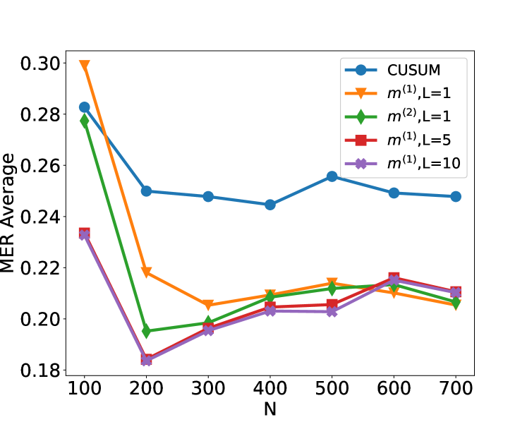
## Line Chart: MER Average vs. N
### Overview
This image presents a line chart illustrating the relationship between 'N' (likely sample size or number of observations) and the 'MER Average' (Mean Error Rate Average). The chart compares several methods: CUSUM, m^(1),L=1, m^(2),L=1, m^(1),L=5, and m^(1),L=10.
### Components/Axes
* **X-axis:** Labeled "N", ranging from approximately 100 to 700, with tick marks at 100, 200, 300, 400, 500, 600, and 700.
* **Y-axis:** Labeled "MER Average", ranging from approximately 0.18 to 0.30, with tick marks at 0.18, 0.20, 0.22, 0.24, 0.26, 0.28, and 0.30.
* **Legend:** Located in the top-right corner, listing the following data series with corresponding colors:
* CUSUM (Blue)
* m^(1),L=1 (Orange)
* m^(2),L=1 (Green)
* m^(1),L=5 (Red)
* m^(1),L=10 (Purple)
### Detailed Analysis
* **CUSUM (Blue Line):** The line starts at approximately 0.285 at N=100, decreases to around 0.255 at N=200, remains relatively stable around 0.25 between N=200 and N=600, and then slightly increases to approximately 0.255 at N=700.
* **m^(1),L=1 (Orange Line):** This line exhibits a steep decline from approximately 0.28 at N=100 to around 0.19 at N=200. It then plateaus, fluctuating between approximately 0.20 and 0.22 from N=200 to N=700, with a slight increase to around 0.22 at N=600.
* **m^(2),L=1 (Green Line):** Similar to the orange line, it shows a significant drop from approximately 0.275 at N=100 to around 0.185 at N=200. It then stabilizes, remaining between approximately 0.20 and 0.22 from N=200 to N=700, with a slight increase to around 0.21 at N=600.
* **m^(1),L=5 (Red Line):** This line starts at approximately 0.27 at N=100, decreases to around 0.20 at N=200, and then fluctuates between approximately 0.20 and 0.22 from N=200 to N=700, peaking at around 0.22 at N=600.
* **m^(1),L=10 (Purple Line):** This line begins at approximately 0.275 at N=100, drops to around 0.20 at N=200, and then remains relatively stable between approximately 0.20 and 0.22 from N=200 to N=700, with a slight increase to around 0.21 at N=600.
### Key Observations
* All methods show a decreasing trend in MER Average as N increases from 100 to 200.
* After N=200, the MER Average stabilizes for all methods, with minor fluctuations.
* The CUSUM method consistently exhibits a higher MER Average compared to the other methods across all values of N.
* The methods m^(1),L=1, m^(2),L=1, m^(1),L=5, and m^(1),L=10 converge to similar MER Average values as N increases beyond 200.
* The most significant reduction in MER Average occurs between N=100 and N=200 for all methods.
### Interpretation
The chart demonstrates the impact of sample size (N) on the Mean Error Rate Average (MER Average) for different methods. The initial steep decline in MER Average as N increases suggests that increasing the sample size initially leads to a substantial improvement in accuracy or reliability. However, beyond a certain point (around N=200 in this case), the benefit of increasing the sample size diminishes, and the MER Average plateaus.
The CUSUM method consistently performs worse than the other methods, indicating that it may be less effective in this scenario. The convergence of the other methods suggests that the choice of L (a parameter within the methods) has a limited impact on performance when N is sufficiently large.
The data suggests that there is a trade-off between sample size and accuracy. While increasing the sample size can improve accuracy, there is a point of diminishing returns. The optimal sample size depends on the specific method used and the desired level of accuracy. The chart provides valuable insights for selecting an appropriate sample size and method for a given application.