\n
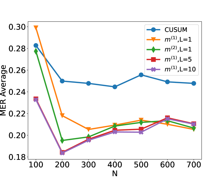
## Line Chart: MER Average vs. N for Different Methods
### Overview
The image is a line chart comparing the performance of five different statistical methods or algorithms. The performance metric is "MER Average," plotted against a parameter "N" (likely sample size or number of observations). The chart shows how the average Mean Error Rate (MER) changes as N increases from 100 to 700 for each method.
### Components/Axes
* **Chart Type:** Multi-series line chart with markers.
* **X-Axis:**
* **Label:** `N`
* **Scale:** Linear, ranging from 100 to 700.
* **Tick Marks:** At intervals of 100 (100, 200, 300, 400, 500, 600, 700).
* **Y-Axis:**
* **Label:** `MER Average`
* **Scale:** Linear, ranging from approximately 0.18 to 0.30.
* **Tick Marks:** At intervals of 0.02 (0.18, 0.20, 0.22, 0.24, 0.26, 0.28, 0.30).
* **Legend:** Positioned in the top-right corner of the plot area. It contains five entries, each with a unique color, marker shape, and label.
1. **Blue line with circle markers:** `CUSUM`
2. **Orange line with inverted triangle markers:** `m^(1),L=1`
3. **Green line with diamond markers:** `m^(2),L=1`
4. **Red line with square markers:** `m^(1),L=5`
5. **Purple line with 'x' (cross) markers:** `m^(1),L=10`
### Detailed Analysis
The following data points are approximate values extracted from the chart. The trend for each series is described first, followed by the estimated values at each N.
**1. CUSUM (Blue, Circle Markers)**
* **Trend:** Starts highest, drops sharply between N=100 and N=200, then fluctuates with a slight overall downward trend, remaining the highest series after N=200.
* **Approximate Data Points:**
* N=100: ~0.282
* N=200: ~0.250
* N=300: ~0.248
* N=400: ~0.245
* N=500: ~0.255
* N=600: ~0.249
* N=700: ~0.248
**2. m^(1),L=1 (Orange, Inverted Triangle Markers)**
* **Trend:** Starts very high, drops dramatically between N=100 and N=300, then shows a gradual, slight upward trend from N=300 to N=700.
* **Approximate Data Points:**
* N=100: ~0.300 (Highest initial point)
* N=200: ~0.219
* N=300: ~0.206
* N=400: ~0.210
* N=500: ~0.214
* N=600: ~0.211
* N=700: ~0.206
**3. m^(2),L=1 (Green, Diamond Markers)**
* **Trend:** Starts high, drops very sharply to its minimum at N=200, then shows a steady, gradual upward trend for the remainder of the chart.
* **Approximate Data Points:**
* N=100: ~0.278
* N=200: ~0.195
* N=300: ~0.199
* N=400: ~0.209
* N=500: ~0.211
* N=600: ~0.215
* N=700: ~0.207
**4. m^(1),L=5 (Red, Square Markers)**
* **Trend:** Starts relatively low, drops to a minimum at N=200, then increases gradually, closely following the path of the purple line (`m^(1),L=10`).
* **Approximate Data Points:**
* N=100: ~0.233
* N=200: ~0.184
* N=300: ~0.196
* N=400: ~0.205
* N=500: ~0.206
* N=600: ~0.217
* N=700: ~0.211
**5. m^(1),L=10 (Purple, 'X' Markers)**
* **Trend:** Nearly identical to the red line (`m^(1),L=5`). Starts low, drops to a minimum at N=200, then increases gradually. The two lines are often overlapping or very close.
* **Approximate Data Points:**
* N=100: ~0.233
* N=200: ~0.183
* N=300: ~0.196
* N=400: ~0.203
* N=500: ~0.203
* N=600: ~0.214
* N=700: ~0.210
### Key Observations
1. **Universal Initial Drop:** All five methods show their highest MER Average at N=100 and experience a significant drop by N=200.
2. **Performance Hierarchy:** After the initial drop (N>=200), a clear performance hierarchy emerges and persists:
* **Highest MER (Worst):** `CUSUM` (Blue)
* **Middle Tier:** `m^(1),L=1` (Orange) and `m^(2),L=1` (Green) are generally close, with Green often slightly lower than Orange after N=300.
* **Lowest MER (Best):** `m^(1),L=5` (Red) and `m^(1),L=10` (Purple) are consistently the lowest and nearly indistinguishable from each other.
3. **Convergence at Low N:** At N=200, the red (`m^(1),L=5`) and purple (`m^(1),L=10`) lines reach the absolute lowest point on the chart (~0.183-0.184).
4. **Diverging Trends Post-N=200:** After N=200, the trends diverge:
* `CUSUM` fluctuates but stays relatively flat.
* `m^(1),L=1` (Orange) and `m^(2),L=1` (Green) show a slight upward trend.
* `m^(1),L=5` (Red) and `m^(1),L=10` (Purple) also show a slight upward trend, maintaining their performance advantage.
### Interpretation
This chart likely compares the efficiency or accuracy of different change-point detection or sequential analysis algorithms. "MER" could stand for "Mean Error Rate" or a similar metric where lower values are better.
* **The parameter `L` appears critical:** For the `m^(1)` family of methods, increasing `L` from 1 to 5 or 10 dramatically improves performance (lowers MER). The difference between `L=5` and `L=10` is negligible, suggesting diminishing returns beyond a certain `L` value.
* **Method `m^(2)` vs. `m^(1)` at L=1:** The `m^(2),L=1` method (Green) generally outperforms the `m^(1),L=1` method (Orange) for N > 200, indicating that the `m^(2)` formulation may be more efficient than `m^(1)` when the parameter `L` is small.
* **CUSUM as a Baseline:** The CUSUM (Cumulative Sum) method, a classic algorithm for change detection, serves as a baseline. All proposed `m` methods (with any `L` value) significantly outperform CUSUM for N >= 200 in this evaluation.
* **The "Sweet Spot" at N=200:** The most dramatic performance gains for all methods occur between N=100 and N=200. The optimal performance (lowest MER) for the best methods is achieved at N=200, after which there is a slight degradation (increase in MER) as N grows to 700. This could indicate that these methods are particularly well-tuned for problems of that scale, or that the difficulty of the task increases with N in a way that slightly impacts all algorithms.
**In summary,** the data suggests that the proposed `m` methods, especially with higher `L` values (5 or 10), offer a substantial improvement over the standard CUSUM approach for the task measured by MER Average, with the most significant advantage appearing for sample sizes (N) of 200 and above.