## Line Chart: EGA vs. Perturbed
### Overview
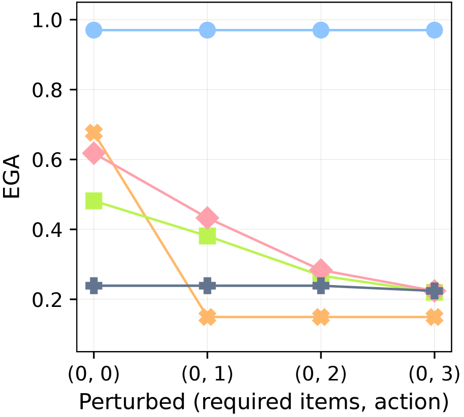
This image presents a line chart illustrating the relationship between "Perturbed (required items, action)" on the x-axis and "EGA" on the y-axis. The chart displays multiple data series, each represented by a different colored line, showing how EGA values change as the perturbation level increases.
### Components/Axes
* **X-axis Title:** "Perturbed (required items, action)"
* **X-axis Markers:** (0, 0), (0, 1), (0, 2), (0, 3)
* **Y-axis Title:** "EGA"
* **Y-axis Scale:** Ranges from approximately 0.0 to 1.0, with increments of 0.2.
* **Legend:** (Implicit, based on line colors)
* Light Blue Line
* Peach/Orange Line
* Pink Line
* Lime Green Line
* Dark Grey/Black Line
### Detailed Analysis
The chart contains five distinct lines, each representing a different data series.
* **Light Blue Line:** This line is nearly flat, starting at approximately 0.95 at (0, 0) and remaining around 0.93-0.95 across all perturbation levels (0, 1), (0, 2), and (0, 3).
* **Peach/Orange Line:** This line starts at approximately 0.7 at (0, 0) and decreases steadily to around 0.15 at (0, 3).
* **Pink Line:** This line begins at approximately 0.6 at (0, 0) and exhibits a steeper decline than the peach line, reaching approximately 0.25 at (0, 3).
* **Lime Green Line:** This line starts at approximately 0.45 at (0, 0) and decreases rapidly to approximately 0.1 at (0, 3).
* **Dark Grey/Black Line:** This line is relatively flat, starting at approximately 0.2 at (0, 0) and remaining around 0.2-0.25 across all perturbation levels.
Here's a breakdown of approximate EGA values for each line at each perturbation level:
| Perturbation | Light Blue | Peach/Orange | Pink | Lime Green | Dark Grey/Black |
|--------------|------------|--------------|------|------------|-----------------|
| (0, 0) | 0.95 | 0.7 | 0.6 | 0.45 | 0.2 |
| (0, 1) | 0.94 | 0.5 | 0.45 | 0.3 | 0.2 |
| (0, 2) | 0.93 | 0.35 | 0.3 | 0.2 | 0.25 |
| (0, 3) | 0.93 | 0.15 | 0.25 | 0.1 | 0.2 |
### Key Observations
* The light blue line demonstrates high and stable EGA values across all perturbation levels.
* The peach, pink, and lime green lines all show a negative correlation between perturbation and EGA – as perturbation increases, EGA decreases. The lime green line exhibits the steepest decline.
* The dark grey/black line remains relatively constant, indicating that EGA is not significantly affected by the perturbation in this case.
* The lines diverge significantly, suggesting different sensitivities to the perturbation.
### Interpretation
The chart likely represents the performance or effectiveness of a system or process (as measured by EGA) under varying levels of disruption or challenge ("Perturbed"). The "required items, action" likely refers to the number of necessary components or steps and the action taken.
The consistent high EGA value for the light blue line suggests a robust component or process that is unaffected by the perturbations. The decreasing EGA values for the other lines indicate that these components or processes become less effective as the perturbation increases. The steep decline of the lime green line suggests a particularly vulnerable component.
The flat dark grey/black line indicates a component that is resilient to the perturbations, or one that is already operating at a minimal level of effectiveness.
The data suggests that the system's overall performance is heavily influenced by the components represented by the peach, pink, and lime green lines, as their EGA values are significantly impacted by the perturbations. Further investigation could focus on understanding why these components are so sensitive and how to improve their resilience. The (0,0) values suggest a baseline performance level, and the subsequent decreases show the impact of introducing the "perturbation".