\n
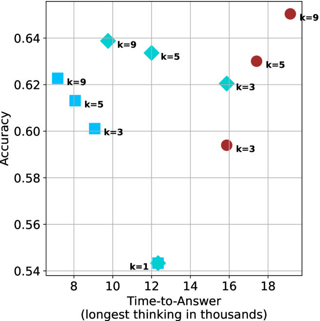
## Scatter Plot: Accuracy vs. Time-to-Answer
### Overview
This image presents a scatter plot visualizing the relationship between Accuracy and Time-to-Answer (measured in thousands of units). The data points are differentiated by the value of 'k', representing a parameter. The plot appears to explore the trade-off between speed and correctness for different values of 'k'.
### Components/Axes
* **X-axis:** Time-to-Answer (longest thinking in thousands) - ranging from approximately 8 to 19.
* **Y-axis:** Accuracy - ranging from approximately 0.54 to 0.65.
* **Data Points:** Scatter plot points, each labeled with a 'k' value (k=1, k=3, k=5, k=9).
* **Colors:**
* Blue: k=1, k=3, k=5
* Red: k=3, k=5, k=9
* Teal: k=5, k=9
* **Labels:** Each data point is labeled with its corresponding 'k' value.
### Detailed Analysis
The plot contains data points for k=1, k=3, k=5, and k=9. Let's analyze each 'k' value's trend:
* **k=1:** A single blue data point at approximately (11.5, 0.54).
* **k=3:** Two data points: a blue point at approximately (9.5, 0.60) and a red point at approximately (16.5, 0.59).
* **k=5:** Two data points: a blue point at approximately (10.5, 0.62) and a red point at approximately (17.5, 0.63).
* **k=9:** Two data points: a teal point at approximately (10, 0.64) and a red point at approximately (18.5, 0.65).
**Data Table Reconstruction:**
| k | Time-to-Answer (thousands) | Accuracy | Color |
|-----|-----------------------------|----------|-------|
| 1 | 11.5 | 0.54 | Blue |
| 3 | 9.5 | 0.60 | Blue |
| 3 | 16.5 | 0.59 | Red |
| 5 | 10.5 | 0.62 | Blue |
| 5 | 17.5 | 0.63 | Red |
| 9 | 10 | 0.64 | Teal |
| 9 | 18.5 | 0.65 | Red |
### Key Observations
* Generally, as 'k' increases, the maximum achievable accuracy also increases, but at the cost of increased Time-to-Answer.
* For k=3, k=5, and k=9, there are two data points each, suggesting potentially different configurations or runs for the same 'k' value.
* The red data points (k=3, k=5, k=9) tend to have higher Time-to-Answer values compared to the blue data points (k=1, k=3, k=5).
* There is a noticeable spread in Time-to-Answer for k=3, k=5, and k=9, indicating variability in performance.
### Interpretation
The data suggests a trade-off between accuracy and speed, parameterized by 'k'. Higher values of 'k' generally lead to better accuracy but require more Time-to-Answer. The presence of multiple data points for k=3, k=5, and k=9 indicates that the relationship isn't strictly deterministic; other factors likely influence the Time-to-Answer for a given 'k' value.
The plot could be illustrating the performance of a model or algorithm where 'k' represents a complexity parameter (e.g., number of neighbors in a k-NN algorithm, the number of layers in a neural network, or the size of a search space). The spread in data points for higher 'k' values might be due to variations in the input data or the randomness inherent in the algorithm. The fact that the red points are generally further to the right suggests that increasing 'k' leads to a more computationally expensive process, but potentially a more accurate result. The k=1 point is an outlier in terms of accuracy, suggesting that a very low 'k' value results in significantly lower performance.